The Consistency of Information based on Observations of Users’ Behavior Regarding the Wayfinding Transfer between Trains and City Buses at Hakata Station in Fukuoka City
Background A legible and user-friendly wayfinding system of public transport networks is one of the key factors for improving a city’s intangible value. Therefore, this study focuses on the wayfinding system in the transfer between city buses and trains at Hakata Station to see how the current sign system at Hakata Station could affect people’s wayfinding behavior in order to find methods for improving the system.
Methods The study conducted a survey related to the sign distribution and a wayfinding protocol. The signs were classified based on the functions in the survey. The wayfinding protocol included two aspects: 1) a wayfinding experiment that recorded and observed subjects’ wayfinding behavior, and 2) an interview and a questionnaire that were conducted afterward to assess the subjects’ wayfinding behavior.
Results It was discovered that the signs, including directional signs, information signs, and identification signs were not consistent based on the mount types, color codes, illumination types, and the height. Bus information at Bus Stop A was not inadequate and integrated; moreover, information such as “Hakata Bus Terminal” and “Bus Stop A-F” on directional signs confused subjects to move ahead at Hakata Gate. The subjects’ behavior patterns were consistent at the JR Kyushu part of the Station Concourse, but they were inconsistent at the Shinkansen Entrance Central Gate and the Hakata Gate.
Conclusions In this study, problems were clearly identified and methods were pointed out to improve the current sign system in order to lead people to smoothly transfer from trains to city buses. Also, a proposal based on four points for stations in other cities that were similar to Hakata Station was suggested, such as the consistency of signs at each decision point and path in the wayfinding process, the integrity and adequateness of bus information at bus stops, the clarity of differences between the bus terminal and bus stops at station squares, and the concern for information priorities at the whole sign system.
Keywords:
The Consistency of Information, Sign System, Wayfinding in the Transfer, Trains and the City Bus, Users’ Behavior Observation1. Introduction
1. 1. The brief background
According to the Global Power City Index 2014, Fukuoka ranks the 36th place in the world and 3rd place in Japan (The Mori Memorial Foundation, 2014). Furthermore, Hakata Station is the largest and busiest terminal station in Kyushu, but also a gateway to other cities; as a result, a number of visitors will come to Fukuoka by railways and then take buses to reach their desired destinations. There are some advantages of taking buses instead of subways, such as it can give people plenty of time to enjoy the sightseeing along the streets and taking a bus is also a flexible way to enhance people’s opportunities to arrive at the detailed spots.
A legible and user-friendly wayfinding system of the transfer in the public transport network is one of the key elements of civic imageability to improve intangible urban value. Wayfinding conceptualizes in terms of spatial problem solving (Romaedi Passini, 1984), so it can give people especially for the visitor, a better understanding of a station’s complexity. In addition, people not only benefit from a good wayfinding system but also the wayfinding system will increase people’s confidence to get lost and encourage them to rely on using it.
So far, the research related to the wayfinding system of public transport networks is not thoroughly studied. As we all know, people want to know how to efficiently and comfortably transfer in different public transport facilities. Therefore, it is quite necessary for us to make it clear that how is the situation of wayfinding system and how the public sign system in the physical space of the station affects people’s wayfinding behavior in the transfer.
1. 2. The research purpose of this study
The paper is to understand how the sign system affects people’s wayfinding behavior in the transfer between trains and the city bus in order to conclude methods for improving the current sign system at Hakata Station. Additionally, Fukuoka City is one of the twenty cities designated by government ordinance of Japan. Nine cities including Fukuoka are on the list at the area of west Japan. As a result, Hakata Station in Fukuoka City is selected as one of the two research sites due to the significances of the terminal station corresponding to the research. It is the first step to research the wayfinding in the transfer between trains and the city bus in the transport network of west Japan; so, the aim of this study is also to suggest a proposal for other terminal stations, which are similar to it in the respect of the terminals’ scale and importance.
1. 3. The selection of the research site
From the list of cities designated by government ordinance of Japan, six cities as the capital cities of its Prefecture in the west Japan are selected. Compared with the following factors, Hakata Station in Fukuoka City is selected as one of two research sites (Table 1).

Selection factors of the research site
1. 4. Definitions of terms in this study
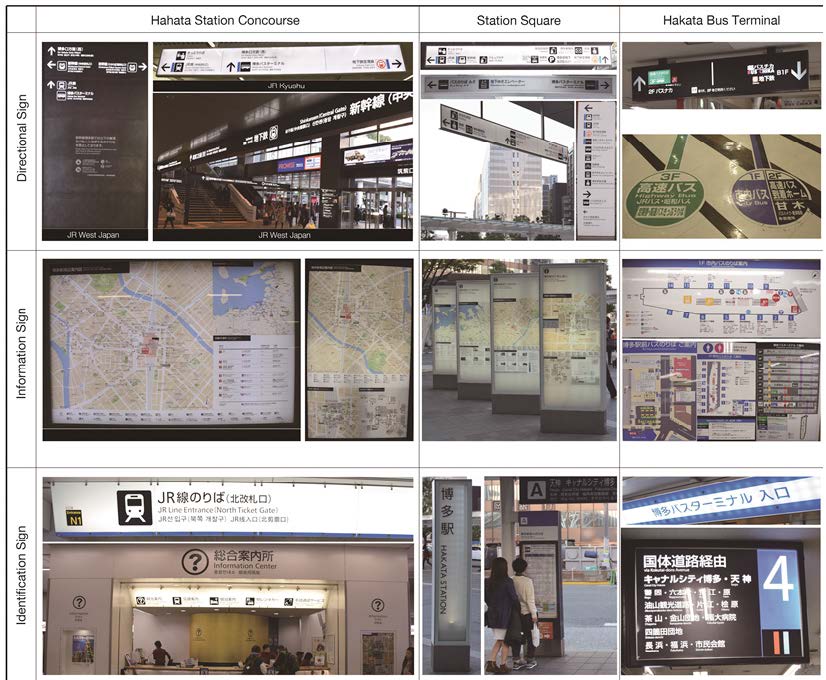
According to the Guideline of Public Transport Facilities for Passengers (2013) published by Ministry of Land, Infrastructure, Transport and Tourism, signs in the public transport networks include four types: the directional sign, the information sign, the identification sign and the regulatory sign. The following terms in this study are defined:
directional signs typically designate a place, an object, or an event in the form of a name, a symbol, or a pictograph and an arrow (Passini Romedi, 1984). Signs are located remotely from destinations to direct people the various destinations within a given environment and display arrows to point out specific paths, such as, left, right, straight ahead to destinations (Chris Calori, David Vanden-Eynden, 2015).
information signs interpret the meaning of an environment, or places and the relationship of locations (Guideline of Public Transport Facilities for Passengers, 2013).
identification signs are located at a destination to identify that destination or place in an environment (Chris Calori, David Vanden-Eynden, 2015). The signs are the most elementary state description of the location (Passini Romedi, 1984).
regulatory signs intended to regulate people’s behavior or prohibit certain activities within an environment (Chris Calori, David Vanden-Eynden, 2015).
compound signs, at least, mix the either of two types above. In this study, the compound sign is a combination of the directional sign and the information sign.
in this study, except the five types of signs above, else signs include the timetable and explanations of tickets fares and parking.
human behavior refers to the array of every physical action and observable emotion associated with individuals (Wikipedia).
wayfinding can be defined a process that people orientate themselves to destinations, so transfer behavior refers to the array of every physical action and observable emotion associated with individuals in the transfer process. It is considered as the same meaning with human behavior in this study.
Kevin Lynch (1960) defined “nodes are the strategic foci into which the observer can enter, typically either junctions of a path or concentrations of some characteristic”. So in this study, nodes refer to important decision points, such as gates (entrance and exit of buildings), starting point of wayfinding task, stairs, elevators and bus stops.
2. Research methods
In this study, research methods included two aspects: 1) a survey of the sign distribution in the physical environment of Hakata Station and then 2) a wayfinding protocol.
2. 1. Methods of the survey
Considering the people transfer behavior, regulatory signs did not really affect transfer behavior, so target signs were following (Table 2) in three spaces, such as the Station Concourse, the Station Square, and the Hakata Bus Terminal. Signs were classified into categories based on signs’ functions and each sign was marked with a specific number. The amount, locations, functional types, and information contents of signs were recorded on site.
The survey methods of signs
2. 2. Methods of the wayfinding protocol
The purpose of the wayfinding protocol was to understand the human behavior in the transfer in order to figure out the situation of sign usage. The wayfinding protocol included two aspects: 1) a wayfinding experiment. 2) After the experiment, a questionnaire and an interview that recorded their wayfinding experiences were conducted to assess their wayfinding processes.
Fifteen international students (four males and eleven females) who just arrived at Fukuoka City without any experiences at Hakata Station were recruited to conduct this experiment (Table 3). All participants were paid 1000-yen for their participation.
The demographic characteristic of subjects
• Date: 2015.10.12~2015.10.18.
• Daytime: 09:30am.~16:00pm.
The task was composed of the route A and the route B. As noted that sex differences appeared to have a significant effect on wayfinding strategy and males have better spatial capabilities (Chien-Hsiung Chen, Wen-Chih Chang, Wen-Te Chang, 2009), but, males were quite fewer than females among recruited participants, besides, the route A was longer and more difficult than the route B, thus, eight subjects (four males and four females) were from the route A, while seven female subjects were asked to start from the route B. The route A started from the Shinkansen Entrance, and the route B started from the JR Line Entrance North Ticket Gate. Because the wayfinding journey from the Shinkansen Entrance to the destination of this experiment included the part, which was the JR Line Entrance Central Ticket Gate, so, in this study, no subjects started from here. The destination of the wayfinding task was asked to get to the bus stop of Canal City HAKATA. The reason of selection of Canal City HAKATA was because the Canal City HAKATA ranked the 2nd place of visiting and the first one was the JR Hakata City in Fukuoka (Tourism statistics 2013, 2013). During the wayfinding process, all subjects were permitted to use any tools or ask people for assistance to complete their tasks.
The measurement was conducted by observing and accompanying subjects together. As regarded the subjects’ task performance related to the study, the following data was measured:
• Wayfinding time: time spending was calculated from the starting point to the destination with a timer.
• Sign usage: the sign usage referred to how many signs and what functional type of signs was used in the wayfinding process. It was recorded at each node, such as the starting point, the Hakata Gate, and the Bus Stop A. as well as paths in the Station Concourse, the Station Square, and the Hakata Bus Terminal.
• Wandered place: the places that subjects stayed at least 2 seconds (Elisangela Vilar, Francisco Rebelo, Paulo Noriega, 2014)).
• Wayfinding tools: what other tools subjects used except signs, such as smartphones, guide maps or asking people.
3. Results of the survey
3. 1. The situation of sign distribution
Figure 1 shows the sign distribution in layout. Table 4 shows the most types of signs distribute at the Hakata Station Square. Directional signs mainly distribute in the Station Concourse (47 numbers) and the Station Square (25 numbers), particularly the JR Kyushu part of the Station Concourse and the Station Square (Figure 2). Information signs also centralize in the two locations, such as the Station Concourse (17 numbers) and the Station Square (15 numbers). There are no directional signs in the Chikushi Station Square. Directional signs are the least at the Bus Terminal. Only one compound sign is at the Hakata Station Square.

The sign distribution in the layout of target spaces
Categories and numbers of target signs

The distribution of target signs
• Hakata Station Concourse
Figure 3 shows the Station Concourse distributes the most numbers of signs (54%), the Station Square is the 30% and 1F of the Bus Terminal is the 16%. The directional signs in the Station Concourse are two types based on two different operating companies, namely JR West and JR Kyushu (Table 5). JR West operates the Shinkansen and directional signs are white on black. JR Kyushu operates local train lines, and directional signs are consistent black on white. The illumination types (Figure 4) are quite different, JR Kyushu part is the internal illumination of the entire sign face and external illumination that washes the sign face, however, JR West is the internal illumination of the contents only with an opaque sign background.

The ratio of target signs in three spaces

Illumination types of directional signs at the Station Concourse
Directional signs in the Station Concourse
• Shinkansen Entrance (Central Gate) and JR Lines Entrance (North Ticket Gate) at Station Concourse
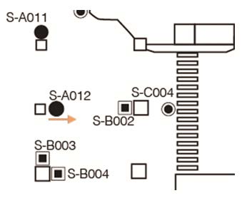
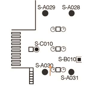
At the Shinkansen Entrance, only the directional sign (S-A012) perpendicularly provides bus information to the entrance. At the JR Lines Entrance (North Ticket Gate), an information sign (S-B010) and directional signs (S-A030, S-A031) provide bus information, but only timetables on the columns are right ahead to the entrance, not directional signs (Table 6).
Sign distribution at entrance gates in the Station Concourse
• Station Square
The height of directional signs at the Hakata Gate is higher than the ones installed inside of the Station Concourse (Figure 5), but they are in the consistent design, which means they are in the same colors, materials, and mount types. Information signs are mostly installed in three places at the Station Square: close to the Hakata Bus Terminal, close to the Hakata Gate and close to the Stop A and B.

Directional signs at the Hakata Gate and the Station Concourse
• Hakata Bus Terminal
There are three floors in the Bus Terminal: the first floor is for taking the city bus; the second floor and third floor are for taking the highway bus. The second one is the arrival floor while the third one is the departure. Signs in the Bus Terminal are messy and not consistent, besides, bilingual and multilingual messaging of signs are issues (Figure 6), most signs are only in domestic languages, such as the biggest information sign hang on the wall are written only in Japanese. The font size of English display on identification signs is 8 mm and 6 mm on information signs. 6 mm is smaller than the standard (Table 7).
The standard of font size (Guideline of Public Transport Facilities for Passengers, 2013)

Different information signs at the 1F of the Bus Terminal
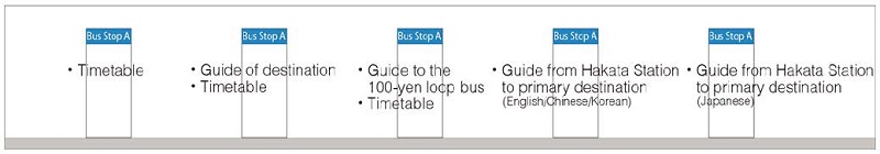
• Bus Stop A
The Bus Stop A provides the most bus lines and has five information signboards. However, the information is not integrated (Table 8) and it is observed some people check the signboards one by one to obtain the available information with the increase of numbers of people.
Bus information on signboards of the Bus Stop A
• The consistency of sign distribution at three spaces
From the Table 9, it indicates the inconsistency of signs corresponding to sign illumination types, mount types (Transportation research board, 2011), and the color modes. Directional signs are two types in the Station Concourse, which means directional signs at the JR Kyushu part keep the same design style with the ones located at the Hakata Gate and the Station Square, but completely different with the directional sign where are in the Bus Terminal. Information signs are the same design style at the Station Concourse and the Station Square, but different with the information signs at the Bus Terminal. Identification signs are totally different in the three spaces.
The comparisons of sign distribution in three spaces
4. Results of the wayfinding protocol
The destinations heading for Canal City were two places, one was the Bus Stop A in the Station Square, and another was the platform No. 4 in the 1F of Hakata Bus Terminal. Thus, There were two types of wayfinding behavior patterns either in the route A or the route B.
4. 1. Results in the route A
In the route A, three subjects moved to the destination at the Bus Stop A, and five subjects moved to the Bus Terminal. As shown from the route A (Table 10), four subjects’ wayfinding time exceeded the average time. Subject F spent the most time about 9 minutes. Subject F firstly arrived at the Bus Stop A, but subject F could not confirm this was the correct place or not and then moved to the Bus Terminal after asking people.
Subject F was the only one who moved to both the Bus Stop A and the Bus Terminal (Table 10). Subject C spent about 3 minutes that was the shortest time (Figure 7) because subject C saw buses coming at the Hakata Gate and just wanted to move there for having a try.
Only subject D reached the 2F Pedestrian Deck by an escalator, when subject D got close to the escalator and did not notice directional signs hang from the ceiling in the left front and just looked at the right unconsciously and saw the information heading for the Bus Terminal on a directional sign where located on the left of the escalator.
Subject D used the most numbers of signs due to moving into the 2F shop inside of the Bus Terminal. Subject A, D, E, F, H all moved to the Bus Terminal to take a bus and most of them spent almost 6 minutes. Subject A regarded a directional sign as an identification sign hang on the exit of the Bus Terminal shop because an exit of underground covered the view of the arrow on the directional sign. Subject A and D (Figure 8) moved to the shop of the Bus Terminal instead of the city bus area at first, that were the reasons why they spent more time than others. Subject G used the fewest numbers of signs because of asking people for assistance three times.

Wayfinding time and sign usage in the route A
Results of the wayfinding experiment in the route A

Subjects’ (A, D) wayfinding patterns in the route A
• Subject A: I move to the shop because I see a sign (Bus Terminal) at the Hakata Gate, but I realize it is a shop, not Bus Terminal when I move inside. I do not think I am wrong because the sign really tells me it is the Bus Terminal. Now I understand the reason is the exit of an underground covers my view, so I do not see the arrow...
• Subject D: I move here and I do not know which way to go next without seeing any signs. I look right unconsciously and notice people go upstairs by elevator, so I decide to go upstairs. I see a directional sign close to the elevator, but firstly I do not see the contents due to its installed angle...
• Subject G: I do not see information signs at the Station Concourse because the signs are parallel with my view. Later, I cannot easily find the bus stops on the information sign located at the Station Square, as well as the Canal City. The contrast of the sign performance is not good, and I cannot focus...
4. 2. Results in the route B
Five subjects moved to the Bus Stop A and two subjects moved to the Bus Terminal in the route B (Table 11). The most wayfinding time in the route B was subject L (Figure 9), subject L also moved to both the Bus Stop A and the Bus Terminal, conversely, subject L firstly moved to the Bus Terminal and asked the staff for assistance, however, subject L had to move back to the Hakata Gate to find the destination, but the No. 4 platform heading for Canal City was in the vicinity of subject L and the staff did not tell the bus could be taken at the Bus Terminal. Subject N firstly used the Google Map for navigating the direction instead of relying on signs, but it did not work well because current technologies could not focus and assist users explore so specific and accurate scale of areas.
Subject M read the information signs and confirmed the direction and saw buses coming at the Hakata Gate then moved there, so subject M spent the shortest time. Subject K also firstly saw the directional sign on the shop gate, so subject K reached the shop gate and realized there were no ways to the main gate if not go through the shop of the Bus Terminal, finally subject K decided to go along the curbside to reach the main gate of the Bus Terminal, but the curbside was dangerous due to many cars driving (Figure 10).
Results of the wayfinding experiment in the route B

Wayfinding time and sign usage in the route B

Subjects’ (J, K, L) wayfinding patterns in the route B
• Subject K: at the Hakata Gate, I do not see directional signs firstly due to the different height with the ones in the Station Concourse. When I see the “Bus Terminal” on a directional sign, it makes me decide I should go there and go along the road to reach the main gate, but there are no ways there, I have to walk along the curbside because I do not want to go back...
• Subject L: I come into the Bus Terminal, but I find there is no English display on signs, so I have to ask the staff, however, the staff’s English is not good, I guess he tells me I should go to the Bus Stop A to take the bus, so I return...
Later, when I get to the Bus Stop A, I still have no ideas I can take the bus here, it makes me a little worried, but what I am sure is that I can ask people here again...
4. 3. Results of sign usage at decision points
• Starting point: Shinkansen Entrance (Central Gate)
It indicated (Figure 12) that five subjects used the directional signs at the starting point and the other three were not. No subjects used information signs. Subject D, F, and G said they did not see directional signs. The font size of Japanese display was 40 mm and English display was 15 mm (Figure 11) that was smaller than the standard.

The font size of the directional sign (S-A012) at the starting point
• Starting point: JR Line Entrance (North Ticket Gate)
It indicated that six subjects used directional signs located at the right of the entrance, but subject O firstly used an information sign instead of directional signs. Subject L firstly saw two timetables on columns (Figure 12).

The sign usage at starting points in the route A and B
• Hakata Gate
From Figure 13, it shows an information sign (S-B016) provides “Hakata Station Area Map”. However, no subjects saw it in the route A. Subject G stood close to the information sign, but subject G asked people and did not see the information sign. Only subject O saw the map among fifteen subjects. The contents of other four information signs were related to guides of the commercial and the station building. Maybe the location of this information sign should be adjusted to close to the path in order to make people see with ease and the priorities of the information signs should be taken into account.

The usage of information signs by subjects at the Hakata Gate
In the route A, three subjects did not see the directional sign, and in the route B, two subjects did not see it (Figure 14). It indicated directional signs were very high at the Hakata Gate (Figure 15).

The usage of directional signs by subjects at the Hakata Gate

How do you think of the directional signs?
• Hakata Bus Terminal
Signs were quite different with other two spaces and did not make subjects’ behavior patterns straight (Figure 16). There were no waiting rooms on the first floor, so people waited for the bus against walls, as a result, with the increase numbers of waiting people, subjects could not see signs on the floor. Identification signs in flag mount mode showed specific destinations. It was measured that the font size of English display on directional signs was 8 mm, so it was readable within 2 meters, but it was difficult to read between two identification signs because the distance was more than 11 meters, so the font size of English should be more than 30 mm (Guideline of Public Transport Facilities for Passengers, 2013).

Overall subjects’ behavior patterns at the Hakata Bus Terminal
• Subject E: I even do not know this floor is for the city bus when I come into the first floor (Bus Terminal); many signs are hang up at the left, right, and the front, so the visual clutter makes me difficult to focus. Finally I find the information on an information sign, but the location is not good and the font size on it is quite small to read...
• Bus Stop A
The difficulty at the Bus Stop A was the confirming of desired bus information, such as bus routes, numbers, boarding ways and ticket fares. The information on signboards was not integrated and inadequate. Additionally, signs were not consistent with other spaces.
4. 4. Summaries of the wayfinding protocol
The route B was quite shorter than the route A corresponding to the distance and time spending. Most of subjects confused and wandered at 19 places (Figure 17), mainly at the Hakata Gate and the Bus Terminal Gate. It was clear that directional signs at the JR Kyushu part of the Station Concourse sequentially made all the subjects confident to move and behavior patterns consistent because all of the texts on directional signs related to bus transfer consistently displayed “Hakata Bus Terminal”, but at the Hakata Gate that linked the concourse and the square are “Hakata Bus Terminal” and “Bus Stop A-F”, most of the subjects said, they could not understand the differences of two contents and could not confirm their next move. Information signs were parallel to subjects’ views at the Station Concourse and difficult to understand due to the sign performance and small font size (Figure 18). The font size of contents on information signs was 1~5 mm (smaller than 7 mm). The amount of information, the font size, the contrast of sign performance, systematic display of foreign languages and locations should be adjusted.

Places where subjects wandered.

How do you think of the information signs?
5. Discussions
5. 1. The inconsistency of signs at nodes in space
From the analysis, it suggested that the performance of directional signs were not consistent corresponding to the mount types, the color codes, installed height, illumination types, design styles from the JR West to the Bus Terminal and the Bus Stop A. Directional signs were only consistent at the JR Kyushu part of the Station Concourse, so signs here made subjects have straight behavior patterns and perform confidently. The Shinkansen Entrance Central Gate and the Hakata Gate did not make subjects’ wayfinding behavior patterns consistent; especially behavior patterns performed differently from the Hakata Gate. Information related to bus taking was also not consistent, it indicated “Bus Stop A” and “Hakata Bus Terminal” on directional signs confused subjects to move next.
Nodes such as starting points, the Hakata Gate, the Bus Terminal Gate, bus stops were paramount, so they should provide clearer, reliable, and predictable information to enable people orient smoothly, so directional signs should decrease the differences. Considering the installed angles, signs should be perpendicular to people’s view, rather than parallel. At the JR Line Entrance North Ticket Gate, not only two timetables on the columns should be provided but also directional signs and information signs should also be provided on columns that were right ahead of the entrance in order to make people firstly receive the information from signs with ease. At the Shinkansen Entrance, the font size should be enlarged. At the Hakata Gate, signs and information should be consistent and simple to lead people’s wayfinding journeys, moreover bus information should be provided here to make users have a better understanding of the transfer information and the space layout. It should strike an appropriate balance between the consistency and predictability (The Yellow Book: a prototype wayfinding system for London, 2007). At the Bus Terminal, information signs should be more clear and legible to read, for example, the amount of information, locations and systematic display of the foreign language should be adjusted.
5. 2. Difficulties of receiving bus information at bus stops
Some subjects reached either the Bus Stop A or the Bus Terminal, they still did not confirm this was the correct place or not because the information was not inadequate and integrated. The bus stop was not a destination, so it was necessary to assure people receiving available information to go next. Under this situation, designers should make people recognize the information without taking physical fatigue and feel secure from worries. Firstly the bus information elements (Table 12) should be analyzed in order to meet people’s need. Three types of bus information were suggested and secondly, the integration of information, proper locations, clarity of contents, the consistency with other signs should be taken into account.
List of bus information elements at bus stops
5. 3. Space limits on affecting human behavior
Due to the space limits, subjects did not see some signs because signs were hidden by the exit of underground. Some subjects even saw the directional signs without seeing the arrows; consequently it made mistakes and took subjects’ effort. Designers should take the space limits into account at the beginning of project in order to decrease the barriers and make people move correctly.
5. 4. Clarity of signs contents
Clarity of the contents, such as the clarity of terminologies, especially the native and correct translations for solving the problems of language hindrance (Meng-Cong Zhang, Tadao Shimizu and Kiminobu Sato, 2008), integrity of the pictograms, understandability of the arrows, and simplicity of the information amount should also be taken into account. Provision of the foreign language should be systematic (Wonjun Chung, 2010).
5. 5. Priorities of the information in wayfinding process
Priorities of the information referred to the priority of the information contents and the priority of information locations in the sign system. The priority of information contents meant urban planners and managers should firstly consider what Fukuoka City could provide for visitors as an attractive city and the information necessity of attractions and sightseeing in the sign system at Hakata Station. If needed, how to connect popular attractions with Hakata Station by what means. It was clear that directional signs only provided the information related to the “Bus Terminal” and “Bus Stop A-F”; besides, there were no hierarchies of information on information signs, so subjects could not prioritize to find the available information with ease. The priority of information locations meant the information should be provided at proper locations. It was turned out that no directional signs at starting points directed the way to reach the attractions or sightseeing. Providing the attractions information at starting points (entrances) either on directional signs or information signs should be taken into consideration at Hakata Station due to the complexity of the station and the attractiveness of Fukuoka City, if a visitor planned to reach the Canal City HAKATA, the visitor firstly had no ideas how to reach there and had to get to the Bus Stop A or the Bus Terminal, and then took effort to search for the accurate boarding stop, bus routes, bus numbers and payment to complete the task by using the current sign system, but if a visitor knew the desired information when just came out of the entrance gate, the situation changed better because the information assisted the visitor in forming a mental map, which was quite helpful for the coming wayfinding journey.
6. Conclusions
From the survey of sign distribution and a wayfinding protocol, this study figured out difficulties existed in the transfer between trains and the city bus by using the current sign system. The following problems were identified: Firstly, directional signs were not consistent based on the mount types, color codes, illumination types, and the height. The sign performance of information signs, such as the font size, the contrast and hierarchies of contents affected people wayfinding behavior much. In addition, the location should be more conspicuous and installed angles should not be parallel to people’s view. Identification signs at the Bus Terminal should adjust the font size to make the information clearer and more readable. The compound sign was only one located at the Station Square, so the compound signs should be more installed to strike an appropriate balance of the information between the consistency and the predictability. Secondly, key nodes such as train entrances, the Hakata Gate, the Bus Terminal Gate and the Bus Stop A should assure consistent signs.
Paths linked nodes were also paramount, it was clear that only the path from the JR Kyushu part to the Hakata Gate made subjects move straight due to the consistent directional signs and bus information, however, paths between the Hakata Gate and the Bus Terminal Gate had different behavior patterns. As a result, the continuity, consistency, conspicuity and clarity of signs should be emphasized in the path of the wayfinding process. Thirdly, the consistency and adequateness of bus information should be taken into consideration. Particularly it was figured out the information at the Bus Stop A was not inadequate and integrated, so bus information elements should be adjusted. Fourthly, the differences between the Bus Terminal and the Bus Stop A-F at the Station Square should be clearer to make people understand better and smoothly lead people to take buses. It indicated that subjects did not know the differences at the Hakata Gate and they could take the bus heading for the desired destination either at Bus Stop A or Bus Terminal. Fifthly, priories of information on signs should be significantly taken into account for Fukuoka City as an attractive city that ranked the 36th place in the world. The experiences in the transfer were quite important because the experience had a strong expression to people who was the first time to visit.
This study not only points out methods to improve the current sign system in order to smoothly lead people to transfer from trains to the city bus at Hakata Station but also, it suggests a proposal based on four points for other complex terminal stations at attractive cities. Firstly, it is very important to assure the consistency of signs at each decision points (nodes) and paths in the wayfinding process, secondly, the integrity and adequateness of bus information at bus stops should be taken into consideration, thirdly, if a complex station has a Bus Terminal station and bus stops at station squares, it is quite necessary to clarify the difference between the bus terminal and bus stops in order to make users complete the bus taking at ease, fourthly, priorities of the information at the whole sign system is also significant to a station, what information should be provided by what forms is needed to consider, because users prefer to obtain available information at first and then carry out an act.
The limitations of this paper existed, 1) no males were tested at the route B, and 2) due to various components in terms of the graphic system of signs affecting users’ understanding of their wayfinding processes, but the font size was only analyzed, therefore, the typeface, typography, letter space and other relevant graphic elements needed to consider in the further study.
Notes
Copyright : This is an Open Access article distributed under the terms of the Creative Commons Attribution Non-Commercial License (http://creativecommons.org/licenses/by-nc/3.0/), which permits unrestricted educational and non-commercial use, provided the original work is properly cited.
References
-
Calori, C., & Vanden-Eynden, D. (2015). Signage and wayfinding design: a complete guide to creating environmental graphic design systems. New Jersey: John Wiley & Sons..
[https://doi.org/10.1002/9781119174615]

-
Chen, C. H., Chang, W. C., & Chang, W. T. (2009). Gender differences in relation to wayfinding strategies, navigational support design, and wayfinding task difficulty. Journal of environmental psychology, 29(2), 220-226.
[https://doi.org/10.1016/j.jenvp.2008.07.003]
- Chung, W. (2010). The current status of the public sign system centering on the Busan Station: The problems about methods from professional perspective. Japanese Society for the Science of Design, 57(2), 31-38.
- Cities designated by government ordinance of Japan. (n.d.). Retrieved from https://en.wikipedia.org/wiki/Cities_designated_by_government_ordinance_of_Japan.
- Complex stations. (n.d.). Retrieved from https://ja.wikipedia.org/wiki/複合商業施設..
- 公共交通機関の移動等円滑化整備ガイドライン[Guideline of Public Transport Facilities for Passengers]. (n.d.). Retrieved June, 2013, from: http://www.mlit.go.jp/common/001016331.pdf.
- 平成25年福岡市観光統計概要[Guideline of Fukuoka Tourism Statistics 2013] (n.d.). Retrieved January 13, 2013, from:http://www.city.fukuoka.lg.jp/data/open/cnt/3/46868/1/shousai.pdf.
- Human behavior. (n.d.). Retrieved from https://en.wikipedia.org/wiki/Human_behavior.
- Lynch, K. (1960). The image of the city. Cambridge, Massachusetts: The MIT Press.
-
Passini, R. (1984). Spatial representations, a wayfinding perspective. Journal of environmental psychology, 4(2), 153-164.
[https://doi.org/10.1016/S0272-4944(84)80031-6]
- Passini, R. (1984). Wayfinding in architecture. NY: Van Nostrand Reinhold.
- The Mori Memorial Foundation. (2014). Global Power City Index 2014. Retrieved from http://www.mori-m-foundation.or.jp/gpci/pdf/GPCI14_E_Web.pdf.
- The Yellow Book: a prototype wayfinding system for London. (2007). Retrieved from https://tfl.gov.uk/info-for/boroughs/legible-london.
- Harding, J. R. (2011). Wayfinding and Signing Guidelines for Airport Terminals and Landside, 52. Transportation Research Board.
-
Vilar, E., Rebelo, F., & Noriega, P. (2014). Indoor human wayfinding performance using vertical and horizontal signage in virtual reality. Human Factors and Ergonomics in Manufacturing & Service Industries, 24(6), 601-615.
[https://doi.org/10.1002/hfm.20503]
- Zheng, M. C., Shimizu, T., & Sato, K. (2009). INFORMATION SIGNS BASED ON USERS'WAYFINDING BEHAVIOR IN TRANSFER BETWEEN UNDER-GROUND STATIONS. デザイン学研究, 55(6), 39-48.