Order Effect of Warm-Cool Judgment of Colors
Abstract
Background Color is closely related to emotions and is an important factor in inducing emotion. However, although hue is highly related to color heat, most of the studies on hue and emotion are conducted broadly on each color, such as Red and Blue, and are conducted separately from the study on color heat. It is necessary to discuss in detail whether color can be classified as a unique temperature, that is, an emotion of warm or cool and whether the warm-cool emotion is immutable or variable. Since human experience colors in various orders in an actual environment where they encounter colors, which can change their perception of colors, it is very important to review the order of color presentation.
Methods The two experiments had differences in the color stimuli used, and the difference in the result between evaluating the reflective color and evaluating the transmissive color was compared. The reflective color experiment was conducted in which subjects saw reflective color samples and evaluated the degree of warm-cool on a 7-point Likert scale, while the transmissive color experiment was evaluated on a sensory scale (-10 to 10, decimal allowed) by looking at color stimuli on a computer monitor. Additionally, to check the effect of the order in which the colors were presented, the transmissive color experiment was conducted in three sets: forward (Red> Orange> Yellow> Green> Blue> Purple> Red), random (no direction), and reverse (Red> Purple> Blue> Green> Yellow> Orange> Red).
Results The results of the reflective color experiment and the transmissive color experiment showed that the peak points of the warm and cool or the conversion points of the warm-cool judgment were very similar, and thus confirmed that the warm-cool judgment of color was not affected by the difference in the stimulus. Comparing the results for the three orders of the transmissive color experiment, the point that the forward order changed from warm to cool and the point that changed from cool to warm appeared earlier based on the hue angle.
In the reverse order, contrary to the forward result, the point that changed from warm to cool and the point that changed from cool to warm appeared later. The change of judgement occured earlier based on the order in which color was presented. The results of the random experiment changed the warm-cool judgment of color at a location halfway between the forward-direction and the reverse-direction results. Therefore, there are variable sections in which warm-cool judgment varied depending on the order in which color was presented.
Conclusions The warm-cool of color can vary in context, but appropriate warm-cool judgment is determined in each situation, rather than withholding judgment. In color, there are constant and variable sections for the warm-cool judgment.
Keywords:
Order Effect, Warm-Cool, Color, Reflective and Transmissive, Relativity1. Introduction
Color is an essential element in our daily lives and associations, feelings and emotions are triggered in the process of recognizing colors. Research on the relationship between color and emotion has been discussed for a long time, and a conclusion was drawn by a universal model to predict the emotion terms (Sato et al., 2000; Nakamura et al., 2000; Ou et al., 2004; Ou et al., 2012; Lee et al., 2009; Xin et al., 2004). Among the research results so far, emotional adjectives related to color attributes, that is, hue, lightness and chroma are color activity, color weight and color heat respectively (Kobayashi, 1981; Sato et al., 2000; Ou et al., 2004). Kobayashi (2009) developed a color image scale with three adjective pairs related to color attributes and Ou et al. (2004) and Ou et al. (2018) proposed an equation for calculating the values of three emotional adjective pairs using CIELAB color values. Specific discussions on the emotions or changes in contradictory emotions according to changes in color, lightness and chroma are continuously researched.
Among the three emotion categories, hue is highly related to color heat or warm-cool emotion. Hue is a factor of color that affects emotions and it is being actively studied in various directions, including a study on emotions caused by hues (Valdez and Mehrabian, 1994; Kaya and Epps, 2004; Güneş and Olguntürk, 2020), a study on hues, emotion and preference (Manav, 2007), a study on perceptual and emotional reactions to lighting environments and hues (Lombana and Tonello, 2017), and a study on the physiological effects of hues (Küller et al., 2009). It can be interpreted that color is closely related to emotions and is an important factor in inducing emotion. However, although hue is highly related to color heat, most of the studies on hue and emotion are conducted broadly on each color, such as Red, Blue, etc. and are conducted separately from the study on color heat. It is necessary to discuss in detail whether color can be classified as a unique temperature, that is, an emotion of warm or cool and whether the warm-cool emotion is immutable or variable.
Meanwhile, colors interact with the colors around them. All three attributes of color appear differently depending on the background, neighborhood colors, complexity of colors, size, the given context, etc. Brown and MacLeod (1997) revealed that color appearance depends on the average and distribution of ambient colors. In addition, Min and Park (2023) revealed that color image evaluation varies according to the color presentation tool due to the context effect. The different perception of colors means that the emotions of colors can also change. Color evaluation is affected not only by the surrounding environment and context but also by the order in which it is shown. Egré et al. (2013) confirmed that the linguistic category of color varies according to the order in which the color stimulus is presented (Random, Ascending, Descending). This suggests that the judgment of color may vary depending on the order in which the color is presented, and the emotion may also vary. Although the use of counter-balanced design is important in cognitive research due to problems such as the order effect (Pollatsek and Well, 1995), the random presentation method is still adopted in color experiments. Since human experience colors in various orders in an actual environment where they encounter colors, which can change their perception of colors, it is very important to review the order of color presentation.
Therefore, the purpose of this study is to clarify how color heat; warm-cool are judged according to how the color is presented. First, we would like to check the hue range with warm-cool and determine whether warm-cool is applied to all colors or whether it is a limited emotion in some colors. Next, we would like to discuss the absoluteness of warm-cool for color by checking whether the warm-cool judgement for the color changes due to the presented order (forward, reverse and random).
2. Method
2. 1. Stimuli and Subjects
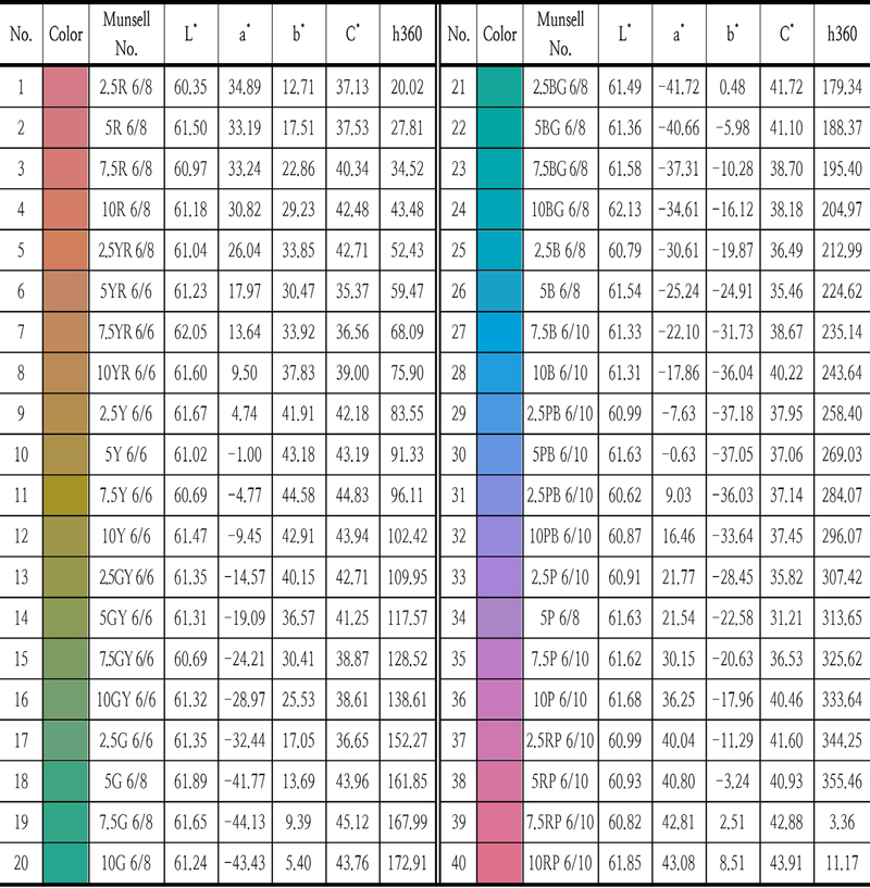
The experiment was conducted in two parts. The two experiments had differences in the color stimuli used, and the difference in the result between evaluating the reflective color and evaluating the transmissive color was to be compared. In the first experiment, a color chip colored with paint and a 7-point Likert scale was used. As shown in Table 1, 40 hues with intervals of 2.5 were determined among the color chips of The Munsell Book of Color (Matte), and 40 color chips with lightness value (60-62) and chroma value (35-45) at similar levels were selected (Based on the color chip measurement value). The size of the color chip is about 2° visual angle (2cm × 2cm, viewing distance of 50cm).

Reflective colors (Munsell color chips) from the first experiment
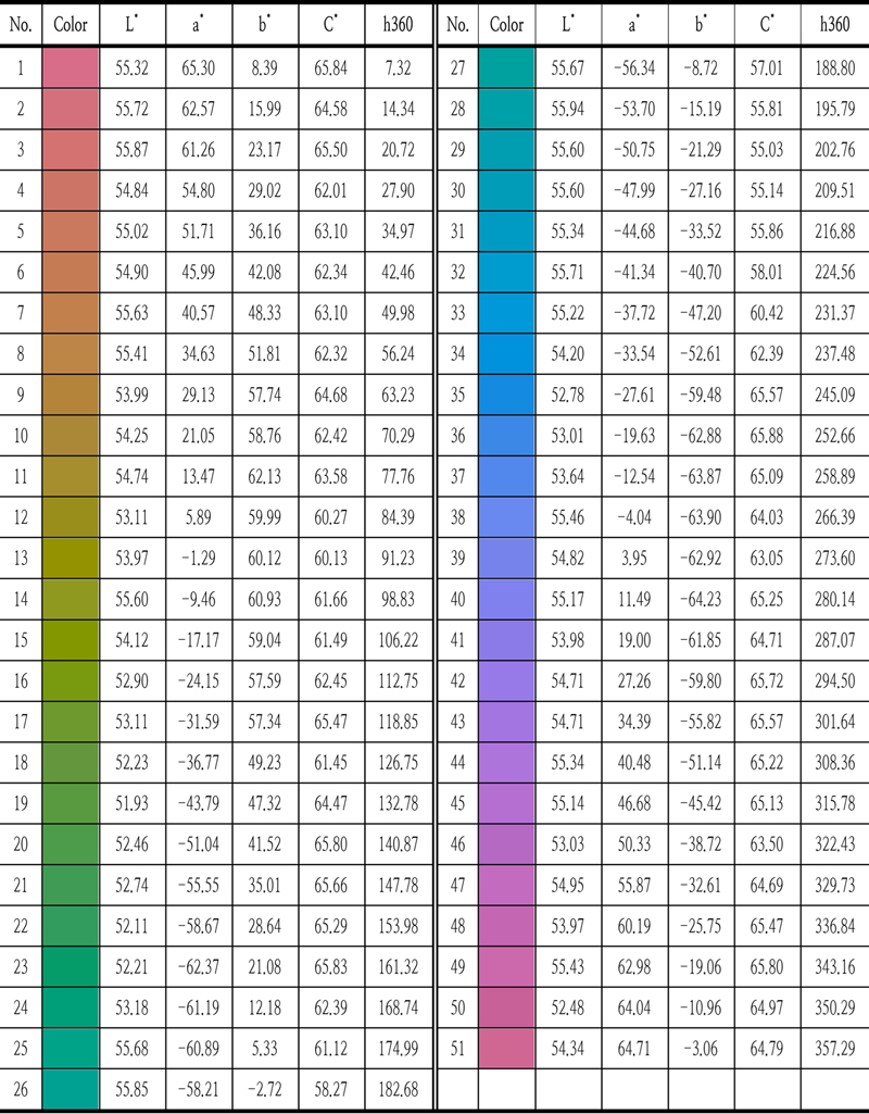
In the second experiment, a color sample was presented on a monitor and used a sensory scale (-10-10). As in the first experiment, 51 samples were produced that differed only in hue by matching the lightness value (51-55) and the chroma value (55-65) as much as possible and are presented in Table 2 (Based on the display color measurement value). The chroma value was intended to match the level of 60-65 but the chroma maximum value fell in the Green~Blue section, so the chroma value of 7 color samples was produced at the level of 55-59. Hue was adjusted so that it was separated at equal intervals (about 7° intervals) within the CIELAB color space. The color stimulus was placed in the center of the medium gray display screen with a reference size of about 5° (5 cm x 5 cm, viewing distance of 50 cm). In this study, we tried to confirm the relationship between hue and warm-cool, so according to Valdez and Mehrabian (1994)’s concern that failure to control color properties is impossible to design experiments and interpret results, only hue differences were considered.
Transmissive colors (monitor colors) from the second experiment
The subjects of the experiment had normal color vision and were between their 20s and 40s, and 10 to 15 people participated.
2. 2. Procedure
All experiments were conducted in a dark room, and all subjects were checked for normal color vision using a color test table before participating in the experiment. The 15 subjects of the first experiment evaluated the warm-cool degree on a 7-point Likert scale for color chips randomly presented one by one under the D65 illumination of a viewing box with a medium gray interior. To confirm the consistency of the response, 4 samples, 10% of the samples, were repeated twice, and the subject was required to evaluate a total of 44 color samples.
In the second experiment, 10 subjects evaluated the degree of warm-cool at -10 to 10 points (allowed with a decimal point) for a color sample displayed one by one on a computer monitor. The criteria for the sensor scale were -10 points for ‘Greatest imaginable cool’, 0 points for ‘Neither warm nor cool’ and +10 points for ‘Greatest imaginable warm’, and absolute evaluation was required. The evaluation was made on a total of 55 color stimuli, including repetition. After viewing the color stimulus for 2 seconds, the empty screen of the middle gray screen for 2 seconds before viewing the next color stimulus was allowed to prevent an afterimage of the previous color. In this experiment, to check the effect of the order in which the colors were presented, forward-direction (Red>Orange> Yellow> Green> Blue> Purple> Red), random (no direction), reverse-direction (Red> Purple> Blue> Green> Yellow> Orange> Red), a total of 3 sets were conducted. A break of 5 minutes was given in the middle of each experimental set.
3. Result
3. 1. Observer Accuracy
The observer accuracy equation used by Ou et al. (2004) was used to confirm the accuracy of the subject group and response. wis the proportion of wrong decisions of the color sample i within the observer group. N is the number of color samples.
| (1) |
The range of the accuracy value by equation is from 0 to 1, and the closer to 1, the better. As shown in Table 3, the subject response accuracy for the first experiment and all three directions of the second experiment was calculated as high values of 0.8 or higher, and it was determined that the response was agreed upon within the subject group and the subject’s response was accurate.
Observer accuracy values for the 51 single-color
The range of the accuracy value by equation is from 0 to 1, and the closer to 1, the better. As shown in Table 3, the subject response accuracy for the first experiment and all three directions of the second experiment was calculated as high values of 0.8 or higher, and it was determined that the response was agreed upon within the subject group and the subject’s response was accurate.
3. 2. Reflective and Transmissive Colors
Figure 1 shows the comparison of the results of the reflective color sample used in the first round and the transmissive color sample in the second round. Although each has a different color value, it was converted to a hue angle of 360° on the X-axis, and the average of the warm-cool evaluation values of the subjects was converted from -1 to +1 on the Y-axis. A positive number on the Y-axis represents the degree of warm and a negative number represents the degree of cool. The higher the absolute value, the stronger the degree of judgement. The dotted line of the graph is the result of the first reflective color sample, and the solid line is the result of the secondary transmissive color sample. Color stimuli of the first and second experiments corresponding to each hue angle were placed on the graph. As shown in the graph, the warm-cool judgement result showed similar results regardless of the type of stimulus. The warm and cool judgement areas (hue angles) were almost the same, and the warm to cool conversion points (hue angle 140°~ 150°, 335°~ 360°) were similar. This can be judged to have little effect on the stimulus, and it means that it can be compared with the results of previous studies in which the reflective color samples were mainly used. It was proved that there was no problem using the transmissive color in conducting the warm-cool study for this study. It is difficult to set the chroma or lightness closely using only reflective colors, and it is not effective in experimenting with several sets of order effect, so the further on experiment was conducted with only transmissive colors.

Comparison of reflective color results and transmissive color results
3. 3. Transmissive Color Results
The warm-cool judgement result for the transmissive color presented as random is shown in Figure 2. As shown in the graph of Figure 1, the X-axis represents the hue angle, and the Y-axis represents the warm-cool judgement value. The solid line is the warm-cool judgement value, and the gray dotted line is a polynomial trend line that can predict the trend of the warm-cool judgement. The transmissive color stimulus is presented at the top of the graph.

Warm-cool judgement for the transmissive color presented in random order
Warm is the highest in the Orange ~ Yellow section, and cool is the highest in the Blue ~ Purple section. The points where the change in warm-cool occurred are the Yellow ~ Green and Purple ~ Red sections.
Looking at the trend line in Figure 2, a sharp rising curve appears from about 0° to 30° of the hue angles, and a curve of gentle slope is formed near the peak of the warm. The trend line of the gentle curve shows a sharp change with a steep slope again in the Yellow ~ Green section, which changes from warm to cool, but in the cool area, the gentle slope such as the warm area is restored. In the Purple ~ Red section, which changes from cool to warm, there is the same tendency of a steep slope as the Yellow ~ Green section. In this way, a sharp slope is formed in the section where the emotion of the warm-cool changes compared to the section judgement as warm or cool, which means that the warm or cool is not clear, and the range of colors that feels ambiguous is narrow.
The experimental results graph of Figure 2 showed that the change of warm-cool occurred rapidly which means that the warm-cool emotion for the color was clear. To verify this, the response rate evaluated as warm or cool was checked with the graph in Figure 3. On the X-axis of the graph, the transmissive color stimuli are presented in the order of hue angle, and on the Y-axis, the rate of the number of responses of the subjects who responded as warm or cool is indicated. The solid line is the response rate of warm, and the dotted line is the response rate of cool. A score of 1 means that all the subjects who participated in the experiment agreed on the same judgement. The sum of the number of warm and cool responses to each stimulus should be 1 point, and the stimulus that cannot be 1 point is the case in which some subjects have a ‘0’ score that cannot be judged as warm or cool.

The number of responses rate evaluated as warm or cool
In the graph, most of the subjects agree that it is warm or cool while the section with conflicting opinions is very narrow. Through the response results of each subject, the number of times that a score of ‘0’ that cannot be evaluated as warm or cool is at least 0 to a maximum of 7 times. This is about 14% of the total number of irritants. Even the rest of the subjects, except for one subject who gave a ‘0’ score seven times, answered ‘0’ up to four times and only about 8%. It can be confirmed that the subjects clearly judged most of the colors by warm or cool rather than neutral judgement.
In Figure 3, the section where the subjects’ judgements are mixed is marked with a gray box which is a section where 40% to 60% of the total subjects disagree. There are 14 stimuli in the section where subject evaluations are mixed, and they are about 27% of the total number of stimuli. Colors for which the subjects’ agreement is not reached occur in the section from Red to Orange, Yellow to Green, Green, Green to Blue, and Purple to Red. All other sections except Green are the points where the color category changes and are colors that cannot be accurately determined as Red, Orange, Yellow, Green, Blue and Purple. Green is an exceptional color and the judgement of warm and cool changes based on Green.
To confirm the influence and change by the order in which the color is viewed, the experimental results of forward-direction (Red> Orange> Yellow> Green> Blue> Purple> Red), random (no direction), reverse-direction (Red> Purple> Blue> Green> Yellow> Orange> Red) were compared and displayed in the graph of Figure 4. The X-axis and Y-axis are the same as the previous graph format showing the hue angle and warm-cool evaluation values. The solid black line is the result of a random experiment and the solid red line and the dotted red line represent the forward and reverse experiment results, respectively. Comparing the results of the three orders, the point that the forward order changes from warm to cool and the point that changes from cool to warm appear earlier based on the random order results. In the reverse order, contrary to the forward result, the point that changes from warm to cool and the point that changes from cool to warm appear later. In the case of the forward direction, the judgement changes from warm to cool at the same time as Green is shown in Yellow, and the judgement changes from cool to warm again at the same time as Red is shown in Purple. Conversely, in the case of the reverse direction, when Purple is shown in Red, the judgement changes from warm to cool, and when Green is shown in Blue, it changes from cool to warm again. The change of judgement occurs earlier based on the order in which color is presented. Randomized results show that judgement change at a location halfway between the forward and reverse results. In the Yellow ~ Blue-Green and Purple ~ Red areas, the section in which the judgement of warm and cool varies according to the order in which color is presented. In addition, the judgement values for warm and cool are also higher when the direction is in the order of direction rather than the random order. Interestingly, the difference is not large in the warm judgement value because it changes quickly from warm to cool in the forward order, but the judgement value for cool appears higher as the area of cool expands. Conversely, in the reverse order, as the warm area widens, the warm judgement value also appears higher than the other order results. The sudden change of warm-cool judgement shown in the random order appears the same in the forward and reverse order.

Warm-cool according to presentation order
To compare the warm area and the cool area, the area is displayed on the CIELAB graph in Figure 5. The orange area of each graph corresponds to warm, and the blue area corresponds to cool. The size of the bubble at the color stimuli position represents the value of warm-cool. Graphs of forward, random and reverse directions which are the order of presentation of stimulus and the graph reflecting all results were prepared. The ‘Total’ graph shows the warm-cool areas of the three graphs overlapping and presents the variable and constant sections of the warm-cool according to the order of presentation of the stimulus. Comparing the three order graphs, the warm area is widening to the yellow area as it changes to Forward > Random > Reverse, and on the contrary, it is narrowing to Purple. Overall, it is rotating about 45° to 90° to the left in the CIELAB graph. In all three orders, the color areas of warm and cool were similar in each experiment, but there is a clear difference between warm and cool in ‘Total’ and the color areas of cool. This is interpreted as having a high possibility of change as warm emotion is more affected by the order than cool. Looking at the ‘Total’ graph in Figure 5, regardless of the order, the warm section appears narrow around the Orange, and the cool section appears wide around the Blue. The sections in which the warm-cool changes according to the order are the Yellow to Green and Purple to Red sections. As a result, it was confirmed that there are color areas and unchanged areas in which the warm-cool can change according to the situation.

Change of warm-cool emotion area by color presentation method (Bubble size: average value)
Since this experiment started with Red and proceeded in three different orders, it is predicted that the fluctuation section of the warm-cool will become larger and both the warm and cool section that do not change will become narrower according to the color of the starting point.
4. Discussion
The experimental results using the Munsell color chip and monitor color sample were compared to check whether there is a difference depending on the stimulus in the relationship between color and warm-cool, and the judgement values of warm or cool were different, but it was confirmed that the peak point of each judgement or the color point at which the warm-cool changes were similar. It is not possible to prove that all the results are the same until the reflected color, but it can be said that the order effect or warm-cool in the transmitted color will show similar patterns. Even if the stimulus, lightness, chroma, etc. are different, the same hue has the same warm-cool.
In the random experimental results, the peak points of warm and cool judgement were confirmed to be the Orange ~ Yellow section and the Blue ~ Purple section, respectively, and the turning points of warm-cool emotion appeared in Green-Yellow and Red-Purple. This finding is consistent with the results of Ou et al. (2004) which revealed that the warmest color angle is 50°. In addition, Oh and Kwak (2019) revealed that in the lighting color experiment, Red-Yellow causes warm emotions, Blue causes cool and warm-cool change in Green and Blue-Red, confirming that even if the stimuli are different, they are consistent with the results of this experiment.
The subject’s accuracy was calculated to confirm the consistency of the experimental results and the agreement on the warm-cool was verified by examining the subjects’ warm-cool consent. The subjects evaluated most colors as warm or cool which is related to the categorical perception of colors. Holmes and Regier (2017) confirmed that the warm-cool classification is related to categorical perception, and the clear result of the warm-cool judgment in this study supports the argument of Holmes and Regier (2017) that the warm-cool classification is related to categorical perception. However, although it is a narrow section, the section where warm or cool judgement is not agreed upon was found around the points where the warm-cool evaluation changes, and this phenomenon is related to the results of a study by Brown, Lindsey and Guckes (2011) that the colors at the boundary of the color group are not classified as categorical perceptions such as color names. It is difficult to classify categories for colors at the boundary of the color group, which may make it difficult to classify warm-cool.
Finally, the warm-cool was affected by the order in which the colors were shown, and the warm-cool was converted earlier as opposed to the order in which they were shown. This is consistent with the direction in which the linguistic category of color changes in the study of Egré et al. (2013), and it is judged that the phenomenon in which the warm-cool judgement varies according to the order is due to the perception phenomenon in which the category of recognizing color changes according to the order. In addition, it was confirmed that there is a color area in which warm-cool changes due to the influence of the presentation order and an invariant color area that is not affected. This result is contrary to studies (Ou et al., 2004; Ou et al., 2018) that calculate warm-cool emotions by formula because warm-cool for color is determined. Of course, there are sections in which warm-cool remains unchanged, but since there are sections in which judgement change according to surrounding situations such as the order in which they are shown, it seems difficult to calculate judgement numerically.
5. Conclusion
In this study, it was confirmed that all colors have warm or cool and that the ambiguous color range for warm-cool is narrow. Warm-cool can change depending on the situation, but appropriate warm-cool judgment is made in each situation, not suspending judgment. The classification of warm-cool is related to the categorical perception of color, and the determination of warm-cool judgement becomes clear depending on whether a categorical perception of color is present. Looking at the relationship between the specific color and the warm-cool, the peak point of the warm is in the Orange section, and the peak point of the cool is in the Blue section. The turning points of warm and cool occur in the Green-Yellow section and the Red-Purple section. However, since the evaluation of the warm-cool can be changed by relative judgment, there are constant and variable sections for the warm-cool judgement depending on the color.
Notes
Copyright : This is an Open Access article distributed under the terms of the Creative Commons Attribution Non-Commercial License (http://creativecommons.org/licenses/by-nc/3.0/), which permits unrestricted educational and non-commercial use, provided the original work is properly cited.
References
-
Brown, A. M., Lindsey, D. T., & Guckes, K. M. (2011). Color names, color categories, and color-cued visual search: Sometimes, color perception is not categorical. Journal of vision, 11(12), 2-2.
[https://doi.org/10.1167/11.12.2]

-
Brown, R. O., & MacLeod, D. I. (1997). Color appearance depends on the variance of surround colors. Current Biology, 7(11), 844-849.
[https://doi.org/10.1016/S0960-9822(06)00372-1]
-
Egré, P., De Gardelle, V., & Ripley, D. (2013). Vagueness and order effects in color categorization. Journal of Logic, Language and Information, 22, 391-420.
[https://doi.org/10.1007/s10849-013-9183-7]
-
Güneş, E., & Olguntürk, N. (2020). Color-emotion associations in interiors. Color Research & Application, 45(1), 129-141.
[https://doi.org/10.1002/col.22443]
-
Holmes, K. J., & Regier, T. (2017). Categorical perception beyond the basic level: The case of warm and cool colors. Cognitive science, 41(4), 1135-1147.
[https://doi.org/10.1111/cogs.12393]
- Kaya, N., & Epps, H. H. (2004). Relationship between color and emotion: A study of college students. College student journal, 38(3), 396-405.
-
Kobayashi, S. (1981). The aim and method of the color image scale. Color research & application, 6(2), 93-107.
[https://doi.org/10.1002/col.5080060210]
- Kobayashi, S. (2009). Color image scale. http://www.ncd-ri.co.jp/english/main_0104.html.
-
Küller, R., Mikellides, B., & Janssens, J. (2009). Color, arousal, and performance-A comparison of three experiments. Color Research & Application, 34(2), 141-152.
[https://doi.org/10.1002/col.20476]
-
Lee, W. Y., Luo, M. R., & Ou, L. C. (2009). Assessing the affective feelings of two-and three-dimensional objects. Color Research & Application, 34(1), 75-83.
[https://doi.org/10.1002/col.20464]
-
Lombana, M., & Tonello, G. L. (2017). Perceptual and emotional effects of light and color in a simulated retail space. Color Research & Application, 42(5), 619-630.
[https://doi.org/10.1002/col.22127]
-
Manav, B. (2007). Color-emotion associations and color preferences: A case study for residences. Color Research & Application, 32(2), 144-150.
[https://doi.org/10.1002/col.20294]
- Min, J., & Park, Y. (2023). The Influence of color presentation tools on interior color image evaluation. Journal of Korea Society of Color Studies, 35(4), 70-78.
-
Nakamura, T., Hoshino, H., Sato, T., & Kajiwara, K. (2000). The attempt of quantitative expression for colour emotion-Influence of assessment method. Sen-I Gakkaishi, 56(11), 508-517.
[https://doi.org/10.2115/fiber.56.508]
-
Oh, S., & Kwak, Y. (2019). Hue and warm-cool feeling as the visual resemblance criteria for iso-CCT judgment. Color Research & Application, 44(2), 176-183.
[https://doi.org/10.1002/col.22324]
-
Ou, L. C., Luo, M. R., Woodcock, A., & Wright, A. (2004). A study of colour emotion and colour preference. Part I: Colour emotions for single colours. Color Research & Application, 29(3), 232-240.
[https://doi.org/10.1002/col.20010]
-
Ou, L. C., Ronnier Luo, M., Sun, P. L., Hu, N. C., Chen, H. S., Guan, S. S., ... & Richter, K. (2012). A cross-cultural comparison of colour emotion for two-colour combinations. Color Research & Application, 37(1), 23-43.
[https://doi.org/10.1002/col.20648]
-
Ou, L. C., Yuan, Y., Sato, T., Lee, W. Y., Szabó, F., Sueeprasan, S., & Huertas, R. (2018). Universal models of colour emotion and colour harmony. Color Research & Application, 43(5), 736-748.
[https://doi.org/10.1002/col.22243]
-
Pollatsek, A., & Well, A. D. (1995). On the use of counterbalanced designs in cognitive research: a suggestion for a better and more powerful analysis. Journal of Experimental psychology: Learning, memory, and Cognition, 21(3), 785.
[https://doi.org/10.1037//0278-7393.21.3.785]
- Sato, T., Kajiwara, K., Hoshino, H., & Nakamura, T. (2000). Quantitative evaluation and categorising of human emotion induced by colour. Advances in Colour Science and Technology, 3, 53-59.
-
Valdez, P., & Mehrabian, A. (1994). Effects of color on emotions. Journal of experimental psychology: General, 123(4), 394.
[https://doi.org/10.1037/0096-3445.123.4.394]
-
Xin, J. H., Cheng, K. M., Taylor, G., Sato, T., & Hansuebsai, A. (2004). Cross-regional comparison of colour emotions Part I: Quantitative analysis. Color Research & Application, 29(6), 451-457.
[https://doi.org/10.1002/col.20062]