Redesigning the Korean Blood Pressure Chart
Background The current Korean blood pressure (BP) chart design has limitations in indicating Pulse Pressure (PP), Prehypertension (PreHBP), and Isolated Systolic Hypertension (ISH) cases because of insufficient information and inaccurate BP categorization. Alternative designs were developed to more comprehensively organize the information necessary for understanding BP cases (Normal, PP, Prehypertension Stage 2, hypertension Stage 2, and ISH) using five visualization types: a BP classification table (Table), two BP charts (Square and Bar), and two combinations of table and charts (SqTable and BarTable).
Methods Using an online questionnaire, mock BP test results (five BP cases presented with the current and alternative designs) were tested to measure the objective accuracy of participants’ diagnosis and rationale clarification tasks, and their subjective ratings on design properties (text readability, BP measurement visibility, and diagnosis visibility).
Results In terms of comprehension scores, all alternatives outperformed the Current design, with Table, SqTable, and BarTable outscoring Square and Bar designs. The results suggest that the category definitions in the BP classification table are essential for the diagnosis–rationale comprehension, and the tabular representation is cognitively a better fit to the symbolic nature of the task. BP category definitions included only in the Square and Bar designs were not successfully recognized. All alternatives also earned higher design property ratings than the Current design.
Conclusions For better understanding of health communication materials, messages should be composed considering the sufficiency and complexity of information, the cognitive process necessary to understand the messages, and the graphical representations matching the cognitive process and the examinee’s numerical and graphical literacy.
Keywords:
Health Communication, Blood Pressure Chart, Information Sufficiency, Cognitive Fit, Tabular and Graphical Representations1. Introduction
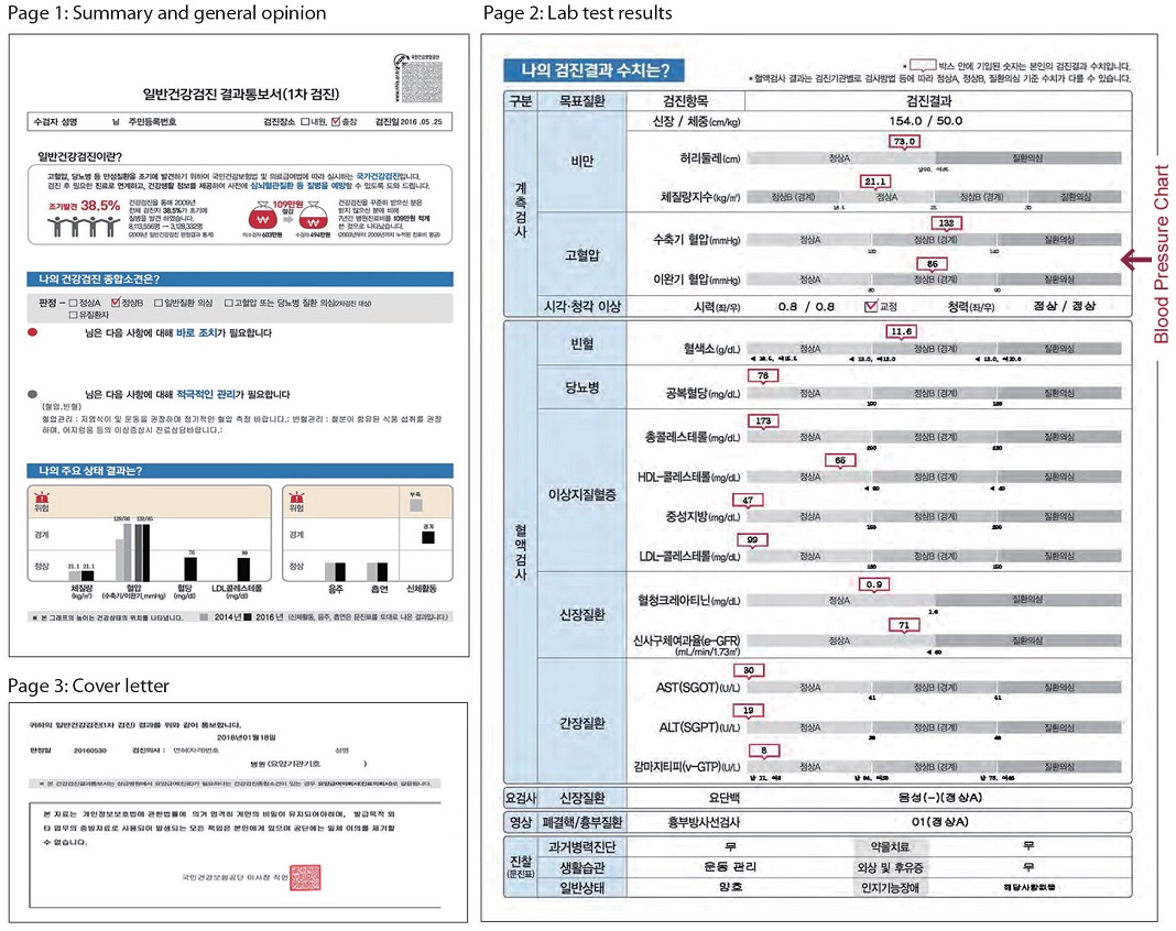
South Korean National Health Insurance Service (NHIS) provides free of charge health screening services for all subscribers aged 40 or older for the early detection of lifestyle-induced diseases such as hypertension. The NHIS health check-up report is 3 pages long (Appendix A). On page 2, blood test results are visualized as a series of bar charts; the blood pressure (BP) chart (Fig. 1) categorizes systolic blood pressure (SBP) and diastolic blood pressure (DBP) readings into Normal A, Normal B (borderline), or High Blood Pressure (HBP) Suspicion using two separate bars. However, the current BP chart design needs improvement in the following areas:

Current BP chart design on NHIS health check-up report
- 1. Health professionals find the bar charts difficult to explain, while examinees feel the explanation is beyond their comprehension. Kang et al. (2017) interviewed thirty medical professionals who commented that the current report design with too many bar charts and data was not intuitive for the examinees (p. 256); they recommended clarifying the blood test results in numbers for the examinees with low graphical literacy (pp. 254–255). In another study, 120 NHIS health check-up examinees reported that the bar charts were difficult to understand, saying “while visual bar graphs provide a readily comprehensible overview, the format was not effective in comprehending the test results in detail” (Oh et al., 2017, p. 173); they also recommended replacing the current bar charts with numeric data.
- 2. The three BP categories of Normal A, Normal B (borderline), and HBP Suspicion do not correspond to the six BP categories outlined in the 2013 Korean Society of Hypertension guidelines for the management of hypertension (Shin et al., 2015) which is the national standard for hypertension diagnosis and treatment; these are: Normal, Prehypertension (PreHBP) Stage 1, Prehypertension Stage 2 (PreHBP2), Hypertension Stage 1, Hypertension Stage 2 (HBP2), and Isolated Systolic Hypertension (ISH). In the current BP chart design, BP readings corresponding to PreHBP are labeled as Normal B (borderline), which could mislead examinees into thinking that their BP is normal. This conjecture was tested, and the results are presented in Sections 5 and 6.
- 3. Elevated Pulse Pressure (PP) cases are not dealt with, either textually or graphically. PP is the numeric difference between SBP and DBP. Elevated PP indicates the stiffness of the aorta and greater risks of cardiovascular diseases for adults aged 60 or older (Sheps, 2019). However, the concept of PP is not widely known among the public. Without proper indication, examinees would not know if their PP readings deserve attention. This conjecture was also tested, and the results are presented in Sections 5 and 6.
- 4. The experts’ interpretation of SBP and DBP readings is altogether missing. Examinees only learn about the two readings and the categories they belong to. Consequently, when the two readings belong to different categories as in ISH, examinees might feel confused. In ISH (Shin, 2003), DBP is under 90 (Normal B), but SBP is higher than 140 (HBP Suspicion); therefore, the result can be arbitrarily interpreted as either one. This conjecture was also tested, and the results are presented in Sections 5 and 6.
In short, the current BP chart design was hypothesized to have the following limitations: (1) it misleads the examinees with PreHBP into thinking that their BP readings are normal, (2) it does not indicate PP cases, and (3) it could confuse ISH examinees with BP readings belonging to two different categories. Such miscommunication, thus, defeats the very purpose of NHIS health screening, which is the early detection of lifestyle-induced diseases.
The primary objective of this study is to develop an alternative BP chart that communicates BP readings, experts’ interpretive diagnosis, and diagnosis rationale better than the current design. In the author's previous study (Hahn, 2020), three alternative BP charts designed in Table, Chart, and TableChart types were tested in Normal, PreHBP, and PP cases. While the current and all alternatives were comparable in Normal BP case, the Table and TableChart—both have the BP classification table at the center—significantly outperformed Current and Chart in PreHBP and PP cases. The BP category definitions in the classification table played a critical role in the participants’ understanding of the diagnosis and rationale. The unsatisfactory performance of the Chart type in the study, however, could be attributed to either the unfit between representation and cognitive task, or the quality of the visual chart design; that calls for a further investigation with more diversified chart designs in a broader range of BP cases. For this purpose, in this study the following five alternative designs (Fig. 2) were developed: Table (a classification table of BP categories and definitions), Square (a rectangular BP chart widely used in hospitals), Bar (another widely used BP chart with parallel SBP and DBP bars), SqTable (a combination of Square and Table designs), and BarTable (a combination of Bar and Table designs). Their effectiveness in communicating the five BP readings—normal, PP, PreHBP2, HBP2, and ISH—in comparison with the current design is tested by measuring the participants’ comprehension scores for each.

Alternative designs: (a) Table, (b) Square, (c) Bar, (d) SqTable, (e) BarTable
The secondary objective is to compare the current design and the alternatives in terms of design properties. As the alternatives contain additional text and visual information, the visual complexity has increased. The current design could be favored over the alternatives for simplicity that comes at the price of information sufficiency. The participants’ subjective ratings on text readability, BP readings visibility, diagnosis visibility, and overall preference are analyzed along with their verbal comments to find out the strengths and weaknesses of each design in detail.
2. Literature Review
As this study tests the communication effectiveness of the tabular and graphical representations in the problem-solving context, existing knowledge on this subject is outlined in the next section, followed by the Korean health check-up report design ideas proposed in recent studies.
2. 1. Comparison of tabular and graphical representations
Until the 80s, study findings related to tabular and graphical representations in the problem-solving context were contradictory in nature as the studies involved different kinds of materials and tasks, measuring different dependent variables. For example, of the various studies analyzed by Vessey (1991, pp. 229–233), eight were non-paradigmatic, i.e., the graphs and numeric values were mixed in the representations, while the tasks comprised both symbolic and spatial questions according to Vessey’s classification. Lucas (1979, as cited in Powers et al., 1984) experimented with graphical and tabular representations in the business decision-making context, focusing on the participants’ subjective evaluation (usefulness, enjoyment, etc.), while majority of the other studies measured time, accuracy, or both.
For a more systematic study design and deeper understanding of how and why tabular and graphical representations affect the problem-solving process, the cognitive fit model was proposed (Vessey, 1991; Vessey & Galletta, 1991). The model hypothesizes that the fit between representation and task type will facilitate the problem-solving process and that one will not have to transform one’s mental representation of the problem to fit it to the task. Vessey (1991) classified representations into tabular and graphical types, and tasks into symbolic and spatial types (p. 219). Tables representing symbolic-verbal (alphabetic) or numeric-discrete data values were hypothesized to support symbolic tasks, e.g., extracting or recalling specific data values. Graphs, in contrast, represent spatial information, i.e., ”the topological and geometric relations among the components of the problem” (Larkin & Simon, 1987, p. 66, as cited in Vessey, 1991), and hence were hypothesized to support spatial tasks, e.g., finding relationships, trends, and patterns in the data. Vessey (1991) tested the cognitive fit hypothesis—tables support symbolic tasks and graphs support spatial tasks—by analyzing outcomes of previous studies published between 1927 and 1990. Of these studies, five reported that purely symbolic elementary tasks were performed better with tables in terms of accuracy and/or time, while eight studies concluded that purely spatial elementary tasks carried out with graphs took less time, and were either similar or better in accuracy (p. 230). Vessey and Galletta’s (1991) empirical study also concluded that the problem-solving performance was superior with the symbolic task-representation fit in terms of both time and accuracy, while the spatial task-representation fit was superior in accuracy only (p. 75); thus, the cognitive fit hypothesis was partially substantiated for spatial tasks.
The dichotomy of table vs. graph or symbolic vs. spatial, however, is quite vague. Saket et al. (2015) evaluated the effectiveness of Table, Line Chart, Bar Chart, Scatterplot, and Pie Chart visualizations across 10 elementary tasks with 5–34 data points. The filtering task was performed faster with Bar Chart and Table. The retrieving value task was performed equally faster with Table, Pie Chart, and Bar Chart, and the values retrieved across the three visualizations were also comparable in accuracy. Saket et al.’s (2015) recommendations, however, are more specific: Bar Chart for finding clusters, Line Chart for correlations, Scatterplot for anomalies, and Table and Pie Chart should be avoided for correlation tasks.
While Saket et al. (2015) experimented with rather simple datasets, Labunets et al. (2017) compared the effectiveness of tabular and graphical representations with in-depth and complicated security risk information and tasks of varying complexity. They concluded that the participants gave more precise and complete answers with tables, as tables organized data in rows by linear spatial relationships (p. 3039). Tables, however, were “prone to questions’ complexity, while graphical representation seems to be equally good for both simple and complex questions” (pp. 3040–3042).
In addition to the representation-task match, Powers et al. (1984) factored in the problem solver’s familiarity with the representation. They tested a table, graph, and both with retrieval, comparison, and calculation type tasks, hypothesizing a superior performance using the graph-table combination, as it provides both the overview and specifics of the information. They observed that tabular representation significantly increased the participants’ comprehension while the graph-table combination supported slower but more accurate performance (p. 545). The results were attributed to the representation-task match (the ease of retrieving the highest score using tables, p. 557), participants’ familiarity with the table, and possible information overload from the graph-table combination. Smerecnik et al. (2010) discussed the cognitive workload (measured with mean pupil size and peak pupil dilation) and attention (viewing time, number of eye fixations, and eye fixation durations) directed to the representations as factors influencing performance of text, table, and graph type representations. While the tabular and graphical representations required less cognitive workload than textual information, graph required longer viewing and fixation time than the others, while graph and text both required more fixations than the table. They concluded that graphs hold attention for longer period than textual or tabular information, thus explaining why “graphical information resulted in better comprehension” than textual or tabular information (p. 1394).
2. 2. Studies on Korean health check-up report design
The current NHIS health check-up report design was commissioned by the Korea Institute of Design Promotion in 2012 (Lee & Paeng, 2012). The researchers Lee and Paeng developed a 3-page report design—General opinion, Lab test results, and Recommendations—in reference to a U.S. blood test report design (Leckart, 2010) where intuitive red-green spectrum bar charts replaced unintelligible text and numbers. Lee and Paeng (2012) introduced similar bar charts in grayscale; the BP chart was visualized as a bar with a red call-out containing both SBP/DBP readings. The new report design was first tested at a private hospital, and its customized versions were subsequently adopted at other hospitals. NHIS adopted the design in 2015 (Shin, 2015) and customized it to remove the Recommendations page and split the BP chart into two separate bars.
Though the current report design is a great improvement over the previous one, Kim et al. (2018) evaluated two customized versions of Lee and Paeng’s (2012) design adopted at two university hospitals, and pointed out the examinees’ poor understanding of the results and the medical staff’s low satisfaction with the design. Moreover, graphs, strong color contrast, and difficult terminology caused high visual complexity. Kim et al. (2018) proposed an improved design with enhanced typography and data visualization that helped examinees grasp the overall results faster; the consistency in typeface, color use, and graphs was also well-received. Nonetheless, all individual charts including the BP chart were not improved in this study.
Suk and Shin (2015, p. 247) also proposed a new report design. The experts’ opinions and recommendations were written in plain language, while test results that required immediate attention were highlighted in red; the examinee’s BP and heart rate data were visualized with past check-up data for comparison. A test of the existing and proposed designs with 52 participants demonstrated that the latter was preferred in terms of usability and design, with improved typography and infographics. The proposed design, however, displayed only the readings without informing about the required normal range. Thus, the examinees might immediately recognize the issues of concern, but they would not know exactly how bad their readings are. As the study only collected participants’ subjective ratings data, the objective accuracy of the participants’ understanding is unknown.
In summary, the communication performance of tabular and graphical representations is affected by the cognitive fit between representations and tasks (Vessey 1991; Vessey & Galletta, 1991), complexity of information (Labunets et al., 2017), problem solver’s familiarity with the representation (Powers et al., 1984), and cognitive workload and attention (Smerecnik et al., 2010). Furthermore, while the Korean health check-up report has been improved, the BP chart design still needs improvement in terms of category accuracy or information sufficiency. Moreover, the improved designs have been evaluated based on test participants’ subjective ratings, not on the accuracy of their objective understanding.
Based on the insights gained, this study was designed to observe how tabular, graphical (square and bar types), and combinations of tabular-graphical (SqTable and BarTable) charts compare in accuracy for identifying the diagnosis and clarifying the diagnosis rationale tasks. The performance will be measured both on the basis of participants’ objective comprehension scores and subjective ratings. Referring to Powers et al. (1984) and Vessey (1991), the table and table-graph combinations were expected to support the first task of retrieving discrete data better than the others, while for the second task, the table-square type combination (Fig. 2d) was expected to assist the participants in comprehending the diagnosis rationale better than the others. The description of the research design continues in the next section.
3. Alternative BP Chart Designs
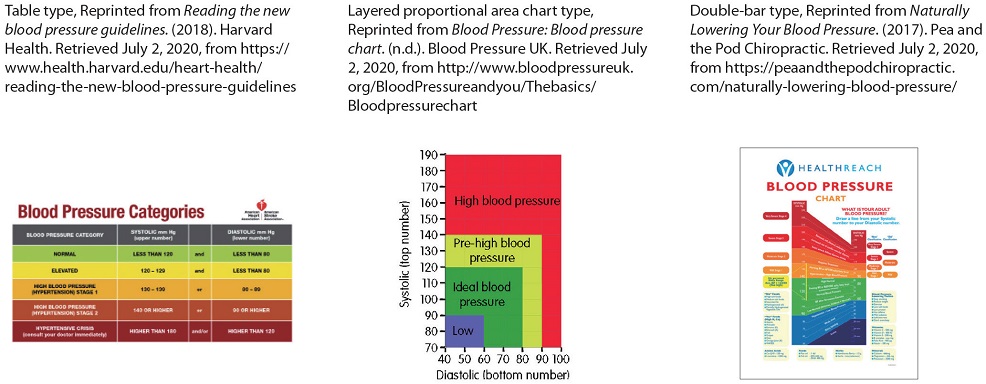
As mentioned in Section 1, five alternative BP chart designs were developed: Table, Square, Bar, SqTable, and BarTable (Fig. 2). The Table design was adapted from the common BP classification table (Appendix B, item a), Square and Bar designs were also adapted from widely used BP charts (Appendix B, items b and c), and SqTable and BarTable designs were combinations of table and graphs (square and bar types). In this section, the design rationale behind the alternative BP charts continues.
BP information sufficiency: Aside from SBP and DBP readings, the alternative designs include a summary table representing (1) the calculated PP and normal PP range, (2) the medical expert’s diagnosis considering SBP, DBP, and PP, and (3) the recommended follow-up actions, to clarify information that was either only implied or completely missing in the current design. The summary table supplies the examinee information necessary for identifying the BP readings and diagnosis, understanding recommendations, clarifying what the two BP readings mean collectively, and what should be done about it. Along with information sufficiency, text readability is also improved with larger font size. Furthermore, Table, SqTable, and BarTable types include BP classification (categories and definitions) tables that are expected to facilitate the examinees' understanding of the diagnosis rationale.
Color-coded diagnosis: The experts’ diagnosis is highlighted using different colors for intuitive recognition of the results: green for Normal, yellow for PP, orange for PreHBP2, and Red for HBP2 and ISH cases (Appendix C). For example, BP charts in Fig. 2 display the PreHBP2 cases in orange among the green-yellow-orange-red spectrum of BP categories. The diagnosis section in the summary table, and the corresponding areas on the Square and Bar graphs, and rows in the BP classification tables are highlighted, letting the examinees know what can and cannot be ignored.
Tabular and graphical visualizations of readings: Unlike the current design, alternative designs comprise a BP classification table (Table, Fig. 2a), a commonly used BP chart designed as per the nested proportional area chart format (Square, Fig. 2b), another widely used BP chart with two parallel SBP and DBP bars (Bar, Fig. 2c), a combination of Square and Table designs (SqTable, Fig. 2d), and a combination of Bar and Table designs (BarTable, Fig. 2e). The BP classification table (Figs. 2a, 2d, and 2e) is expected to:
- • clarify the diagnosis rationale by contextualizing SBP and DBP readings within BP category definitions. However, it requires the examinee to have logical literacy (AND, OR, etc.) as the definitions are expressions containing numeric and logical signs.
- • assist the participants pinpoint SBP and DBP categories using the color highlights applied to corresponding rows.
- • provide higher space efficiency with an organized layout.
The Square graph (Figs. 2b and 2d) is expected to:
- • communicate the diagnosis in a more intuitive manner with graph areas designated as Normal, PreHBP, HBP, and ISH cases; SBP and DBP coordinates and color highlights applied to corresponding areas indicate the diagnosis.
- • effectively visualize the ISH cases with a delineated ISH area on the graph (Appendix C.3, item e).
- • have limitations in visualizing SBP-DBP difference for PP cases.
Lastly, the Bar graph (Figs. 2c and 2e) is expected to:
- • communicate the diagnosis in a more intuitive manner with graph areas designated as Normal, PreHBP, HBP, and ISH cases; SBP and DBP coordinates and color highlights applied to corresponding areas indicate the diagnosis.
- • better illustrate PP cases with steeper SBP-DBP segment slopes (Appendix C.4, item b), and ISH cases with SBP–DBP data points placed apart in HBP and Normal areas (Appendix C.4, item e).
In short, the alternative designs provide more comprehensive information both in terms of text and visualizations. Table, SqTable, and BarTable are expected to clarify the diagnosis rationale with the BP classification table; Bar is expected to better visualize the PP and ISH cases with the SBP–DBP segment slope and placement, while Square is expected to display ISH cases with delineated ISH area on the graph.
4. Research Design
4. 1. Research questions and hypotheses
A quantitative study was conducted to investigate two research questions:
- 1. How do the alternatives (Table, Square, Bar, SqTable, and BarTable) compare to the current design in communicating the five BP cases (Normal, PP, PreHBP2, HBP2, and ISH)?
- 2. How do the alternatives compare to the current design in text readability, BP measurements visibility, diagnosis visibility, and overall design preference?
The first question compared communication performance between designs. Interactions between BP cases and designs were assumed. The research hypotheses were as follows:
H1a: Chart design (Current, Table, Square, Bar, SqTable, and BarTable) has a significant influence on the study participants’ comprehension scores.
H1b: BP case (Normal, PP, PreHBP2, HBP2, and ISH) has a significant influence on the study participants’ comprehension scores.
H1c: The design-BP case combination (total combinations = 30; Appendix C) has a significant influence on the study participants’ comprehension scores.
The second question compared design properties. Alternative designs contain more information, and consequently exhibit higher visual complexity than the current design. Some participants were hypothesized to prefer the simplistic appearance of the current design. Hunt et al. (1995) demonstrated that the most preferred design is not always the most accurate or informative one. The research hypotheses were as follows:
H2a: Design has a significant influence on the study participants’ text readability ratings.
H2b: Design has a significant influence on the study participants’ BP measurement visibility ratings.
H2c: Design has a significant influence on the study participants’ diagnosis visibility ratings.
H2d: Design has a significant influence on the study participants’ preference choice frequencies.
4. 2. Research method
A questionnaire was distributed online on desktop PC screens, and data collection continued until 200 valid datasets were obtained (Power = 0.9, Alpha = 0.05, Effect size = 0.5). This study targeted NHIS check-up examinees aged 40 or older. Participants were divided into two age groups (40s and 50s) and two gender groups (male and female) in equal portion. The examinees aged 60 or older were excluded for two reasons: first, health literacy is significantly lower in the elderly (Oh et al., 2017); therefore, a different approach in health check-up report design is recommended for them; second, though HBP prevalence is higher (48.7%) among the elderly, their awareness, treatment, and control rates are lower than middle-aged patients (Lee et al., 2015, p. 374). For the elderly, solutions targeting fundamental and immediate behavior change are required. The alternative designs developed in this study are more useful for early HBP detection and prevention in middle-aged examinees.
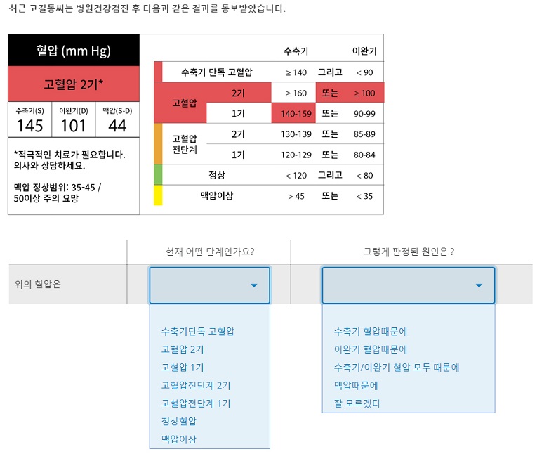
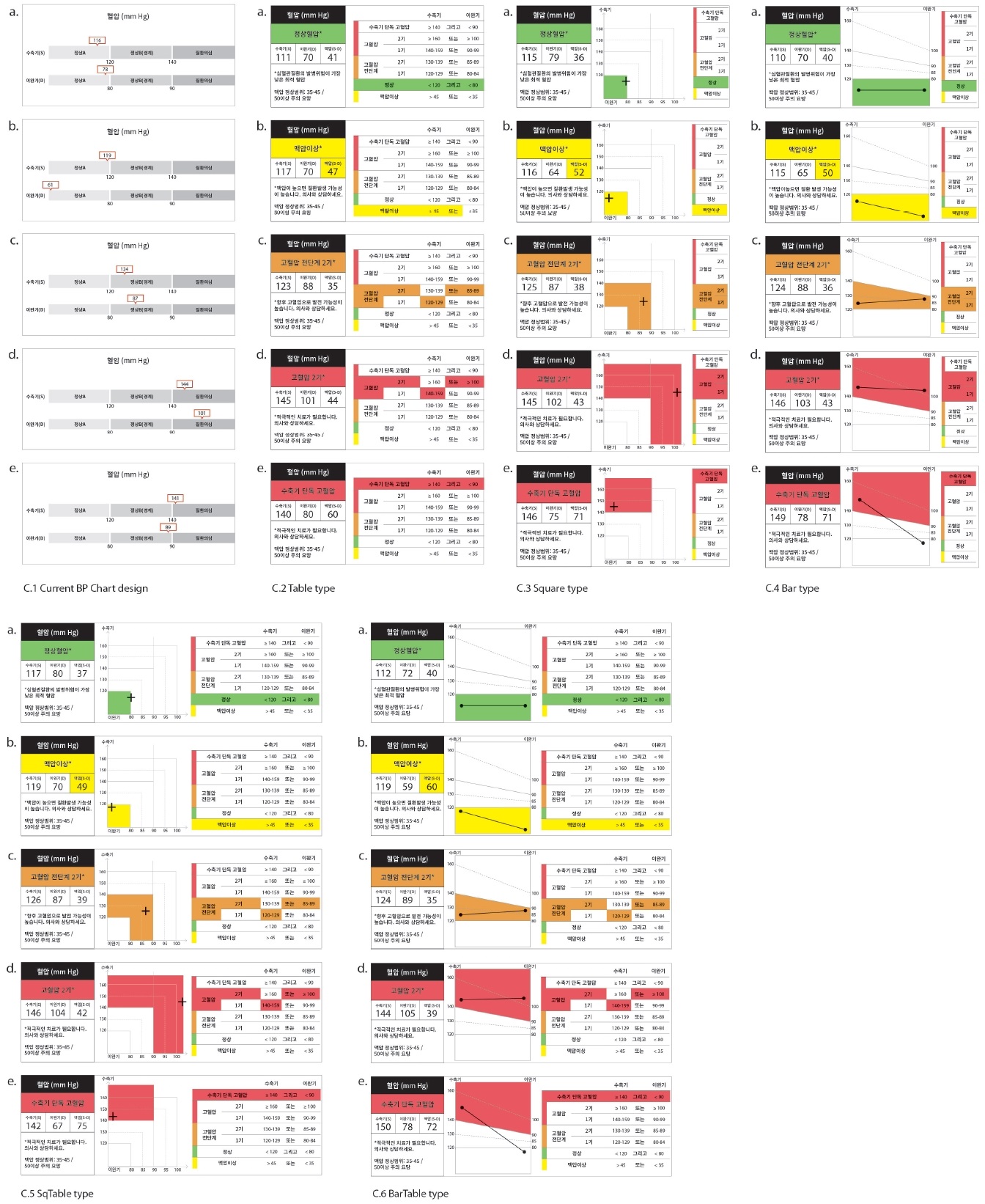
The questionnaire (Appendix C.7) consisted of two parts. Part I tested H1a, H1b, and H1c. Participants were presented with 30 mock BP test results (five BP cases presented using six designs, Appendices C 1-6). First came the current design, followed by Square (Fig. 2b) and Bar (Fig. 2c) alternative designs presented randomly to minimize the carry-over learning effects in the repeated experiment. Lastly, Table (Fig. 2a), SqTable (Fig. 2d), and BarTable (Fig. 2e) designs were presented, also in random order. For each of the results, participants were asked to perform two tasks: (1) identify the diagnosis, i.e., find out what the diagnosis is (ScoreD), and (2) clarify the diagnosis rationale, i.e., their understanding of why the SBP, DBP, and calculated PP were diagnosed as such (ScoreR). When both ScoreD and ScoreR were correct, participants’ diagnosis–rationale score (ScoreDR) was also considered correct. To even out the difference in participants’ BP knowledge, scientific definitions of BP related terms were shared before the experiment.
Part II tested H2a, H2b, H2c, and H2d. Participants first rated the six designs in terms of text readability, BP readings visibility, and diagnosis visibility on 10-point scales. The participants then named their most preferred design and explained the reason in a short-answer question. The ratings and choice frequencies were compared for all the designs.
5. Data Analysis
5. 1. H1: Communication performance
H1a, H1b, and H1c were tested using participants’ diagnosis identification score data (ScoreD) and diagnosis-rationale score data (ScoreDR). Rationale identification data (ScoreR) were excluded as ScoreR is meaningless without ScoreD.
Regarding ScoreD (Table 1), the Shapiro–Wilk test for normality was significant at p < 0.001 for all the designs, BP cases, and design-BP case combinations; therefore, a non-parametric rank-based test was performed using R software nparLD package (Brunner & Konietschke, 2012). The Wald-type statistic (WTS) and ANOVA-type statistic (ATS) were significant for design (p < 0.001), BP case (p < 0.001), and design-BP case combination (p < 0.001), as plotted in Fig. 3. The post-hoc test results are as follows:

ScoreD: Descriptive statistics, relative treatment effects, Wald type and ANOVA type statistics

ScoreD: Communication performance comparison between designs
Normal cases: All alternatives outperformed Current (RTE = 0.57) at p < 0.001. Table (RTE = 0.61), SqTable (RTE = 0.62), and BarTable (RTE = 0.61) outdid Square (RTE = 0.60) and Bar (RTE = 0.59) at p < 0.001.
PP cases: All alternatives outscored Current (RTE = 0.27) at p < 0.001. Table (RTE = 0.57), SqTable (RTE = 0.58), and BarTable (RTE = 0.58) worked better than Square (RTE = 0.54) and Bar (RTE = 0.51) at p < 0.001. Square outperformed Bar at p < 0.001.
PreHBP2 cases: All alternatives outdid Current (RTE = 0.13) at p < 0.001. Table (RTE = 0.54), SqTable (RTE = 0.55), and BarTable (RTE = 0.55) worked better than Square (RTE = 0.43) and Bar (RTE = 0.43) at p < 0.001.
HBP2 cases: All alternatives outscored Current (RTE = 0.24) at p < 0.001. Table (RTE = 0.56), SqTable (RTE = 0.58), and BarTable (RTE = 0.59) outperformed Square (RTE = 0.49) and Bar (RTE = 0.50) at p < 0.001, while Table and SqTable difference showed weak significance at p < 0.05.
ISH cases: All alternatives outperformed Current (RTE = 0.19) at p < 0.001. Table (RTE = 0.56), SqTable (RTE = 0.55), and BarTable (RTE = 0.57) worked better than Square (RTE = 0.45) and Bar (RTE = 0.45) at p < 0.001.
Regarding ScoreDR (Table 2), all designs, BP cases, and design-BP case combinations failed the normality test at p < 0.001. The nparLD non-parametric rank-based test concluded that the WTS and ATS were significant for design (p < 0.001), BP case (p < 0.001), and design-BP case combination (p < 0.001), as plotted in Fig. 4. The post-hoc test results are as follows:
ScoreDR: Descriptive statistics, relative treatment effects, Wald type and ANOVA type statistics

ScoreDR: Communication performance comparison between designs
Normal cases: All alternatives outperformed Current (RTE = 0.68) at p < 0.001. Table (RTE = 0.74) and SqTable (RTE = 0.73) worked better than Square (RTE = 0.70), Bar (RTE = 0.71), and BarTable (RTE = 0.72) at p < 0.001.
PP cases: All alternatives outscored Current (RTE = 0.39) at p < 0.001. Table (RTE = 0.71), SqTable (RTE = 0.71), and BarTable (RTE = 0.71) worked better than Square (RTE = 0.67) and Bar (RTE = 0.63) at p < 0.001, while Square outdid Bar at p < 0.001.
PreHBP2 cases: All alternatives outperformed Current (RTE = 0.34) at p < 0.001. Table (RTE = 0.47), SqTable (RTE = 0.45), and BarTable (RTE = 0.46) worked better than Square (RTE = 0.38) and Bar (RTE = 0.40) at p < 0.001, while Bar outdid Square at p < 0.01.
HBP2 cases: Table (RTE = 0.41), SqTable (RTE = 0.39), and BarTable (RTE = 0.40) outscored Current (RTE = 0.34), Square (RTE = 0.36), and Bar (RTE = 0.35) at p < 0.001.
ISH cases: Table (RTE = 0.38), SqTable (RTE = 0.38), and BarTable (RTE = 0.38) outperformed Current (RTE = 0.33) at p < 0.001; Table, SqTable, and BarTable outdid Square (RTE = 0.34) at p < 0.001; while BarTable also outscored Bar at p < 0.001.
The analyses confirmed design-BP case interaction at p < 0.001. Thus, the hypotheses H1a, H1b, and H1c are accepted. A comparison of Figs. 3 and 4 indicates that even participants who accurately identified the diagnosis struggled with the diagnosis rationale task.
5. 2. H2: Design properties
To test H2a, H2b, and H2c, text readability, BP measurement visibility, and diagnosis visibility ratings were tested for normality and the results were all significant at p < 0.001. Non-parametric Kruskal–Wallis test and Dunn’s test followed the normality test (Table 3). Text readability (χ2 = 14.40 at p < 0.05), BP measurement visibility (χ2 = 17.53 at p < 0.01), and diagnosis visibility (χ2 = 34.90 at p < 0.001) ratings were different. Therefore, the hypotheses H2a, H2b, and H2c are accepted. The rating differences, however, were observed between current and alternative designs only, at p < 0.01 or p < 0.001. Fig. 5 summarizes rating differences between designs: the five alternative designs earned comparable ratings which were superior to the rating of the current design.
Ratings: Descriptive statistics and post-hoc test results

Rating comparison between designs
5. 3. H2d: Most preferred design
The most preferred design by participants are Current (19%), Table (21%), Square (12%), Bar (13%), SqTable (20%), and BarTable (15%). One sample t-test performed on the preferred designs confirmed significant differences at p < 0.001. Thus, H2d is also accepted. Table design (Fig. 2a) was preferred the most, and the choice is moderately correlated to text readability (Cramer’s V=0.23), BP measurement visibility (Cramer’s V=0.20), and diagnosis visibility (Cramer’s V=0.28). Participants’ comments regarding their preferred designs (Table 4) revealed that all designs were considered as Easy to Understand/Clear with varying degrees. While Current design (19%) was preferred for Simplicity and Familiarity, Table (21%) was considered Easy to Understand/Clear and was positively commented on all aspects except Graph. SqTable and BarTable were favored for Graph and the availability of BP categories, with only one participant mentioning Simplicity as their strength, which indicates that the BP classification table and graph together resulted in a visually complex layout. SqTable was also commented on for the visibility of BP readings and Diagnosis, while BarTable was favored for its Tabular layout.
Participants’ chart design preference and emergent codes
6. Discussion
Theoretical implications of this study point to the significance of information sufficiency (Griffin et al., 2004), cognitive fit (Vessey, 1991), and reader’s numerical and graphical literacy (Garcia-Retamero & Galesic, 2010) in health communication materials that resulted in the superior performance of tabular representation over graphs.
Information sufficiency: The concept of information sufficiency, originally defined as the level of information each person needs to deal with risks (Griffin et al., 2004, p. 24), also applies to the wider scope of decision-making or problem-solving tasks. Then, what type of information should be furnished in the BP chart? As conjectured in Section 1, the current BP chart design only displays Normal BP readings. Moreover, low ScoreD and ScoreDR values for Current design suggest that it does not supply information necessary for the examinee’s understanding of BP test results. A significant number of participants mistook the PP and PreHBP2 cases for Normal, while the ISH cases were mistaken as either PreHBP Stage 1 or HBP Stage 1. In contrast, Table, SqTable, and BarTable designs showed consistently better performance across all BP cases. Square and Bar designs showed relatively weaker performance, highlighting the significance of BP category definitions for accurate test result communication.
Cognitive fit: The strong communication performance of Table, SqTable, and BarTable designs can be attributed to the cognitive fit (Vessey 1991; Vessey & Galletta, 1991) between the symbolic task and table. The first task of identifying diagnosis (ScoreD), on a conceptual level, is a simple symbolic process of recognizing numeric (SBP and DBP), textual (diagnosis), and sensory (color) data values, that can be facilitated by the information organized in tabular form. The author, however, expected ScoreD to be fairly high and comparable for all the alternative designs with no statistical differences, even for Square and Bar designs, as the diagnosis is clearly stated in the summary table. However, the relatively lower scores for Square and Bar designs indicate that some participants overlooked the summary table and tried to infer the diagnosis from graphs. The visualization and placement of the summary table need to be improved for visibility. The second task of identifying diagnosis rationale (ScoreDR) required evaluation of SBP and DBP readings against the BP category definitions written using logical expressions, thus the availability of the BP classification table was critical. Table, SqTable, and BarTable designs presented BP category definitions in a neatly organized table; the color highlights applied to corresponding rows instantly hinted the area of focus, enabling participants to pinpoint relevant expressions. The ScoreDR for SqTable, however, was not higher than the other two, suggesting that the Square design was not particularly helpful in clarifying the diagnosis rationale.
Numeracy and graphicacy: The Square and Bar types did not meet the expectations set in Sections 2 and 3, as the designs were not effective in ISH case visualization, elevated PP case visualization, and assisting the participants in comprehending the diagnosis rationale, respectively. These results can be discussed in relation to the participants’ numerical and graphical literacy (Garcia-Retamero & Galesic, 2010), and their familiarity with the BP charts (Powers et al., 1984). Graphical literacy, or graphicacy (Balchin & Coleman, 1966, as cited in Poracsky et al., 1999), is the ability to find specific information and relationships, and make inferences and predictions from the data and graph (Friel et al., 2001, as cited in Garcia-Retamero & Galesic, 2010). Garcia-Retamero and Galesic’s research on the correlation between numeracy, graphicacy, and the accuracy of responses concluded that “people, regardless of their numeracy skills, differ substantially in their ability to understand graphically presented quantitative information about health” and the graphs were “most useful for the participants who had low numeracy but relatively high graphical literacy skills” (pp. 1019–2010). Referring to Galesic and Garcia-Retamero’s (2011) findings that “one-third of the population in [the US and Germany] had both low graph literacy and low numeracy skills” (p. 444), about a third of the Korean participants in this study are estimated to be low in both skills. Additionally, the participants were not familiar with the two BP charts tested in this study, as the national health check-up report has been published with the problematic current design for years. Comprehending the two BP charts requires knowledge about the BP categories that Square and Bar types did not provide, and a certain level of graphicacy which, as ScoreDR data indicated, most study participants did not have.
Preference ratings: As conjectured in Section 1, Current design was favored as it was familiar to the participants and was simple in design. The lack of necessary information (e.g., BP categories and definitions) ironically improved the Current design’s visual appeal by leaving ample white space in the chart; the two simple bar charts are well placed, and the red BP speech bubbles also look prominent. The Current design, however, earned mediocre ratings on text readability and inadequate ratings on BP measurement visibility and diagnosis visibility (Fig. 5). Even Table design, though it was considered Easy to Understand/Clear, did not earn higher ratings on BP measurement visibility and diagnosis visibility. SqTable and BarTable were consistently well-received across the three properties, with both text and graph having high visibility. Though participants preferred Square to Bar design, the difference was not significant.
The practical implications of this study are as follows: first, this study is the first to improve the Korean BP chart design for enhanced information sufficiency by clarifying the information that used to be only implied or completely missing in the current design with summary and BP classification tables; second, this is also the first empirical study on Korean BP chart design that collected the examinee’s objective comprehension scores as well as subjective preference ratings to find out how the chart designs are understood in detail. Findings from this study will inspire Korean medical professionals and designers to probe the patient’s health literacy and graphicacy in reading health communication materials.
7. Conclusions
In this study, the weaknesses of the current Korean BP chart design in indicating PP, PreHBP, and ISH cases were examined. Then, for improved communication performance, five alternative designs were developed that represented a broader range of information (BP readings, BP category definitions, calculated PP, and diagnosis) in five visualization styles (Table, Square, Bar, SqTable, and BarTable). A quantitative study tested the accuracy of the current and alternative designs with diagnosis and rationale recognition tasks. Results confirmed that all the alternatives outscored the current design in communicating Normal, PP, PreHBP2, HBP2, and ISH cases. Table, SqTable, and BarTable earned significantly higher scores than Square and Bar because of information sufficiency and cognitive fit between the tabular representation and tasks. Alternatives scored higher on design properties (Text Readability, BP Measurement Visibility, and Diagnosis Visibility) as well. These findings suggest that health communication materials can be improved by (1) composing messages considering the information sufficiency, complexity, and cognitive processes necessary to understand the messages, and (2) using graphical representations that match the cognitive processes and the examinee’s numerical and graphical literacy levels.
This study is limited in that the participants’ comments collected using the online questionnaire were too brief to find out which parts of the alternative designs were effective or ineffective. A qualitative study of how people read the alternative BP charts with verbal comments and eye-tracking data will expand the author’s understanding of how alternative designs can be further improved in language and graph design, e.g., by adding stage distinctions and area labels for higher diagnosis-rationale comprehension scores in PreHBP2, HBP2, and ISH cases.
Notes
Copyright : This is an Open Access article distributed under the terms of the Creative Commons Attribution Non-Commercial License (http://creativecommons.org/licenses/by-nc/3.0/), which permits unrestricted educational and non-commercial use, provided the original work is properly cited.
References
- Blood Pressure: Blood pressure chart. (n.d.). Blood Pressure UK. Retrieved July 2, 2020, from http://www.bloodpressureuk.org/BloodPressureandyou/Thebasics/Bloodpressurechart.
-
Brunner, E., & Konietschke, F. (2012). nparLD: An R Software Package for the Nonparametric Analysis of Longitudinal Data in Factorial Experiments. Journal of Statistical Software, 50(12), 1023.
[https://doi.org/10.18637/jss.v050.i12]

-
Galesic, M., & Garcia-Retamero, R. (2011). Graph literacy: A cross-cultural comparison. Medical Decision Making, 31(3), 444-457.
[https://doi.org/10.1177/0272989X10373805]
-
Garcia-Retamero, R., & Galesic, M. (2010). Who profits from visual aids: Overcoming challenges in people's understanding of risks. Social Science and Medicine, 70(7), 1019-1025.
[https://doi.org/10.1016/j.socscimed.2009.11.031]
-
Griffin, R. J., Neuwirth, K., Dunwoody, S., & Giese, J. (2004). Information Sufficiency and Risk Communication. Media Psychology, 6(1), 23-61.
[https://doi.org/10.1207/s1532785xmep0601_2]
- Hahn, Y. (2020). The accuracy and sufficiency of information in the blood pressure chart. Journal of Integrated Design Research, 19(2), 41-55.
- Hunt, P., Gatenby, S., & Rayner, M. (1995). The format for the National Food Guide: performance and preference studies. Journal of Human Nutrition and Dietetics, 20(3), 210-226.
-
Kang, S. Y., Lee, J. A., & Kim, Y. S. (2017). Knowledge and Attitude of Health Care Providers for Korean National Health Examination. Korean J Health Promot, 17(4), 252-258.
[https://doi.org/10.15384/kjhp.2017.17.4.252]
-
Kim, Y., Lee, K., & Paik, J. J. (2018). Redesigning Medical Examination Result Form Considering Medical Literacy. Journal of Integrated Design Research, 17(3), 93-102.
[https://doi.org/10.21195/jidr.2018.17.3.008]
-
Labunets, K., Massacci, F., Paci, F., Marczak, S., & de Oliveira, F. M. (2017). Model comprehension for security risk assessment: an empirical comparison of tabular vs. graphical representations. Empirical Software Engineering, 22(6), 3017-3056.
[https://doi.org/10.1007/s10664-017-9502-8]
- Leckart, S. (2010, November). The Blood Test Gets a Makeover. Wired. https://www.wired.com/2010/11/ff_bloodwork/.
- Lee, P., & Paeng, H. (2012, June). Health checkup report meets service design. 월간 지방자치.
- Lee, T., Choi, J., Lee, J., Kim, J., & Lee, B. J. (2015). Social Security Factbook 2015. Seoul, South Korea.
- Naturally Lowering Your Blood Pressure. (2017). Pea and the Pod Chiropractic. Retrieved July 2, 2020, from https://peaandthepodchiropractic.com/naturally-lowering-blood-pressure/.
-
Oh, I. J., Choi, H. Y., Kang, S. Y., Lee, J. A., & Kim, Y. S. (2017). Examinees' Knowledge of the Result Form of Korean National Health Examination. Korean J Health Promot, 17(3), 168-175.
[https://doi.org/10.15384/kjhp.2017.17.3.168]
-
Poracsky, J., Young, E., & Patton, J. P. (1999). The emergence of graphicacy. The Journal of General Education, 48(2), 103-110.
[https://doi.org/10.1353/jge.1999.0007]
-
Powers, M., Lashley, C., Sanchez, P., & Shneiderman, B. (1984). An experimental comparison of tabular and graphic data presentation. International Journal of Man-Machine Studies, 20(6), 545-566.
[https://doi.org/10.1016/S0020-7373(84)80029-2]
- Reading the new blood pressure guidelines. (2018). Harvard Health. Retrieved July 2, 2020, from https://www.health.harvard.edu/heart-health/reading-the-new-blood-pressure-guidelines.
-
Saket, B., Endert, A., & Demiralp, C. (2015). Task-Based Effectiveness of Basic Visualizations. IEEE Transactions on Visualization and Computer Graphics, 25(7), 2505-2512.
[https://doi.org/10.1109/TVCG.2018.2829750]
- Sheps, S. G. (2019). Pulse pressure: An indicator of heart health?. Mayoclinic.Org. Retrieved February 12, 2019, from https://www.mayoclinic.org/diseases-conditions/high-blood-pressure/expert-answers/pulse-pressure/faq-20058189.
- Shin, A. (2015, March 12). Health screening report design made easier. MoneyToday. Retrieved July 2, 2020, from https://m.mt.co.kr/renew/view.html?no=2015031214401454724&googleamp#_enliple.
-
Shin, J., Park, J. B., Kim, K., Kim, J. H., Yang, D. H., Pyun, W. B., … Chae, S. C. (2015). 2013 Korean Society of Hypertension guidelines for the management of hypertension: part I-epidemiology and diagnosis of hypertension. Clinical Hypertension, 21(1), 1-11.
[https://doi.org/10.1186/s40885-014-0012-3]
- Shin, Y. W. (2003). Systolic Hypertension in the Elderly. J Korean Geriatr Soc, 7(3), 171-173.
- Smerecnik, C. M. R., Mesters, I., Kessels, L. T. E., Ruiter, R. A. C., De Vries, N. K., & De Vries, H. (2010). Understanding the positive effects of graphical risk information on comprehension: Measuring attention directed to written, tabular, and graphical risk information. Risk Analysis, 30(9), 1387-1398.
-
Suk, S. S., & Shin, D. J. (2015). Redesigning Health Examination Result Sheet to Utilize the User Experience Design. Journal of Digital Design, 15(2), 245-256.
[https://doi.org/10.17280/jdd.2015.15.2.024]
- Vessey, I. (1991). Cognitive Fit: A Theory-Based Analysis of the Graphs Versus Tables Literature. Decision Sciences, 22(2), 219-240.
-
Vessey, I., & Galletta, D. (1991). Cognitive fit: An empirical study of information acquisition. Information Systems Research, 2(1), 63-84.
[https://doi.org/10.1287/isre.2.1.63]
Appendix
Appendix A. Current NHIS health check-up report design
Appendix B. Blood Pressure Chart Designs
Appendix C. The BP charts and questionnaire designs
C.1-6 Thirty combinations of six designs and five BP cases: (a) Normal, (b) PP (Elevated Pulse Pressure), (c) PreHBP2 (Prehypertension Stage 2), (d) HBP2 (Hypertension Stage 2), and (e) ISH (Isolated Systolic Hypertension).
C.7 The questionnaire (communication performance test) screen