
How Color, Shape, and Layout Jointly Influence Affective Responses in UI Design
Abstract
Background Color, shape, and layout are the core visual elements of affective user interface (UI) design, yet it remains unresolved whether their affective meaning is additive, predictable by summing fixed element values, or compositional, constituted by the configuration in which elements appear. Prior research has largely examined these factors in isolation or in pairwise combinations.
Methods Thirty-two participants evaluated 60 UI stimuli constructed by fully crossing five colors, three shapes, and four layout schemes using a binary forced-choice paradigm. Affective responses were measured across six bipolar dimensions representing the Evaluation, Potency, and Activity dimensions of the semantic differential framework. Bayesian generalized linear mixed models were fitted separately for each dimension.
Results Several three-way combinations reversed the affective direction established by two-way effects, indicating that an element’s affective impact depends on its compositional context rather than being fixed. Color was nonetheless the most pervasive affective driver, with the strongest effects concentrated in the Activity dimensions. Hard–Soft was the most comprehensive dimension, with all three factors simultaneously producing significant main effects.
Conclusions These findings indicate that affective meaning in UI is non-additive and context-dependent, challenging element-level approaches and the independent tokenization of visual elements in design systems. Affect should be evaluated at the level of the whole composition rather than summed across elements; practical implications for affective design decision-making are discussed.
Keywords:
User Interface Design, Affective Judgment, Color, Shape, Layout1. Introduction
Affective responses to user interfaces arise rapidly and often precede conscious evaluation. Visual appearance establishes an emotional tone within 50 ms of exposure, and these impressions actively shape subsequent judgments of usability and overall quality (Lindgaard et al., 2006). As digital products increasingly mediate everyday life, designing interfaces that reliably communicate intended emotional qualities has become a central challenge for both research and practice.
Prior work has characterized the affective properties of individual visual elements: color has been linked to pleasantness, excitement, and arousal (Valdez & Mehrabian, 1994; Ou et al., 2004; Elliot & Maier, 2012); shape carries affective meaning independent of semantic content, with curved forms associated with warmth and angular forms with threat (Bar & Neta, 2006; Palumbo et al., 2015); and layout properties such as symmetry and balance influence aesthetic evaluation and satisfaction (Ngo et al., 2003; Lavie & Tractinsky, 2004; Liu et al., 2016). This knowledge underpins both the Kansei engineering tradition (Nagamachi, 1995) and contemporary design systems, which specify or tokenize each element in isolation (Frost, 2016). Both rest on an additive assumption: that each element carries a fixed affective value, so that combined effects can be predicted by summing individual contributions.
However, these elements always co-occur in real interfaces, and recent evidence indicates that their pairwise combinations produce outcomes not predictable from individual contributions (Liu et al., 2021; Cao et al., 2021; Šola et al., 2025). This raises a more fundamental question: is an element’s affective contribution fixed, or is it constituted by the composition in which it appears? We address this by fully crossing color, shape, and layout across six Semantic Differential dimensions, focusing on whether three-way combinations reverse the directions established by two-way combinations. Such reversals would refute the additive assumption and indicate that affective meaning in UI is fundamentally compositional and context-dependent, advancing beyond merely confirming that combined effects exist.
2. Literature Review
2. 1. Color in User Interface Design
Color is among the most immediate and powerful visual cues for affective communication. Valdez and Mehrabian (1994) established that brightness, saturation, and hue are each systematically associated with distinct affective dimensions, including pleasantness and arousal. Ou et al. (2004) mapped individual colors onto three emotional dimensions using the Semantic Differential method, finding that warm colors such as red and orange are associated with excitement and pleasantness, while cool colors convey calmness and purity. Elliot and Maier (2012) further proposed a color-in-context theory, arguing that color’s affective consequences are context-dependent: red may elicit avoidance in threatening contexts while signifying passion in festive ones.
2. 2. Shape in User Interface Design
Shape directly influences the affective character of visual elements. Bar and Neta (2006) found a general preference for curved over angular forms, possibly reflecting an evolutionarily grounded sensitivity to threat. Palumbo et al. (2015) confirmed using implicit measures that curved shapes are associated with safe and positive concepts while angular shapes are linked to danger and negative valence. Bertamini et al. (2016) further established that curved contours are intrinsically pleasant independent of angular contrast. Simpler and rounder forms also elicit faster processing and more positive responses at the level of icon cognition (McDougall et al., 1999).
2. 3. Layout in User Interface Design
Layout organizes visual information and thereby regulates users’ perceptual and emotional responses. Structural properties such as symmetry, balance, and information density substantially influence aesthetic evaluation and user satisfaction (Ngo et al., 2003). Lavie and Tractinsky (2004) identified two empirically distinct dimensions of perceived website aesthetics: classical aesthetics, characterized by orderly and clear design, and expressive aesthetics, reflecting creativity and originality, demonstrating that structural order is a primary driver of classical aesthetic perception. Liu et al. (2016) demonstrated that orderly, balanced layout design positively influences satisfaction with digital interfaces.
2. 4. Combined Effects of Visual Elements
Although prior research has examined the independent contributions of color, shape, and layout, these elements co-occur in real interfaces and their combined influence may differ substantially from single-factor predictions. Liu et al. (2021) found that icon color and border shape jointly influence visual search efficiency and user experience. Cao et al. (2021) demonstrated that color salience and link position interact in their effects on web usability and affective experience. Šola et al. (2025) showed that combinations of visual and textual elements modulate both attentional allocation and emotional response. These studies, however, mostly examine pairwise combinations and treat interactions as local modulations rather than a compositional principle. A compositional view, grounded in Gestalt organization and global precedence (Navon, 1977; Wagemans et al., 2012), holds instead that a local element’s affective reading is set by the global configuration it inhabits, generalizing color-in-context (Elliot & Maier, 2012) to an element-in-composition principle. Three-way reversals are therefore a decisive test, since a third element that reverses rather than modulates an established effect is incompatible with additivity.
3. Method
3. 1. Participants
Thirty-two graduate students (16 male, 16 female), aged 21–26 years, participated in the study. All reported normal or corrected-to-normal vision, no color blindness, and no known neurological disorders. All were regular users of digital interfaces. Written informed consent was obtained from all participants prior to the experiment.
3. 2. Stimuli
Stimuli were constructed by fully crossing three fundamental visual UI elements: color (5 levels), shape (3 levels), and layout (4 levels), yielding 60 unique UI samples (see Figure 1 for examples).
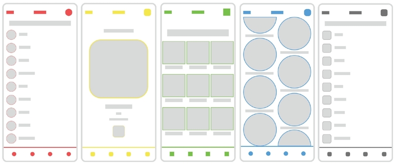
Visual design factors and their corresponding levels used in stimulus construction. Each combination of color, shape, and layout constitutes one unique UI stimulus, resulting in 60 stimuli in total (5 colors × 3 shapes × 4 layouts).
Colors were the five swatches at shade 5 of the Ant Design palette: Red (#ff4d4f), Yellow (#ffec3d), Green (#73d13d), Blue (#40a9ff), and Gray (#737373)—four chromatic hues spanning the warm–cool range plus an achromatic reference. Although drawn from the same palette step, these colors differ in lightness and chroma as well as hue; the color factor was therefore operationalized as a set of holistic color conditions rather than as a single hue dimension, and color effects are interpreted accordingly.
Three shapes were used to span a curvature continuum: Circle (fully curved), Rounded Rectangle (intermediate, with corner radius set to 20% of the side length), and Rectangle (fully angular) (Bar & Neta, 2006; Palumbo et al., 2015).
Four layouts, distinguished by alignment, symmetry, spacing, and modular structure, were used (Figure 1): Stack (panels 1 and 5) arranges identical items repeatedly along a single vertical axis; Absolute (panel 2) places a dominant element freely and centrally without a shared grid; Grid (panel 3) arranges equal-sized elements in a regular two-dimensional matrix (dual-axis alignment, high symmetry, uniform spacing); and Flex (panel 4) distributes large elements evenly along a single axis. Stack and Flex are both vertical arrangements but differ in that the former repeats identical small items whereas the latter distributes large elements with wide spacing.
To assess affective responses, six bipolar adjective pairs were selected based on Osgood et al.’s (1957) Semantic Differential framework, with reference to adjective pairs used in prior color and visual design research (Valdez & Mehrabian, 1994; Ou et al., 2004; Ou & Luo, 2006). Two pairs were chosen to represent each of the three affective dimensions: Evaluation (Pleasant–Unpleasant, Harmonious–Conflicting), Potency (Hard–Soft, Powerful–Weak), and Activity (Active–Passive, Excited–Calm). Final selection was made by consensus among the research team on the basis of semantic relevance to UI visual properties. Each participant completed 360 trials in total (60 UI×6 word pairs).
3. 3. Procedure
Each trial began with a fixation cross presented for 300 ms, followed by a UI stimulus displayed for 2,000 ms. A bipolar adjective pair then appeared on screen, and participants selected the word that better reflected their emotional impression of the preceding UI by pressing “Z” (left word) or “M” (right word). All 360 trials were presented in randomized order. All stimuli were presented on a 24-inch LCD monitor (1920 × 1080 pixels, 60 Hz) at a viewing distance of approximately 50 cm against a white background. Experimental conditions, including lighting and ambient noise, were kept constant across sessions.
3. 4. Statistical Analysis
Six separate models were fitted, one per affective dimension. Each model regressed the binary forced-choice response on color, shape, layout, and their two-way and three-way interactions as fixed effects, with participant modeled as a random intercept to account for within-subject correlation. A binomial family with logit link was specified, consistent with the binary outcome structure of the task. Reference levels were set as Blue (color), Rounded Rectangle (shape), and Stack (layout); all reported coefficients represent log-odds relative to these baselines. Analyses were conducted using the BinomialBayesMixedGLM function in Python’s statsmodels library, which employs a variational Bayes approximation to estimate posterior distributions of fixed and random effects. For each parameter, the posterior mean and posterior standard deviation were obtained from the approximated posterior distribution. A posterior z-score was computed as the ratio of the posterior mean to the posterior standard deviation, reflecting how many posterior standard deviations the estimated effect lies from zero. Parameters with |z| > 2 (*), |z| > 2.5 (**), and |z| > 3 (***) were treated as having 95%, 99%, and 99.9% credible intervals excluding zero, respectively. The same markers are used throughout the Results and figures.
4. Results
4. 1. Evaluation Dimensions
In Pleasant–Unpleasant (Figure 2, left), color exerted the strongest main effects. Red (β = +1.110, ***), Yellow (β = +1.042, ***), and Green (β = +0.588, ***) all significantly increased perceived pleasantness relative to Blue, while Gray (β = −1.242, ***) substantially reduced it. Among shape factors, Circle increased pleasantness (β = +0.528, ***) whereas Rectangle reduced it (β = −0.344, ***). Layout did not produce significant main effects in this dimension, with only one interaction term reaching significance. Several two-way interactions qualified the main effects: Gray × Circle produced an additional negative shift (β = −1.179, ***), as did Yellow × Circle (β = −0.806, ***), whereas Green × Rectangle enhanced pleasantness (β = +0.745, ***). At the three-way level, Green × Circle × Absolute (β = −1.772, ***) and Gray × Rectangle × Absolute (β = −1.402, **) demonstrated that specific color–shape–layout combinations can substantially suppress affective responses beyond what single factors predict.
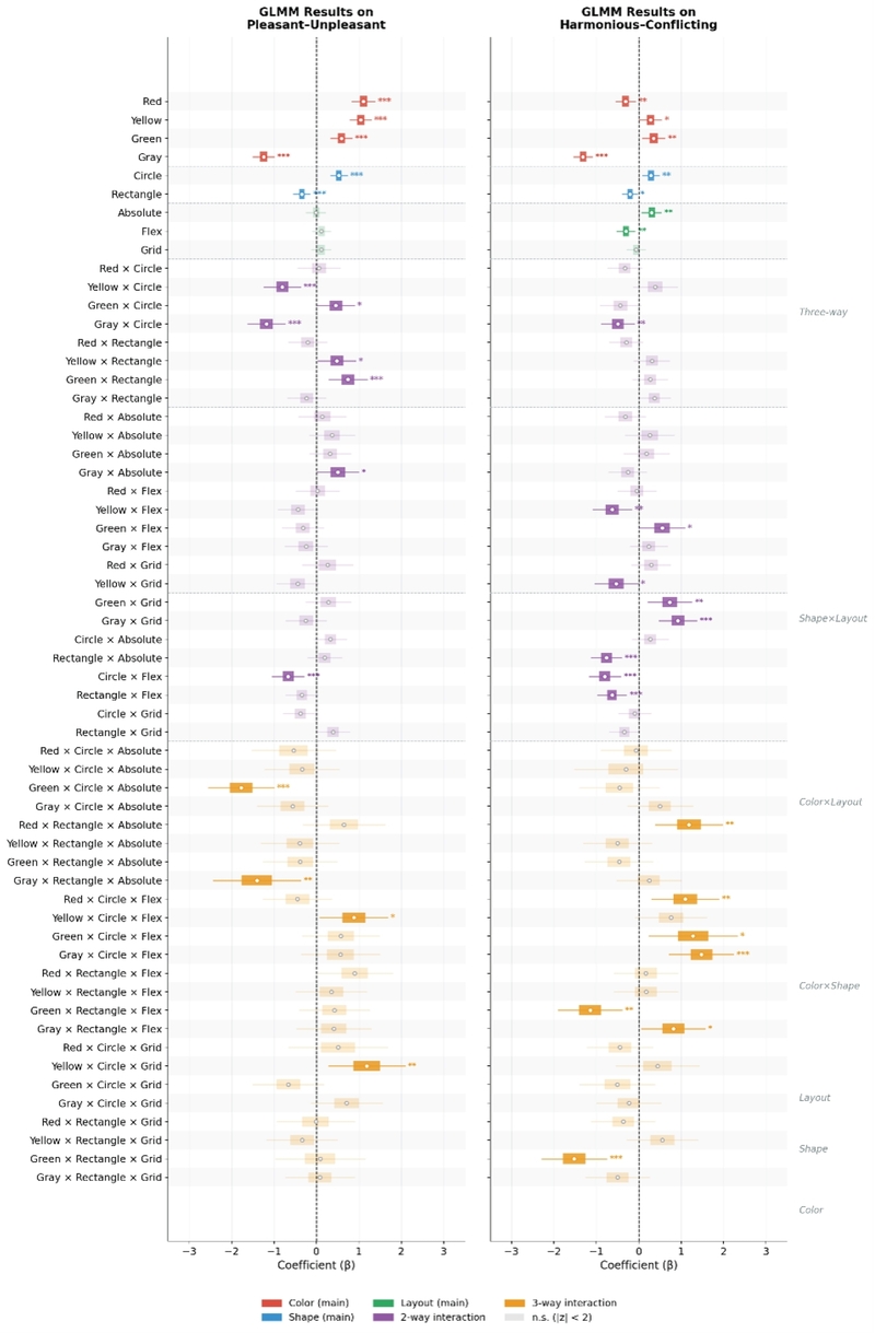
GLMM Results on Pleasant-Unpleasant (left) and Harmonious-Conflicting (right). Colored boxes represent the interquartile range (Q1-Q3) of the posterior distribution; whiskers extend to the 95% credible interval; open circles indicate the posterior mean. Faded bars indicate non-significant parameters.
In Harmonious–Conflicting (Figure 2, right), Gray again dominated with the strongest negative main effect (β = −1.315, ***). Red also reduced harmony (β = −0.312, **), while Green (β = +0.350, **) and Yellow (β = +0.275, *) increased it. Circle enhanced harmony (β = +0.288, **) and Rectangle reduced it (β = −0.208, *). Layout effects were also present: Absolute increased harmony (β = +0.303, **) and Flex reduced it (β = −0.299, **). A notable two-way interaction was Gray × Grid (β = +0.923, ***), which strongly recovered harmony perception despite Gray’s large negative main effect, suggesting that certain layout configurations can counteract color-induced affective suppression. At the three-way level, Gray × Circle × Flex (β = +1.478, ***) partially offset gray’s suppressive main effect on harmony, suggesting that specific shape–layout configurations can mitigate color-induced affective suppression.
4. 2. Potency Dimensions
In Hard–Soft (Figure 3, left), shape emerged as the primary driver, with Rectangle significantly increasing perceived hardness (β = +0.969, ***). Among colors, Yellow (β = −1.224, ***) and Green (β = −0.645, ***) significantly reduced perceived hardness. Layout contributed across multiple levels: Absolute (β = +0.430, ***), Grid (β = +0.639, ***), and Flex (β = +0.286, **) all increased hardness relative to Stack, indicating that most layout configurations are perceived as harder than the Stack baseline. Key two-way interactions included Yellow × Rectangle (β = +1.077, ***), which amplified hardness beyond either factor alone, and Circle × Grid (β = −0.737, ***), which reduced it. The three-way interaction Yellow × Rectangle × Grid produced the largest effect in this dimension (β = −2.534, ***), demonstrating that compound combinations can dramatically reverse the direction of individual factor effects.
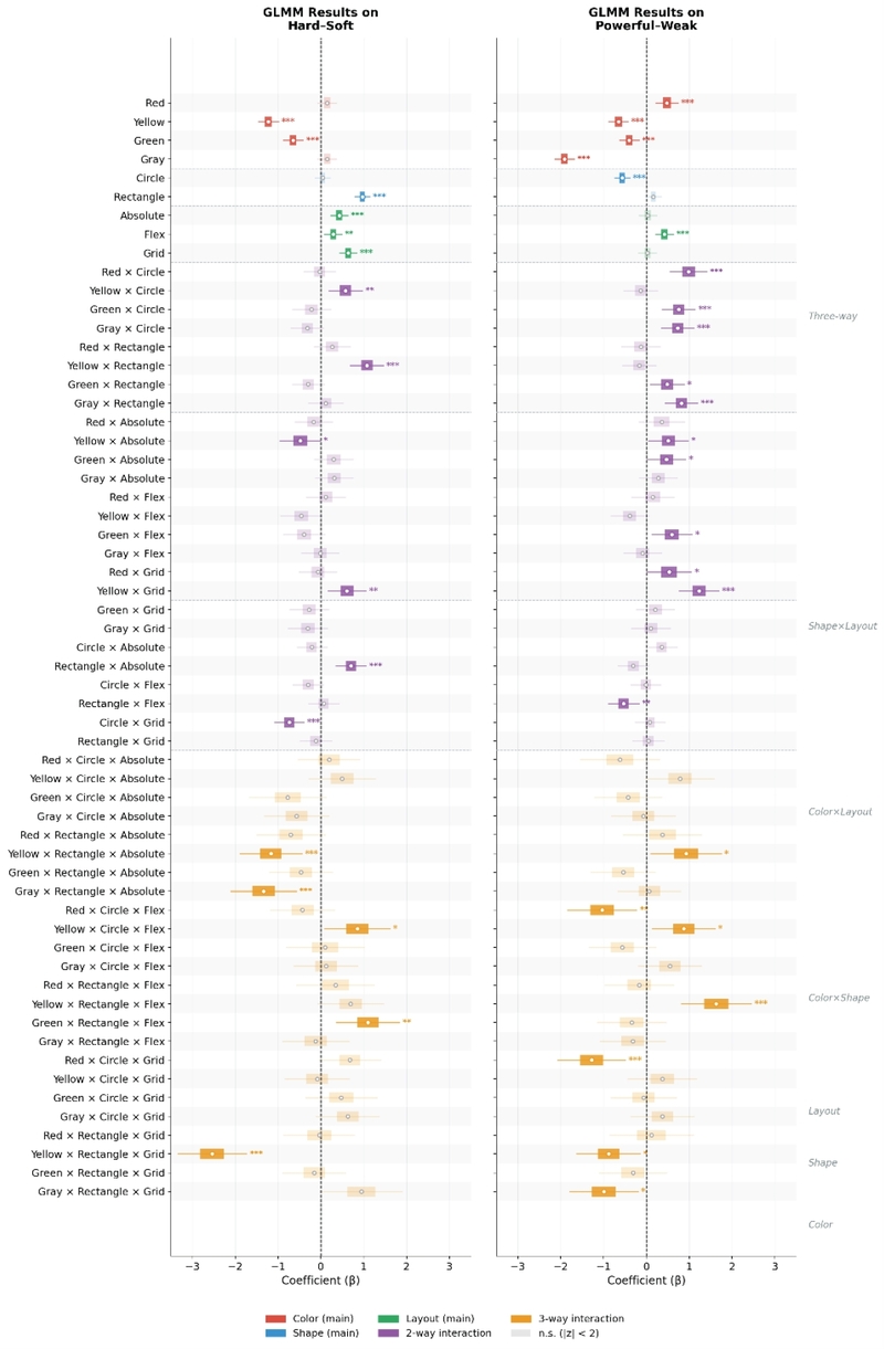
GLMM Results on Hard-Soft (left) and Powerful-Weak (right).
In Powerful–Weak (Figure 3, right), color effects were widespread. Gray produced the largest negative effect (β = −1.911, ***), followed by Yellow (β = −0.651, ***) and Green (β = −0.404, ***), all reducing perceived power relative to Blue. Red was the only color to increase power (β = +0.479, ***). Circle reduced perceived power as a main effect (β = −0.568, ***), though this effect was substantially modified by color context: when paired with Gray, Green, or Red, the circular form partially recovered power perception, with interaction coefficients ranging from β = +0.730 to β = +0.982 (all ***). Among layout interactions, Yellow × Grid produced a strong positive shift (β = +1.228, ***), while Yellow × Rectangle × Flex further amplified perceived power at the three-way level (β = +1.630, ***).
4. 3. Activity Dimensions
In Active–Passive (Figure 4, left), Yellow (β = +1.994, ***), Red (β = +1.782, ***), and Green (β = +1.081, ***) all strongly increased activeness relative to Blue, while Gray reduced it (β = −1.005, ***). Rectangle decreased activeness (β = −0.382, ***). Interaction effects revealed important modulations: Circle combined with Gray (β = −0.806, ***), Red (β = −0.758, ***), and Yellow (β = −0.887, ***) each attenuated the activating effects of those colors, indicating that circular forms can dampen color-driven activity signals in several specific color pairings. Notably, when paired with a grid layout, both Circle (β = +0.769, ***) and Rectangle (β = +1.280, ***) enhanced activeness, suggesting that grid layouts may amplify shape-related activity signals for circles and rectangles alike.
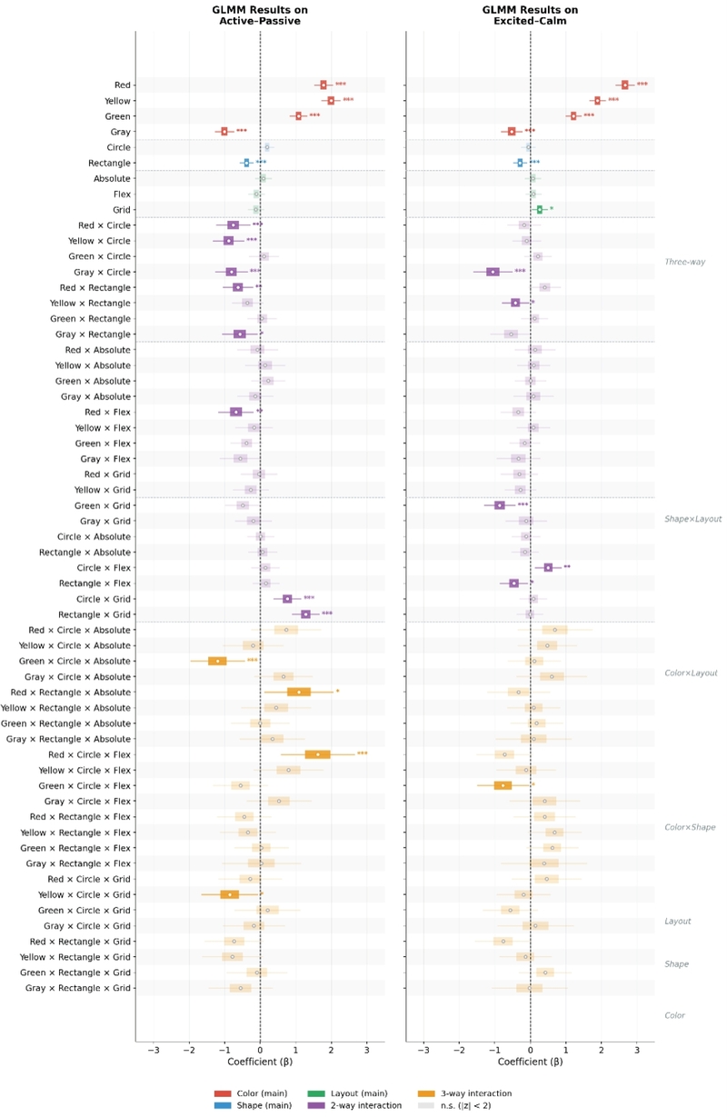
GLMM Results on Active-Passive (left) and Excited-Calm (right).
In Excited–Calm (Figure 4, right), color effects were the largest observed across the entire study. Red produced the strongest single effect (β = +2.664, ***), followed by Yellow (β = +1.890, ***) and Green (β = +1.215, ***), all significantly increasing excitement relative to Blue. Gray reduced excitement (β = −0.525, ***) and Rectangle modestly reduced it as well (β = −0.291, ***). Layout showed a small but significant positive effect for Grid (β = +0.263, *). The Gray × Circle interaction further suppressed excitement beyond the Gray main effect alone (β = −1.053, ***), while Green × Grid produced a strong negative interaction (β = −0.864, ***), substantially attenuating Green’s excitatory main effect under the Grid layout. This indicates that layout context can substantially modulate the affective contribution of color.
5. Discussion
5. 1. Color Effects Across Affective Dimensions
Color emerged as the most pervasive factor, producing significant main effects across nearly all six dimensions for all four non-reference colors. This broadly replicates prior research establishing color as a primary carrier of emotional meaning in visual stimuli (Valdez & Mehrabian, 1994; Elliot & Maier, 2012). The present results add a more specific observation: color effects were substantially stronger in the Activity dimensions than in the Evaluation dimensions, and more selective in the Potency dimensions, where significant effects were limited to specific colors. Red produced the single largest effect in the entire study in Excited–Calm (β = +2.664, ***), whereas its effect in Hard–Soft did not reach significance. This dimensional asymmetry suggests that color is particularly effective at conveying energetic qualities, while its influence on structurally grounded judgments such as hardness or power is more selective, consistent with Valdez and Mehrabian’s (1994) identification of arousal as especially sensitive to hue and saturation. From an affective design perspective, color should be treated as the primary affective signal when designing for energetic or activating emotional qualities, while its role in potency-related judgments requires greater attention to its interaction with shape and layout.
5. 2. The Distinctiveness of Hard–Soft
Among the six affective dimensions, Hard–Soft stood out as the dimension with the most comprehensive pattern of main effects across all three visual factors. Color effects were limited to Yellow and Green, consistent with the observation that color’s influence on potency-related judgments is selective. Shape effects were clear and strong, with Rectangle substantially increasing perceived hardness (β = +0.969, ***). Layout also contributed consistently, with all three non-reference conditions increasing hardness relative to Stack, a breadth not observed in any other dimension. This pattern may reflect an embodied cognition account of tactile-visual crossmodal inference, whereby visual properties associated with physical structure—angular shapes, grid-based layouts—activate sensorimotor associations more broadly than properties linked to hedonic meaning, though the absence of equivalent layout effects in Powerful–Weak suggests that the scope of this sensitivity is dimension-specific.
5. 3. Non-Additive and Context-Dependent Interaction Effects
The interaction structure consistently revealed effects not predictable from lower-order combinations. Shape context modulated color at the two-way level (e.g., in Active–Passive, Circle attenuated the activating effects of Red, Yellow, and Gray), and several three-way interactions reversed two-way effects entirely. In Hard–Soft, Yellow × Rectangle increased hardness (β = +1.077, ***), yet Yellow × Rectangle × Grid produced the largest effect in the opposite direction (β = −2.534, ***). The third element thus does not merely add to the others but recontextualizes them, indicating that UI affect should be evaluated at the composition level rather than summed across elements.
Why should a third element recontextualize rather than add? Layout plausibly acts as a global organizational frame that, by global precedence (Navon, 1977) and Gestalt grouping (Wagemans et al., 2012), is registered before and constrains the interpretation of local color and shape. Grid imposes the strongest such frame, and a single mechanism accounts for opposite outcomes: under Grid, Gray’s harmony suppression was recovered (β = +0.923) as its order supplies the regularity gray lacks, whereas Green’s excitement was substantially attenuated (β = −0.864) as the same order reads as calm. Elliot and Maier’s (2012) color-in-context principle thus generalizes to an element-in-composition principle. We offer these as interpretive hypotheses consistent with perceptual theory rather than as tested mechanisms.
5. 4. Design Implications
The present findings carry practical implications for affective UI design, namely the intentional configuration of visual elements to communicate targeted emotional qualities. Three implications are drawn directly from the result structure.
Implication 1: Establish color first, but treat it as provisional. Color produced the most consistent affective effects and is therefore the most reliable starting point for affective design decisions. Red and Yellow are effective anchors for Activity-oriented targets, while Green and Yellow support Evaluation targets. Gray functions as a broad suppressor and should be used with deliberate intent. However, color’s affective direction is not invariant: Green’s positive effect on excitement was substantially attenuated under Grid layout, and Gray’s suppression of harmony was substantially recovered by the same configuration. Color-based decisions should be verified within the intended shape–layout context before finalizing. For instance, when designing for an energetic target, Red is a dependable first choice, as it produced the largest single effect in the study (excited, β = +2.664), and this anchor can then be refined within its shape and layout context.
Implication 2: Treat Grid layout as a high-risk, high-gain frame. Grid was most frequently implicated in three-way reversals. Grid layout appears to recontextualize established color–shape signals rather than simply adding to them. When affective outcomes are a design priority, Grid layout should not be selected on structural or functional grounds alone; its potential to reverse established color–shape combinations warrants explicit compositional evaluation. For instance, yellow rectangular buttons or cards chosen to signal solidity can have their hardness reversed, from +1.077 at the two-way level to −2.534, once arranged in a Grid.
Implication 3: Apply element-level heuristics as starting points, not endpoints. Existing affective design guidelines remain useful as initial references but become unreliable in combination. The present findings argue for treating color, shape, and layout as a compositional system from the outset, evaluating their combined affective character rather than summing independent contributions. For instance, the established heuristic that curved forms are affectively positive holds for Circle alone (pleasant □ = +0.528) but breaks down in a Gray context, where the Circle × Gray interaction turns strongly negative (□ = −1.179).
6. Conclusion
This study examined how color, shape, and layout jointly influence affective judgments in UI design, using a binary forced-choice paradigm with Bayesian generalized linear mixed models across six Semantic Differential dimensions. Three principal findings emerge. First, several three-way combinations reversed the direction of two-way effects, indicating that affective outcomes cannot be predicted from constituent elements considered independently and that affective meaning in UI is compositional rather than additive. Second, color was the most pervasive determinant of affective judgment, with the strongest effects concentrated in the Activity dimensions. Third, Hard–Soft showed the most comprehensive pattern of main effects, with all three visual factors simultaneously reaching significance, suggesting that tactile-grounded affective dimensions may be more broadly sensitive to visual design variables.
The central contribution is conceptual: affective meaning in UI is non-additive and context-dependent, which challenges the additive assumption underlying element-level guidelines and the independent tokenization of color, shape, and layout in design systems (Frost, 2016). In practice, this argues for evaluating affect at the level of the whole composition rather than summing element-level heuristics.
The sample was restricted to 32 graduate students from a single cultural background, which may limit generalizability given documented cross-cultural variation in color–emotion associations (Jonauskaite et al., 2020). The abstract UI stimuli and binary forced-choice paradigm further constrain ecological validity and preclude assessment of affective intensity. Finally, the five color conditions were not independently controlled for lightness and chroma, meaning that observed color effects reflect holistic color conditions rather than hue alone. Future studies should employ color stimuli with systematically controlled CIELab values to isolate hue, lightness, and chroma contributions.
Acknowledgments
This work was supported by the Ministry of Education of the Republic of Korea and the National Research Foundation of Korea(NRF-2025S1A5A2A03012004)
Notes
Copyright : This is an Open Access article distributed under the terms of the Creative Commons Attribution Non-Commercial License (http://creativecommons.org/licenses/by-nc/3.0/), which permits unrestricted educational and non-commercial use, provided the original work is properly cited.
References
-
Bar, M., & Neta, M. (2006). Humans prefer curved visual objects. Psychological Science, 17(8), 645-648.
[https://doi.org/10.1111/j.1467-9280.2006.01759.x]

-
Bertamini, M., Palumbo, L., Gheorghes, T. N., & Galatsidas, M. (2016). Do observers like curvature or do they dislike angularity? British Journal of Psychology, 107(1), 154-178.
[https://doi.org/10.1111/bjop.12132]
-
Cao, Y., Proctor, R. W., Ding, Y., Duffy, V. G., Zhang, Y., & Zhang, X. (2021). Influences of color salience and location of website links on user performance and affective experience with a mobile web directory. International Journal of Human-Computer Interaction, 37(6), 547-559.
[https://doi.org/10.1080/10447318.2020.1838188]
-
Elliot, A. J., & Maier, M. A. (2012). Color-in-context theory. Advances in Experimental Social Psychology, 45, 61-125.
[https://doi.org/10.1016/B978-0-12-394286-9.00002-0]
- Frost, B. (2016). Atomic design. Brad Frost.
-
Jonauskaite, D., Abu-Akel, A., Dael, N., Oberfeld, D., Abdel-Khalek, A. M., & Mohr, C. (2020). Universal patterns in color-emotion associations are further shaped by linguistic and geographic proximity. Psychological Science, 31(10), 1245-1260.
[https://doi.org/10.1177/0956797620948810]
-
Lavie, T., & Tractinsky, N. (2004). Assessing dimensions of perceived visual aesthetics of web sites. International Journal of Human-Computer Studies, 60(3), 269-298.
[https://doi.org/10.1016/j.ijhcs.2003.09.002]
-
Lindgaard, G., Fernandes, G., Dudek, C., & Brown, J. (2006). Attention web designers: You have 50 milliseconds to make a good first impression! Behaviour & Information Technology, 25(2), 115-126.
[https://doi.org/10.1080/01449290500330448]
-
Liu, W., Cao, Y., & Proctor, R. W. (2021). How do app icon color and border shape influence visual search efficiency and user experience? Evidence from an eye-tracking study. International Journal of Industrial Ergonomics, 84, Article 103160.
[https://doi.org/10.1016/j.ergon.2021.103160]
-
Liu, W., Guo, F., Ye, G., & Liang, X. (2016). How homepage aesthetic design influences users' satisfaction: Evidence from China. Displays, 42, 25-35.
[https://doi.org/10.1016/j.displa.2016.02.004]
-
McDougall, S. J. P., Curry, M. B., & de Bruijn, O. (1999). Measuring symbol and icon characteristics: Norms for concreteness, complexity, meaningfulness, familiarity, and semantic distance for 239 symbols. Behavior Research Methods, Instruments, & Computers, 31(3), 487-519.
[https://doi.org/10.3758/BF03200730]
-
Nagamachi, M. (1995). Kansei engineering: A new ergonomic consumer-oriented technology for product development. International Journal of Industrial Ergonomics, 15(1), 3-11.
[https://doi.org/10.1016/0169-8141(94)00052-5]
-
Navon, D. (1977). Forest before trees: The precedence of global features in visual perception. Cognitive Psychology, 9(3), 353-383.
[https://doi.org/10.1016/0010-0285(77)90012-3]
-
Ngo, D. C. L., Teo, L. S., & Byrne, J. G. (2003). Modelling interface aesthetics. Information Sciences, 152, 25-46.
[https://doi.org/10.1016/S0020-0255(02)00404-8]
- Osgood, C. E., Suci, G. J., & Tannenbaum, P. H. (1957). The measurement of meaning. University of Illinois Press.
-
Ou, L. C., & Luo, M. R. (2006). A colour harmony model for two-colour combinations. Color Research & Application, 31(3), 191-204.
[https://doi.org/10.1002/col.20208]
-
Ou, L.C., Luo, M. R., Woodcock, A., & Wright, A. (2004). A study of colour emotion and colour preference. Part I: Colour emotions for single colours. Color Research & Application, 29(3), 232-240.
[https://doi.org/10.1002/col.20010]
-
Palumbo, L., Ruta, N., & Bertamini, M. (2015). Comparing angular and curved shapes in terms of implicit associations and approach/avoidance responses. PLOS ONE, 10(10), Article e0140043.
[https://doi.org/10.1371/journal.pone.0140043]
-
Šola, H. M., Khawaja, S., & Qureshi, F. H. (2025). Neuroscientific analysis of logo design: Implications for luxury brand marketing. Behavioral Sciences, 15(4), Article 502.
[https://doi.org/10.3390/bs15040502]
-
Valdez, P., & Mehrabian, A. (1994). Effects of color on emotions. Journal of Experimental Psychology: General, 123(4), 394-409.
[https://doi.org/10.1037/0096-3445.123.4.394]
-
Wagemans, J., Elder, J. H., Kubovy, M., Palmer, S. E., Peterson, M. A., Singh, M., & von der Heydt, R. (2012). A century of Gestalt psychology in visual perception: I. Perceptual grouping and figure-ground organization. Psychological Bulletin, 138(6), 1172-1217.
[https://doi.org/10.1037/a0029333]