Design Implications for the Presentation of Eco-feedback Data
Abstract
Background Four decades of eco-feedback studies have produced promising energy conservation results. Up-to-date smart electricity meters allow eco-feedback strategies such as real-time monitoring with appliance-specific data, social comparison, multiple metrics (e.g., cost, CO2, trees), and personalized feedback. Unfortunately, eco-feedback presentation methods for such strategies have been under-studied.
Methods We have investigated the design of energy chart components (i.e., chart type, time range, time intervals), and supportive eco-feedback information (i.e., metrics, personalized advice). Each component was evaluated by measuring the performance of thirty-five participants (e.g., response time and correctness) and their preferences (e.g., understandability and attractiveness).
Results Whereas most of the energy-monitoring applications show the current day’s energy usage information, it is found that users preferred to see the current week’s energy usage with hourly intervals because this better reveals opportunities for saving energy. Users also preferred a stacked area chart over a stacked bar chart to view the disaggregated individual’s data, and a line chart over a bar chart for social comparison data. The environmental metrics (i.e., CO2 and tree) confused the users, but cost ($) and KWh were preferred.
Conclusions This study investigates the eco-feedback presentation methods based on survey measures. The next step in this research is to quantify the amount of energy saved using these methods.
Keywords:
Eco-feeddback, Energy Display, Information Presentation, Interface Design1. Introduction
30% of a building’s energy is inefficiently consumed (Energy Star, 2009) and just a 10% improvement can save twenty billion dollars (Energy Star, 2007). McKinsey’s report states that a 23% reduction of energy consumption can be achieved by changing the building occupants’ behavior and using energy-efficient products (Creyts et al., 2009). People rarely have a chance to learn how much energy they consume on a daily basis and how inefficiently their products use energy, so the lack of awareness largely leads to a waste of energy (Roberts & Baker, 2003; Yun et al., 2013, Vassileva et al., 2012; Jain et al., 2012).
To raise energy awareness much effort has focused on developing eco-feedback technology. Ehrharadt-Martinez et al. (2010) illustrate in their meta review paper how the eco-feedback strategy has evolved. The typical feedback is about energy consumption for the whole building (or household) on a monthly basis. Researchers have added supportive feedback features to the display such as historical consumption, comparison to other buildings (or households), (generic) advice on saving energy, frequent feedback delivery (e.g., weekly or daily), and web access. This addition increased energy savings up to 8.4 percent. Other meta-review studies (Darby, 2006; Fischer, 2008; Abrahamse et al., 2005; Steg et al., 2009) also reveal a wide range of energy savings produced by different eco-feedback studies, from 2.7% to 55%.
However, there are few studies about how eco-feedback information should be presented (Fitzpatrick et al., 2009). Froehlich et al. (2010, 2012) point out that many eco-feedback studies focus on measuring the energy savings without evaluating the usability of their system user interface (UI). Karjalainen et al. (2011) stated there is little information on what kind of feedback works efficiently and is preferred. Roberts et al. (2003) argue that the literature dismisses the manner of feedback representation. In response, this paper reviews the eco-feedback strategies and studies the effective ways to present the feedback, focusing on the strategies of energy charts, metrics and advice.
2. Eco-Feedback Strategies
To understand eco-feedback strategies, first we iteratively searched the literature using keywords related to three topics: energy (e.g., environment, sustainability), feedback (e.g., information) and display (e.g., visualization, presentation). Then we summarized eco-feedback methods and divided them into five categories as follows.
2. 1. Real-time Feedback
Real-time feedback enables users to monitor their energy usage in real time and receive immediate feedback regarding their energy performance (Roberts & Baker, 2003). Darby's meta-review (2006) shows immediate feedback can reduce energy usage by 5% more than feedback without a real-time feature. Immediate and frequent feedback has a high potential to save a great amount of energy, but should only be given at the user's demand. If the feedback is too frequent, it will reduce the user's engagement with the system (Yun et al., 2013).
2. 2. Disaggregated (appliance-specific) feedback
Disaggregated feedback provides people with the consumption information of each of their individual appliances. Fitzpatrick et al. (2009) and Froehlich et al. (2012) point out that disaggregated feedback can also increase users' engagement with the energy display by realizing the change of feedback when they efficiently or inefficiently use a certain device. Ehrharadt-Martinez et al. (2010) categorize this feedback strategy along with the real-time one as the most advanced ones, termed “real-time plus.” Energy displays that employed these strategies report 9-18% energy savings.
2. 3. Historical and Social Comparison
Froehlich et al. (2010) state that historical and social comparisons are a fundamental part of feedback display. Historical comparison allows users to compare their current data to prior data. Darby (2006) argues that historical comparison is one of the most important eco-feedback strategies, along with real-time feedback and cost information. Karjalainen et al. (2011) point out the energy consumption data should be normalized by seasonal factors (e.g., weather) when historical comparison is used.
Another type of comparison, social comparison, allows users to compare their consumption data with others’. Siero et al. (1996) show that presenting comparison data can help motivate office workers to conserve energy. Karjalainen et al. (2011) and Yun et al. (2013) state that comparison feedback can be relevant and effective only when it compares similar groups of people (e.g., similar income or job groups). Abrahamse et al. (2005) argue that social comparison should not be employed alone but with individual feedback to maximize the effectiveness of the strategy.
2. 4. Metrics (measurement unit)
KWh, Cost, and CO2 are commonly used for eco-feedback representation. KWh is a direct electricity consumption unit and the most commonly used unit. According to Wood et al. (2007), KWh is not easy for the average person to use to estimate the total amount used due to the limited understanding of this scientific metric. Thus, this unit can be more effective when supportive tools such as charts or other graphics are used along with it (Roberts & Baker, 2003).
Cost is the most easily understandable unit because people are already familiar with this unit and can easily estimate it. However, monetary electricity savings are typically very low; personal expenditure per day or week could be ineffective or even unhelpful to motivate people to save energy (Wood & Newborough, 2007). Researchers (Fitzpatrick & Smith, 2009; Wood & Newborough, 2007; Wolsink, 1997) suggest using long-term potential savings (e.g. one year) or organizational-level savings (e.g. energy savings when 5000 employees act as the user).
CO2 emission is another of the commonly-used metrics. This unit shows the index of the environmental impact from the user's energy performance. This unit has been employed in eco-feedback studies (e.g., Jain et al., 2013; Grevet et al., 2010; Vassileva et al., 2012) and many commercial energy displays (see Table 1) but has not been easily understood by users as KWh unit (Jain et al., 2013; Fitzpatrick & Smith, 2009). To improve understanding of this unit, tree unit (e.g. the number of trees needed to offset CO2 emission) has also been introduced (e.g. Wood & Newborough, 2007).

Chart, metrics, and advice use for commercial eco-feedback systems
2. 5. Advice
Advice provides people with suggestions about what they can do to reduce energy consumption. A report states that a lack of ‘how to’ information can be one of the biggest barriers that prevents energy-efficient behavior. Fischer (2008) shows that advice can reduce electricity consumption by 14.4% . Yun et al. (2013) suggests that advice can be more effective if the advice is personalized and the timing of the advice is appropriate. Roberts et al. (2003) and Darby (2006) state that advice can greatly support energy savings if it is used with other eco-feedback data.
This is a brief summary of what has been studied on eco-feedback design. What continues to be lacking is how this information should be represented. Current commercial systems that present eco-feedback leave a number of design questions unanswered, such as what type of chart is most effective to display disaggregated energy data? Or what time interval and time range should be used in the chart? Table 1 shows the default features that present eco-feedback information in seven commercial systems. These seven systems were selected since they employ smart meter technology, and then they were the analyzed based on the five categories of eco-feedback strategies. As shown in the table, each energy display provides different types of charts, time ranges, and time intervals, among other information. Jain et al. (2013) points out that a lack of understanding of design strategies make the differences and can discourage user energy savings. In response, this paper provides a set of design suggestions for eco-feedback through a user study introduced in the next section.
3. Methods
To study eco-feedback presentation that fulfills the design strategies explained in the previous section, charts were considered as the main data presentation tool. Charts have been a common way to display historical (time-series) electricity data (2004) on energy bills and online applications. We divide this study into two sections. The first section is about how a chart should be designed for strategies #1 - #3 and the second is how the supportive information should be represented for strategies #4 - #5, as demonstrated in Chapter 2.
To narrow down the chart selection for the first section, we reviewed chart design guide studies in the field of human factors (Gillan et al., 1998; Petkosek et al., 2004). Based on the studies, data types (dynamic / static), number of periods (time range / interval), use of absolute / relative values were considered to choose proper charts. Stacked bar and area charts were selected for individual data monitoring, and bar and line charts were selected for social comparison. The criteria to narrow down to one is the number of data points so the team evaluated the time ranges and intervals in the context of energy monitoring to find the best way to present eco-feedback data. User performance and preference were measured to evaluate them. For the performance test, participants saw two different charts one by one (e.g., bar stacked chart vs. area stackd chart), and they were asked questions about reading or analyzing them. If they answered incorrectly, the investigators corrected them and moved on. After participants experienced both designs in the performance test section, preference questions were asked about the designs’ understandability, visual attractiveness, and overall preference.
In the next section, supportive information was evaluated. The participants’ understanding and preference on the eco-feedback information was tested: demand, status, this week’s data (consumption, cost, CO2 emission, trees), short-term recommendations, and long-term recommendations. Commonly used metrics and terms were selected based on the literature (Mercier et al., 2011) and commercial applications (Table 1). Participants were asked to guess and explain what each of those terms means. If they answered incorrectly, the investigators corrected them and moved forward. After the participants understood all the supportive information, they were asked to rank them in terms of usefulness. The ranking method is argued to be more effective to measure preference than rating scales because value is inherently comparative and competitive (Alwin et al., 1985).
Presentation methods evaluated by performance and preference test
To recruit participants, flyers were posted in university buildings and a digital flyer was posted online at http://pittsburgh.craigslist.org/. The flyer briefly described this study and specified that participants should be people who use web and mobile applications daily. The flyers also explained that the study takes 45 minutes and the compensation for participation is $10. Participants were asked to come to a university laboratory to participate in the study. At the study area, two monitors displayed two different user interfaces (UI) and the questions listed in Table 3 were asked. The interviews were audio-recorded. The record was used to analyze their answer and measure their response time. The responses were not included to measure the time if they were not related to the questions. Highcharts library (http://highcharts.com), one of the most popular chart libraries for web interfaces, was used to develop the charts in the dashboard. Bootstrap CSS library (http://getbootstrap.com/), another of the most popular CSS libraries, was used to stylize the overall components in the interface. A Plugwise electricity meter data (http://www.plugwise.com/) is used to visualize the energy charts.
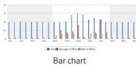
Study results of bar and area charts for an individual’s disaggregated data (day)
4. Findings and Discussion
Thirty-five people who used web and mobile applications daily were recruited. They consisted of office workers (31%), university graduate students (40%) and undergraduate students (29%). The genders of the participants were evenly distributed: male (49%) and female (51%). The ages of the participants were unevenly distributed: 19-29 (51%), 30-39 (28%), 40-49 (14%) and over 50 (1%). Participants self-reported their proficiency in reading charts as proficient (89%) and neutral (11%).
4. 1. Charts for Individual Data
To investigate how much energy data should be displayed at once, we compared a one day (today) energy usage chart and a one week energy usage chart. Table 3 shows the results of user performance and preference on an individual’s energy data.
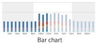
Most participants were able to read both charts correctly and read the bar chart faster. Although the area chart took longer for people to read, 71% of them think that it is more understandable and visually attractive. Overall, 77% of the people chose the area chart over the bar chart to represent the individual’s data for a day. Based on their comments, the area chart is better for reading the overall trends due to the line that connects the data points, whereas the bar chart is better for reading hour-by-hour data due to the divided bars. This led people to answer the basic reading question significantly faster (t(68) = 3.082, p<.01), but many people still thought the area chart is relatively easier to understand and less busy. The participants pointed out that with regards to energy monitoring, understanding the overall trend is more important than reading the data in detail.
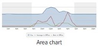
Study results of bar and area charts for an individual’s disaggregated data (week)
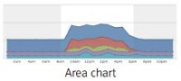
Energy data for a week is commonly presented with hourly or daily intervals. Since a bar and area chart are appropriate for daily and hourly intervals respectively, this study compares the two charts. First, a basic reading question was asked: Which day does the user consume the most electricity? All the participants answered correctly using the bar chart, but only 60% of them could answer correctly for the area chart. In fact, to answer this question correctly for the area chart, they had to consider “the area” of each day in the chart, but instead they tended to find the peak of the graph to answer this question. When they did not answer correctly, the researchers explained why the answer was incorrect. Again, more time was spent reading the area chart for both questions. Participants showed an equal interest in both charts for visual attractiveness (bar: 49%, area 51%) but overall preferred the area chart for presenting the week’s data (bar: 26%, area: 71%). The participants who chose the bar chart liked its simplicity and thought the area chart too complicated. In fact, it sometimes misled them in reading the total daily consumption. The participants who chose the area chart liked that it represents the overall consumption data in detail and informs them how they can save more energy. They pointed out that the missing information in the bar chart is critical for a user’s energy conservation, so the area chart is more useful to them.
Then the investigators asked participants which chart they would like to see first as the primary chart (week or day) to monitor their electricity consumption through an energy display. 80% of the respondents preferred to see week then day and 20% preferred day then week (Table 5). The most preferred pair is the area chart for the week and then the area chart for a day (40%). 65% of respondents responded that the area chart for a week is preferred if there is only one chart option for monitoring electricity usage. When formats other than the personal energy displays are needed (e.g., email, public display), this result can inform the chart selection for those formats as well.
Preference for the primary and secondary charts
4. 2. Charts for Social Comparison
The design of an energy chart for social comparison is also investigated here. Chart guides (Petkosek et al., 2004; Gillian et al., 1998; Abela, 2008) suggest bar and line charts for effective comparison.
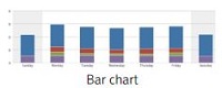
There was no difference between the charts in performance accuracy (Table 6), but the line chart was read more quickly (basic reading: t(68) = 3.493, p < .01; advanced reading: t(68) = 4.120, p < .01). Survey respondents preferred the line chart in terms of understandability (bar: 14%, line: 80%), visual attractiveness (bar: 17%, line: 77%), and overall preference (bar: 17%, line: 80%). They commented that the line chart is more intuitive, provides more motivation, and is simpler (because it only has three lines).
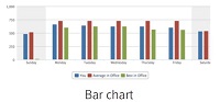
Study results of charts comparing a day’s electricity usage.
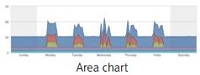
Similar to the previous results, there was not a big difference in reading accuracy, but again people spent less time on the line chart for both reading questions (basic reading: t(68) = 2.093, p < .05; advanced reading: t(68) = 2.030, p < .05). They think the bar chart is more visually attractive (bar: 63%, line: 37%), but the line chart is more understandable (bar: 37%, line: 57%) and preferred overall (bar: 37%, line: 63%). People commented that the bar chart is simple and attractive, but it does not show in detail when to save electricity (e.g., turn off the computer when you leave the office). Their most preferred pair is the line charts for both day and week. In this chart study, there was no statistical correlation between participants’ genders, ages and jobs, and their performance and preference.
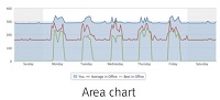
Study results on charts for comparison for a week’s electricity usage
4. 3. Supportive Information (Energy Metrics and Advice)
Eco-feedback metrics and energy-saving advice were evaluated (Figure 1). The participants’ understanding and preference on the following information was tested: demand, status, this week’s data (consumption, cost, CO2 emission, trees), short-term recommendations, and long-term recommendations. The most ambiguous terms turned out to be demand (57%) and trees (46%). The term, demand, is too vague and must be renamed for clarity. Also, people were not familiar with using trees to represent energy consumption.

Supportive information in the user interface
After the participants understood all the supportive information, they were asked to rank them in terms of usefulness. To calculate the score, weighted values are applied from 9 (rank #1) to 1 (rank #9) and Table 8 shows the total score. This week’s consumption and cost, demand, short-term and long-term recommendations were the top five pieces of information selected. They commented that they don’t have a good sense of the amount of CO2, and the meaning of the tree is not directly connected enough to the user’s energy usage to be engaging.
User Evaluation of Information and Advice Choices
With regard to the energy metrics, the use of KWh and cost ($) is preferred over environment metrics (CO2 and trees). Although Jain et al. (2012) argue that KWh is a difficult unit to understand due to “its scientific origin and abstract qualities,” many participants in our study commented that the KWh unit is useful to understand one's accumulated consumption per device when it is used with an energy chart. Jain et al. also argued that the tree metric is more useful than the others because it is a well-known object and easy to visualize. However, when the participants in our study heard the meaning of the tree metric (e.g., the number of trees needed to absorb the CO2 emitted from one’s electricity consumption), they thought that a tree is not the best metric for two reasons. First, because a tree is not directly linked to electricity consumption (electricity consumption generates CO2 emission and then trees absorb it). Secondly, they find it confusing due to the contradictory logic - when more electricity is consumed, more trees are fed, not destroyed! Another environmental metric, CO2, was strongly not preferred because people were not familiar with it. In our study, CO2 and tree were the least-preferred metrics. Regarding advice, people commented these would be more useful if they also provided 1) the expected savings that would result from following the advice, and 2) a “real time” warning notice sent to one's email or mobile phone as soon as the system detects energy waste.
5 . Conclusion
This study investigates the eco-feedback presentation methods focusing on charts and their supportive information. Each component was evaluated by measuring the performance of thirty-five participants (e.g., response time and correctness) and their preferences (e.g., understandability and attractiveness). Although most of the commercial energy-monitoring applications display today’s energy usage, it was found that the week-level energy usage presentation was more useful and preferred. Additionally, an area-stacked chart was preferred to view an individual’s disaggregated data and a line chart was preferred for social comparison data. The response time and accuracy did not always support the participants’ final selection for the charts. The environmental metrics (i.e., CO2 and tree) were preferred the least because they were confusing. KWh was preferred when used with a KWh energy chart. Cost was also preferred, but since an individual’s energy usage cost is typically low and not affected, a large monetary impact is recommended, such as the potential cost for one year or the organizational-level cost.
The study was conducted under laboratory conditions and the tasks were given to the participants to evaluate their performance and preference. Some design suggestions were based on users’ comments and to overcome that limitation, research has been undertaken to quantify the amount of energy saved using the suggested methods(Yun et al., 2015). The results of that study will highlight strategies that can make the largest positive impact on the environment. Participants consist of students and office workers who may be familiar with chart reading. Design implications suggested in this paper may not be proper to all type of users.
Acknowledgments
This study is supported by the Greater Philadelphia Innovation Cluster for Energy Efficient Buildings project (GPIC, a U.S. DOE Innovation Hub, Subtask 6.4) under U.S. Department of Energy Award Number EE0004261.
This article is based on sections of Ray Yun's doctoral dissertation.
Notes
This is an Open Access article distributed under the terms of the Creative Commons Attribution Non-Commercial License (http://creativecommons.org/licenses/by-nc/3.0/), which permits unrestricted educational and non-commercial use, provided the original work is properly cited.
References
- Abela, A. (2008). Advanced presentations by design: Creating communication that drives action. John Wiley & Sons.
-
Abrahamse, W., Steg, L., Vlek, C., & Rothengatter, T. (2005). A review of intervention studies aimed at household energy conservation. Journal of Environmental Psychology, 25(3), 273-291.
[https://doi.org/10.1016/j.jenvp.2005.08.002]

-
Alwin, D. F., & Krosnick, J. A. (1985). The measurement of values in surveys: A comparison of ratings and rankings. Public Opinion Quarterly, 49(4), 535-552.
[https://doi.org/10.1086/268949]
- Creyts, J., Derkach, A., Farese, P., Nyquist, S., & Ostrowski, K. (2009). Unlocking energy efficiency in the US economy.
- Darby, S. (2006). The effectiveness of feedback on energy consumption. A Review for DEFRA of the Literature on Metering, Billing and direct Displays,486, 2006.
- Ehrhardt-Martinez, K., Donnelly, K. A., & Laitner, S. (2010, June). Advanced metering initiatives and residential feedback programs: a meta-review for household electricity-saving opportunities. Washington, DC: American Council for an Energy-Efficient Economy.
- EIA, U. (2011). Annual energy review. Energy Information Administration, US Department of Energy. . Retrieved 2015, from www.eia.doe.gov/emeu/aer.
- Energy Star. (2007). The Energy Start Challenge: Build a Better World 10% at a Time. Retrieved 2015, from http://www.energystar.gov/ia/business/challenge/get_started/brochure_bifoldlayout.pdf.
- Energy Star. (2009). Fast Facts on Energy Use. Retrieved 2015, from http://www.energystar.gov/ia/business/challenge/learn_more/FastFacts.pdf.
-
Fischer, C. (2008). Feedback on household electricity consumption: a tool for saving energy?. Energy efficiency, 1(1), 79-104.
[https://doi.org/10.1007/s12053-008-9009-7]
-
Fitzpatrick, G., & Smith, G. (2009). Technology-enabled feedback on domestic energy consumption: Articulating a set of design concerns. Pervasive Computing, IEEE, 8(1), 37-44.
[https://doi.org/10.1109/MPRV.2009.17]
-
Foster, D., Lawson, S., Wardman, J., Blythe, M., & Linehan, C. (2012, May). Watts in it for me?: design implications for implementing effective energy interventions in organisations. In Proceedings of the SIGCHI Conference on Human Factors in Computing Systems (pp. 2357-2366). ACM.
[https://doi.org/10.1145/2207676.2208396]
-
Froehlich, J., Findlater, L., & Landay, J. (2010). The design of eco-feedback technology. In Proceedings of the SIGCHI Conference on Human Factors in Computing Systems (pp. 1999-2008). ACM.
[https://doi.org/10.1145/1753326.1753629]
- Froehlich, J. (2011). Sensing and Feedback of Everyday Activities to Promote Environmental Behaviors. University of Washington Doctoral Dissertation 2011.
-
Froehlich, J., Findlater, L., Ostergren, M., Ramanathan, S., Peterson, J., Wragg, I., & Landay, J. A. (2012). The design and evaluation of prototype eco-feedback displays for fixture-level water usage data. In Proceedings of the SIGCHI conference on human factors in computing systems(pp. 2367-2376). ACM.
[https://doi.org/10.1145/2207676.2208397]
- Gillan, D. J., Wickens, C. D., Hollands, J. G., & Carswell, C. M. (1998). Guidelines for presenting quantitative data in HFES publications. Human Factors: The Journal of the Human Factors and Ergonomics Society, 40(1), 28-41.
-
Grevet, C., Mankoff, J., & Anderson, S. D. (2010, January). Design and evaluation of a social visualization aimed at encouraging sustainable behavior. In System Sciences (HICSS), 2010 43rd Hawaii International Conference on(pp. 1-8). IEEE.
[https://doi.org/10.1109/HICSS.2010.135]
-
Jain, R. K., Taylor, J. E., & Culligan, P. J. (2013). Investigating the impact eco-feedback information representation has on building occupant energy consumption behavior and savings. Energy and Buildings, 64, 408-414.
[https://doi.org/10.1016/j.enbuild.2013.05.011]
-
Jain, R. K., Taylor, J. E., & Peschiera, G. (2012). Assessing eco-feedback interface usage and design to drive energy efficiency in buildings. Energy and buildings, 48, 8-17.
[https://doi.org/10.1016/j.enbuild.2011.12.033]
-
Karjalainen, S. (2011). Consumer preferences for feedback on household electricity consumption. Energy and buildings, 43(2), 458-467.
[https://doi.org/10.1016/j.enbuild.2010.10.010]
- Mercier, C., & Moorefield, L. (2011). Commercial office plug load savings and assessment: Final report. Produced by ECOVA and Supported Through the California Energy Commission's Public Interest Energy Research Program.
-
Petkosek, M. A., & Moroney, W. F. (2004, September). Guidelines for Constructing Graphs. In Proceedings of the Human Factors and Ergonomics Society Annual Meeting (pp. 1006-1010). SAGE Publications.
[https://doi.org/10.1177/154193120404800701]
- Roberts, S., & Baker, W. (2003). Towards effective energy information. Improving consumer feedback on energy consumption. Centre for Sustainable Energy, 3, 20.
- Roberts, S., Humphries, H., & Hyldon, V. (2004). Consumer preferences for improving energy consumption feedback. Report to Ofgem, Centre for Sustainable Energy, 2(3), 19.
-
Siero, F. W., Bakker, A. B., Dekker, G. B., & Van Den Burg, M. T. (1996). Changing organizational energy consumption behaviour through comparative feedback. Journal of environmental psychology, 16(3), 235-246.
[https://doi.org/10.1006/jevp.1996.0019]
-
Steg, L., & Vlek, C. (2009). Encouraging pro-environmental behaviour: An integrative review and research agenda. Journal of Environmental Psychology, 29(3), 309-317.
[https://doi.org/10.1016/j.jenvp.2008.10.004]
- The power to save money. (2009). PC energy report 2009 United States, United Kingdom, Germany. Retrieved November 3, 2015, from https://loop.wwf.org.hk/user_files/file/PC_EnergyReport2009.pdf.
-
Vassileva, I., Odlare, M., Wallin, F., & Dahlquist, E. (2012). The impact of consumers' feedback preferences on domestic electricity consumption. Applied Energy, 93, 575-582.
[https://doi.org/10.1016/j.apenergy.2011.12.067]
- Wolsink, M. (1997). New experimental electricity tariff systems for household end use. In 1997 ECEEE summer study.
-
Wood, G., & Newborough, M. (2007). Energy-use information transfer for intelligent homes: Enabling energy conservation with central and local displays. Energy and Buildings, 39(4), 495-503.
[https://doi.org/10.1016/j.enbuild.2006.06.009]
-
Yun, R., Lasternas, B., Aziz, A., Loftness, V., Scupelli, P., Rowe, A., ... & Zhao, J. (2013). Toward the design of a dashboard to promote environmentally sustainable behavior among office workers. In Persuasive Technology (pp. 246-252). Springer Berlin Heidelberg.
[https://doi.org/10.1007/978-3-642-37157-8_29]
- Yun, R. (2013). The Design of Persuasive System for Sustainability in the Workplace. In Persuasive Technology. April 3-5, 2013. Sydney, Australia.
-
Yun, R., Scupelli, P., Aziz, A., & Loftness, V. (2013). Sustainability in the workplace: nine intervention techniques for behavior change. In Persuasive Technology (pp. 253-265). Springer Berlin Heidelberg.
[https://doi.org/10.1007/978-3-642-37157-8_30]
-
Yun, R., Aziz, A., Scupelli, P., Lasternas, B., Zhang, C., & Loftness, V. (2015, April). Beyond Eco-Feedback: Adding Online Manual and Automated Controls to Promote Workplace Sustainability. In Proceedings of the 33rd Annual ACM Conference on Human Factors in Computing Systems (pp. 1989-1992). ACM.
[https://doi.org/10.1145/2702123.2702268]