Color in Package Design: A Case Study of User Response to Skincare Packaging Color
Background We explore the potential for mismatch between semantic intentions and user responses to color in skincare package design, as well as implications for color selection in packaging design.
Methods A semantic differential experiment, a card-sorting workshop, and a post-workshop interview were conducted to collect data on participants’ responses to packaging design stimuli. Color in packaging design was manipulated, with other elements controlled.
Results Mismatches between designers’ semantic intents and users’ responses to color in skincare package design were indicated by some results. New colors are further suggested as potential options for triggering the desired responses. Moreover, the results indicate that some colors are more universally accepted as representative of certain product characteristics due to their metaphoric associations. In contrast, others were found to be more susceptible to interpretation, possibly related to past experiences and/or cultural factors.
Conclusions The results provide insights towards the nature of mismatches between designers’ semantic intents and users’ responses to color in skincare package design. For colors with strong associations to shared metaphoric interpretations, minor mismatches between designer intent and user response may result. In contrast, colors without shared associations are increasingly likely to mismatch based upon more idiosyncratic interpretations.
Keywords:
Color Design, Package Design, Product Semantics, User Experience1. Introduction
In today’s competitive environment, package design has occupied a unique role in differentiating products from a wide range of similar goods (Farley & Armstrong, 2007). For example, package design has been described as a brief commercial before product purchase (Munyaradzi Mutsikiwa, 2013). Dazarola, Torán, and Sendra (2012) suggest a model of the Integration of Instances and Events of Product-Person Interaction that describes a typical user packaging experience consisting of six stages: (1) pre-acquisition, (2) pre-usage, (3) usage, (4) no-usage, (5) conservation, and (6) retirement. This case study focuses on pre-acquisition and pre-usage stages to provide insights into differences between designers’ intentions and users’ actual responses towards color in product packaging design.
The cosmetic industry has continued to record significant growth, with a high potential for further development (Statista, 2020). Considering the highly competitive environment in the cosmetic industry, package design plays a significant role as a marketing tool. Makeup, hair, and skincare products often utilize multiple package design elements to communicate practical information and foster brand identity. Therefore, it is important for package designers to have adequate information on whether packaging design choices align with the semantic responses of intended users.
1. 1. Problem Definition
Skincare package design often associates product properties to user needs/benefits, such as moisturizing, brightening, hydrating, firming, clarifying, etc. (Kao Corporation, 2018). Within this strategy, skincare brands use color as a key element in package design to convey product characteristics. For example, VENeffect (2020) is an American skincare brand that incorporates green into all packaging in an attempt to position health and environmental sensitivities as brand values.
The existence of mismatches between designer intent and user response is a recurring issue across design disciplines. For example, Chamorro-Koc et al. (2008) highlight existing differences between designers’ and users’ concepts of the same product, while Crilly et al. (2008) argue that such mismatches between designer intention and user perception are unavoidable. Hassenzahl (2003) also supports the aforementioned statements by claiming that “actual experiences with products may considerably differ from experiences intended by the designer”. Nevertheless, misalignments pertaining to the aesthetic domain, outside the realm of functionality, have been addressed less in the existing literature.
1. 2. Literature Review
Semantics is the study of meaning in language. Product Semantics is a branch of semantics, which is specifically concerned with the study of language meaning in the context of a particular product (Xiaoxiao & Wenming, 2018). In product semantics, psychological, social, and cultural contexts are considered alongside a product’s physical and physiological functions. Product semantics redefines the product from strictly a utilitarian object to “a medium for communication and expression, conveying meaning through the use of various factors, such as styling, texture, material, and color”.
Color Semantics is a branch of product semantics that studies the significance of color, aiming to understand how color’s specific meanings can be accurately expressed to facilitate “intuitive and accurate understanding of products through the objective use of color” (Xiaoxiao & Wenming, 2018).
Moreover, color is known not only to convey meanings but also to evoke emotions. Warmth, accordance, contrast, harmony, excitement, depression, and anguish are some examples of common color-induced sensations (Corridoni et al., 1999). In design practice, color combinations are carefully selected to be eye-pleasing and convey specific concepts, moods, and styles (Eisemann, 2000; Frascara, 2004; Newark, 2007; Samara, 2007). For instance, red color may stimulate ideas around warmth or romance. In this sense, color can associate with concepts rather than specific product characteristics. It is important to note that color perception is often affected by other important factors, such as region, social culture, age demographic, etc. (Xu et al., 2013).
Color helps brands establish unique visual identities, create strong bonds with their target markets, and differentiate themselves from other competitors (Labrecque & Milne, 2011). As a marketing tool, color has been widely used to attract users’ attention, as well as shape perceptions of packaged products. Mohebbi (2014) addresses the key role of color in packaging design in affecting consumer purchase decisions, highlighting its importance in marketing. However, since various factors, such as age, gender, personal experience, physiological and psychological characteristics, have a significant influence on color perception, the application of color in packaging design makes its implementation in marketing effective yet challenging (Singh & Srivastava, 2011).
More recent work has identified the importance of aesthetic product experiences as means to describe user-product interactions (Desmet & Hekkert, 2007). Packaging design consists of several key elements that serve aesthetic functionalities (i.e., color, typeface and/or graphic composition, surface material and/or texture). Many researches have studied relationships between these aesthetic elements and users’ emotional responses. For example, in a recent study exploring the influence of textured surfaces of cosmetic packaging on users’ emotions, results indicated relationships between texture and emotion (Ritnamkam & Chavalkul, 2016). Likewise, according to Salgado-Montejo et al. (2014), simple line segments and shapes convey different meanings, with rounder shapes associated with positive emotions over more angular forms. Even though there have been many studies on the influence of product packaging on user response based on shape, image, text size, and placement (Becker et al., 2011; Nikolaus & Lipfert, 2012; Wang & Li, 2008), there has been little to no attention in literature on the topic of color as a means to stimulate an aesthetic response in cosmetic package design specifically. To bridge this gap in the existing literature, our paper aims to present valuable insights regarding the influence of color on user response in the context of packaging design specifically, as well as find out whether identified users’ responses differ from designers’ intentions.
1. 3. Research Aims & Hypothesis
The scope of this study pertains to color in package design, specifically as it relates to the semantics of color. We identify our main objective as “to explore the extent to which designer’s semantic intent aligns with user’s response to color in skincare packaging design”. Based on the problem definition and literature review, the main hypothesis of the current work is set as follows:
Mismatches between designer’s semantic intent and user’s response to color in package design exist.
Two research questions were further defined as:
- 1. Which responses are evoked in users when presented with various skincare packaging designs differentiated by color?
- 2. What colors could better trigger the desired user response for the given product stimuli?
2. Methods
For the color packaging stimuli of this study, Dr. Jart +’s Cryo rubber sheet mask collection was selected as packaging stimuli (Dr. Jart+ Skincare, 2020; Figure 1).

Dr. Jart+ Rubber Lover Sheet Mask Collection
The reason for this choice is that the package design of these specific sheet masks heavily relies on color as a key element to communicate the intended message to the user while keeping other design elements constant, which helps to control all other aesthetic elements besides color.
The current collection consists of four masks, each represented by a distinct color to communicate the desired emotional response, as indicated on the company’s website (Dr. Jart+ Skincare, 2020): Pink–Firming, Turquoise–Soothing, Yellow–Brightening, Blue–Moisturizing. To ascertain whether subject responses aligned with intended product attributes, a control stimulus was created by manipulating the existing package design.
It is important to note that this study relies solely on how the chosen products are being marketed by the manufacturer, meaning that the intentions of the package designer used in the experiment are assumed based on the content analysis of the brand's official website (Dr. Jart+ Skincare, 2020).
Three discrete research phases were selected: a semantic differential experiment, a card-sorting workshop, and a post-workshop interview. The detailed procedure of the study can be seen in Figure 2.

Detailed Procedure
The semantic differential experiment was aimed to answer the 1st research question, while the card-sorting workshop and the follow-up interview were aimed to answer the 2nd research question simultaneously.
For the 1st research question, our main goal was to identify whether user response and designer intent match in selected color packaging stimuli. Since we wanted to find out user responses to pre-defined adjectives solely, the SD experiment was a sufficient research method, as it is not difficult to implement and provides quantitative results for easier comparison. However, for the 2nd research question, more comprehensive and less quantitative approaches had to be taken since the main goal here was to explore numerous possibilities and find better options for evoking desired user responses. For this reason, a workshop with an increased number of color packaging stimuli was selected, while the post-workshop interview was added as a follow-up for easier analysis and/or interpretation of the workshop results.
We asked 10 university students aged between 20 to 25 years old to take part in our study. Participants were coded based on their gender (M1, M2, M3, M4, M5, and F1, F2, F3, F4, F5). Prior to any experiment, participants were asked to rate their familiarity with skincare on a scale from 1 to 4 (i.e., 1 - not familiar at all, 2 - somewhat familiar, 3 - familiar, 4 – experienced). The demographic information relevant to this study can be seen in the following table:

Participants’ Demographic Information
2. 1. Semantic Differential (SD)
The semantic differential (SD) is often used for measuring the connotative meaning of objects and concepts. The goal of the SD experiment is to measure the meaning of words, particularly adjectives, and their relative concepts (Osgood et al., 1957).
For the SD experiment, 5 stimuli (4 existing, 1 control), 10 subjects, and 4 adjective pairs were used. Participants were gathered in groups of 3 or 4 in a controlled lab environment. Subjects were provided with printed forms, where each stimulus was presented with a scale ranging from one to five, with opposing adjectives on each end. Four SD scales were provided for each stimulus, meaning that each subject completed 20 SD scaled responses in total. Participants were asked to record responses to the given stimuli according to the degree of correspondence from 1 to 5 (e.g., 1 – not nourishing at all, 2 – slightly not nourishing, 3 – neutral, 4 – slightly nourishing, 5 – extremely nourishing).
2. 2. Card-sorting Workshop
Since the main goal of the card-sorting workshop is to investigate other potential colors for better communicating the desired user response, the number of stimuli was increased with the aim of providing a broad color packaging stimuli selection. To obtain those color packaging stimuli, an online search was conducted to collect 30 sheet mask package designs from various skincare companies. The two criteria for selection were: (1) the manufacturer marketed the mask using one of the four adjectives used in this study and (2) a single color was used as a key graphic element in the corresponding package design. As a result of this search, 6 to 9 sheet masks were collected per each affective adjective. Next, masks with similar colors were eliminated to result in 15 final sheet mask package designs.
For the card-sorting workshop, the same participants were given a separate white wall to work on and asked to organize 20 stimuli (4 existing, 1 control, 15 newly created) under four main affective adjective categories (i.e., firming, soothing, brightening, moisturizing). They were then asked to rank stimuli based on their responses from the best-fit color to the worst-fit color on a scale from 1 to 5 (Figure 3).

Card-Sorting Workshop Settings
2. 3. Post-Workshop Interview
From the post-workshop interview, 10 data sets were collected. Each interview was transcribed and analyzed manually. The aim of the post-workshop interview was to explore how participants organized the given card stimuli under each adjective category and how the ranking of the organized stimuli was made. In order to understand participants’ reasoning behind organizing and ranking the 20 provided color packaging stimuli, a follow-up, semi-structured interview was conducted. Interview questions were as follows:
- 1. Why did you organize the given stimuli under the four adjectives in the way you did?
- 2. Why do you think the stimuli you ranked as the best fit are the best for expressing the corresponding adjective?
3. Results
3. 1. SD Experiment
From the semantic differential experiment, 20 SD scales (four adjective-pair SD scales, with opposing adjectives at two ends, for each of the 5 stimuli) from 10 participants were obtained. In total, 200 SD scale responses were analyzed using Principal Component Analysis. Based on the variance in the data set, the first two components explain 100% of the variance, so by analyzing only two principal components, we can interpret the whole original data set. The first principal component explains 73% of the variance in the data set, while the second component explains 27%. With a simple code in Matlab, we derived the following 2D biplot perceptual map (Figure 4). Due to the preliminary nature of this study, thus a smaller amount of participants, the analysis of this 2D bi-plot, as opposed to statistical analysis typically used for SD scales, was arguably sufficient for proper interpretation of the SD experiment results.

2D Biplot of the Two-Component Analysis with 5 Stimuli
In the 2D biplot shown in Figure 4 above, all 4 variables, or affective adjective pairs, are represented as vectors, and the direction and length of each vector indicate how the corresponding variable contributes to the two principal components on the plot. On the other hand, all 5 stimuli are represented as points, with coordinates indicating the score of each stimulus based on the two principal components on the plot.
The 2D biplot from the SD experiment can be interpreted on 4 different levels:
⦁ Stimuli Similarity – how similar vs. differentiated each stimulus is from the other stimuli;
⦁ Stimuli Performance – how well each stimulus is perceived to perform on each variable (i.e., affective adjective);
⦁ Variable Similarity – how correlated variables are to one another;
⦁ Variable Importance – how important each variable is.
Stimuli, which are placed closer together on the biplot, are more similar to one another compared to stimuli located further apart from each other (Figure 4). Consequently, blue and turquoise color-packaging stimuli are extremely similar to each other. Similarly, white and yellow color-packaging stimuli are somewhat similar based on how participants assessed these color stimuli on the four affective adjectives. In contrast, the pink color-packaging stimulus is the most distinct one since it is placed further away from the rest of the stimuli.
First, we analyzed the 5 stimuli based on the variable Not Firming–Firming. By extending the variable vector outward in both directions and drawing perpendicular lines coincident with each stimulus’ data point on the 2D biplot, we can assess how well each stimulus performs on the Not Firming–Firming variable (Figure 5).

2D Biplot Interpretation based on Stimuli Performance: Firming
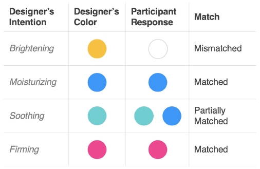
The order in which the perpendicular line hits each stimulus determines how well the stimulus performs: pink being the most firming (matched), and white being the least firming based on the direction of the variable vector (Figure 5). The relative distances between the dotted lines of each stimulus along the variable vector represent the relative differences in performance among those stimuli on the corresponding variable. In the same way, we can conclude the following:
⦁ Based on the Not Soothing–Soothing variable, turquoise and blue are followed by pink, then white, and yellow: turquoise and blue sharing the first spot for the most soothing and yellow being the least soothing (partially matched).
⦁ Based on the Not Moisturizing–Moisturizing variable, blue is very closely followed by turquoise, then pink, white, and yellow: blue being the most moisturizing and yellow being the least moisturizing (matched).
⦁ Based on the Not Brightening–Brightening variable, white is followed by yellow, then pink, turquoise, and blue: white being the most brightening and blue being the least brightening (mismatched).
The conclusions from the stimuli performance interpretation can be seen from the table below:
Color-Emotion Relationships between Color and Adjective
Variable similarities are indicated by the angles between variable vectors. In particular, directionally parallel vectors indicate similarity. For example, variables Not Soothing–Soothing and Not Moisturizing–Moisturizing point in the same direction, suggesting similar participant responses for moisturizing and soothing (Figure 6).

2D Biplot Interpretation based on Variable Similarity
In contrast, variables pointing in opposite directions indicate a negative correlation. For instance, the variables Not Brightening–Brightening and Not Firming–Firming point in essentially opposite directions (Figure 6), meaning that stimuli classified as brightening were not identified as firming.
Perpendicular vectors, on the other hand, represent no association or low correlation between variables. In other words, the performance of a stimulus on one variable tells us nothing about performance on the other. For instance, the variable Not Brightening–Brightening is nearly perpendicular to both Not Soothing–Soothing and Not Moisturizing–Moisturizing, indicating that whether a stimulus is brightening or not does not affect how it is perceived in terms of being either soothing or moisturizing (Figure 6).
The length of each variable vector indicates that variable’s relative perceived importance to consumer preference or choice (Figure 4). As a result, Not Brightening–Brightening, Not Soothing–Soothing, and Not Moisturizing–Moisturizing were identified as variables of greater importance to participants rather than the Not Firming–Firming variable, which has a much shorter vector length compared to other three variables.
3. 2. Card-sorting Workshop
From the card-sorting workshop’s responses, weighted rates of each affective adjective were derived for each of the 20 card stimuli. These weighted rates represented the composition of each stimulus based on the affective adjectives (i.e., firming, soothing, brightening, and moisturizing). Logically, the total sum of these weighted rates for each stimulus equaled 100%. The weighted rates for each stimulus were calculated based on the following formula:
percentage ( adjective ) = 100*sum ( weights (adjective) ) / sum ( weights )
The obtained weighted rates were represented using line graphs across all variables or affective adjectives (Figure 7).

Line Graph of Weighted-Rate Composition based on Adjectives
As indicated in Figure 7, firming showed an association with pinks and beige browns, soothing with greens and purples, brightening with yellows and white, and moisturizing with blues. By comparing these associations with original design intent derived from adjectives associated with various color designs, it is clear that there is some alignment. However, some misalignment was also identified. For example, besides pink, beige-brown packaging designs were also classified as firming. In terms of alignment, blues were classified as moisturizing.
3. 3. Post-workshop Interview
Our analysis of the interview data found that participants organized the given card stimuli under each adjective category based on two factors: (1) past experiences and (2) metaphors/associations related to each color. Table 3 illustrates participant responses related to past experiences.
Past Experiences: Example Excerpts
Based on excerpts presented in Table 3, M3 indicated how his experience of other products in sales contexts influenced his response. Participant F3 specifically pointed to her training in associating certain colors with certain adjectives based on existing skincare products on the market. This result indicated the importance of experience. It may be the case that shared past experiences implicate similar responses to the same color packaging design stimuli. In contrast, differences in experience may result in diverging connections between color in packaging design and the product characteristics they attempt to express and communicate.
By looking at the example excerpts presented in Table 4, we also observed how participants tended to use metaphors in their assessment of color/adjective relations. All participants alluded to a close relationship between blue and moisturizing. This may be because, as noted above, moisturizing has a strong, universal association with water. As blue is a color more universally prescribed as the color of water, an association between blue and moisturizing product properties was present.
Metaphors: example excerpts
In total, the metaphor of water for the moisturizing adjective was mentioned 6 times (f=6). Other metaphors mentioned included: aloe vera (f=2), cucumbers (f=1), green tea (f=1), citrusy fruits (f=2), and skin and/or nails (f=3).
Interestingly, 6 participants said that among all adjectives, firming was the hardest to link or that it defied association to any adjective. It appears some adjectives have a clearer relationship to color association driven through a universal metaphoric connection between the source (i.e., water) and the target (i.e., moisturizing). In this case, users may implicitly and more universally understand blue as associated with moisturizing. In contrast, other product characteristics and color associations (e.g., Pink-Firming in Figure 7 above) may be derived from more idiosyncratic past experiences and/or some combinations of metaphoric associations and autobiographical memories.
4. Discussion & Conclusion
The current study explored responses to color in product packaging design. In particular, we were interested in exploring a possible gap between designers’ intentions towards product attributes, as derived from color/adjective combinations, and users’ responses. The main hypothesis of this study was “mismatches between designer’s semantic intent and user’s response to color in package design exist”. The four packaging design stimuli used in the study were described by the company as: Pink–Firming, Turquoise–Soothing, Yellow–Brightening, Blue–Moisturizing. To these, a control stimulus (i.e., white) was added.
Results from an SD study indicated a relationship between pink and firming, blue and moisturizing, and brightening and white. Interestingly, blue and turquoise were identified to also relate to soothing. This was also supported by the SD experiment results, which indicated that participants often perceived blue and turquoise as moisturizing and soothing, interchangeably. In conclusion, the SD experiment results evidently support our initial hypothesis since at least one adjective-color pair did not match the company’s color selection (i.e., White-Brightening instead of Yellow-Brightening).
From a card-sorting workshop and the post-workshop interview, it was found that participants’ responses evoked by color in skincare package design actually do not align perfectly, yet some alignment exists. Similar to our SD experiment results, white was perceived as the most brightening instead of the designer’s chosen color (i.e., yellow). Another three adjectives either matched with the exact color packaging stimuli (i.e., Blue-Moisturizing) or a similar color from the same hue family (pink vs. nude pink, turquoise vs. green).
This finding supported our hypothesis since some mismatches were identified. Only Blue-Moisturizing color packaging stimuli matched perfectly with participants’ responses, while others matched with the same hue family and/or showed a correlation with additional colors. The reason for this might be that, based on the post-workshop interview, moisturizing was the easiest adjective to associate with color (i.e., blue).
Based on the card-sorting workshop, new colors were suggested as potential options for communicating the desired emotions besides moisturizing. Firming showed an association not only with pinks but also with beige browns. The close relationship between firming and pink was also identified in SD experiment results. The relationship between firming and brown was further explained in the analysis of post-workshop interviews. For example, several participants mentioned that skin-like colors, such as beige, nude, brown, and pinkish colors, remind them of collagen, thus evoking a feeling of firming. For soothing, workshop results indicate a relationship with greens and purples. Brightening also indicated correlations with yellows and white, supporting the SD experiment results.
Post-workshop interview results aligned with previous findings in a number of ways. More than half of the participants indicated no experience of products due to their age and different skin concerns, which supported findings from the SD experiment related to variable importance (3.1.4 Variable Importance). That is, past experiences implicated participants’ ability to make associations between color in packaging design and intended product characteristics (i.e., Pink-Firming).
The current study also suggests that color-product feature relationships in packaging design depend upon past lived experiences and/or more universal metaphoric associations between color and product feature. This provides important insights about the nature of mismatches between designer’s semantic intent in color choice to express features in skincare products and user’s ability to identify with designer’s intention. For example, Blue-Moisturizing is a well-established relationship, while others may be more susceptible to interpretation.
For example, for firming pinks and beige browns are suggested, while for brightening and soothing white/yellows and greens/purples are suggested, respectively.
The implication of this result for color in packaging design is that packaging designs may wish to consider relationships between the lived experiences of users and their influence upon color interpretation as expressive of certain product features. For example, the use of colors with weak associations (e.g., browns, greys) may be increasingly dependent upon user interpretation based upon more idiosyncratic and autobiographical life experiences. On the other hand, colors with strong associations (i.e., Blue-Moisturizing) may be more universally understood by users. The current study provides a demonstration of practicing colors with weak/strong associations. Relatedly, further studies may wish to explore how colors with weaker associations/greater possible interpretations may relate to and be influenced by differences in user profiles (i.e., age, gender, demographic and professional background, educational level, culture, etc.).
Through understanding the nature of mismatches as based upon differences in experience, as well as being aware of existing, more universal color-product characteristic associations (i.e., Blue-Moisturizing), designers will be better placed to align color choices with the intended responses.
Even though the main stimuli of this study pertain to only one skincare company and, thus, cannot be representative of all skincare packaging designs, this study provides important insights about existing mismatches between designer’s semantic intent and user’s emotional response in the context of color specifically. The results and insights from this study can help designers achieve more effective communication by realizing the desired semantic intent through the objective use of color in packaging design.
5. Limitations & Future Study
There are certain limitations in terms of the methodologies used in this study. Even though the SD experiment was successful in identifying color-emotion relationships and interpret correlations between stimuli and variables, the results were limited to the given 4 emotions. Moreover, we understand that by providing a list of possible semantic descriptions in the SD experiment, we cannot be certain whether we could independently capture users’ actual emotional responses to the given stimuli. In future research, we suggest taking alternative methods that encourage volunteered adjectives, thus, addressing this limitation by obtaining users’ intent directly from the source.
A further limitation of the card-sorting workshop is that participants evaluated given stimuli based on printed images rather than real physical product packaging. Considering participants’ multisensory experience by incorporating physical stimuli can lead to a better comprehension of mismatches between intended and realized user response to color in packaging design.
Taking into account the fact that aesthetic elements of package design include not only color but also material, typeface, branding, written descriptions, graphic element composition, etc., there are certain limitations that exist in this study. Isolating the effects of a particular variable, in our case color, from other elements that can potentially influence users’ emotional responses to package design presents a challenge of decontextualization. Another limitation of this study comes from the fact that we can rarely observe single colors used in isolation in product packaging (Orth & Malkewitz, 2008). Moreover, the potential influence of cultural differences on color perception was not measured but appeared important to the identified influence of personal experience upon some color-product attribute combinations (Madden et al., 2000).
Another limitation worth mentioning is the fact that designer intention of the product packaging used in this study is assumed solely based on company’s marketing and has not been directly derived from the source. Consequently, the existence of other factors influencing designer intention is possible, such as portraying certain aesthetics and attracting consumer attention. Thus, a more comprehensive definition of designer intention derived directly from the source is required in the future.
Due to limitations associated with isolating color from other aesthetic elements in package design, as well as potential influences on color perception based on differences in culture and age demographic, future works might include research on the influence of multiple colors in one package design. Further exploration of the influence of metaphors and/or their relation to past experiences in response to color in packaging design is also required. Moreover, since this preliminary study involved only 10 participants, a more in-depth investigation with more participants for proper generalization is highly suggested.
This study can contribute to the design community by serving as a validation of the implemented research methods as part of the design process to help designers extract semantic meanings from colors. In this case, a qualitative approach for deriving user responses to color is suggested for future study to assist a better integration into the typical design process.
Acknowledgments
We thank the participants for their time contributed towards our study. The work was conducted as a part of the UNIST Design Department’s graduate program.
Notes
Copyright : This is an Open Access article distributed under the terms of the Creative Commons Attribution Non-Commercial License (http://creativecommons.org/licenses/by-nc/3.0/), which permits unrestricted educational and non-commercial use, provided the original work is properly cited.
References
-
Becker, L., Rompay, T., Schifferstein, H., & Galetzka, M. (2011). Tough Package, Strong Taste: The Influence of Packaging Design on Taste Impressions and Product Evaluations. Food Quality and Preference, 22(1), 17-23.
[https://doi.org/10.1016/j.foodqual.2010.06.007]

-
Chamorro-Koc, M., Popovic, V., & Emmison, M. (2008). Using Visual Representation of Concepts to Explore Users' and Designers' Concepts of Everyday Products. Design Studies, 29(2), 142-159.
[https://doi.org/10.1016/j.destud.2007.12.005]
-
Corridoni, J., Del Bimbo, A., & Pala, P. (1999). Image Retrieval by Color Semantics. Multimedia Systems, 7(3), 175-183.
[https://doi.org/10.1007/s005300050120]
- Crilly, N., Maier, A., & Clarkson, P. (2008). Representing Artifacts as Media: Modeling the Relationship between Designer Intent and Consumer Experience. International Journal of Design, 2(3), 15-27.
- Dazarola, R. H. J., Torán, M. M. & Sendra, M. C. E. (2012). Interaction for Emotion: The Different Instances and Events of Interaction between People and Products. Proceedings of the 8th International Design and Emotion Conference, London.
- Desmet, P. M. A., & Hekkert, P. (2007). Framework of Product Experience. International Journal of Design, 1(1), 57-66.
- Dr. Jart+ Skincare. (2020). Retrieved from: https://us.drjart.com/.
- Eisemann, L. (2000). Pantone Guide to Communicating with Color. Sarasota, Fla.: Design Books International.
- Frascara, J. (2004). Communication Design: Principles, Methods, and Practice. New York: Allworth.
-
Hassenzahl, M. (2003). The Thing and I: Understanding the Relationship between User and Product. In M. Blythe (Ed.), Funology: From usability to enjoyment, 31-42.
[https://doi.org/10.1007/1-4020-2967-5_4]
- Kao Corporation. (2018). Effects of Positive Emotions Induced by the Use of Skincare. Presented at the 30th IFSCC Congress, Munich.
-
Labrecque, L., & Milne, G. (2011). Exciting Red and Competent Blue: The Importance of Color in Marketing. Journal of the Academy of Marketing Science, 40(5), 711-727.
[https://doi.org/10.1007/s11747-010-0245-y]
-
Madden, T., Hewett, K., & Roth, M. (2000). Managing Images in Different Cultures: A Cross-National Study of Color Meanings and Preferences. Journal of International Marketing, 8(4), 90-107.
[https://doi.org/10.1509/jimk.8.4.90.19795]
-
Mohebbi, B. (2014). The Art of Packaging: An Investigation into the Role of Color in Packaging, Marketing, and Branding. International Journal of Organizational Leadership, 3(2), 92-102.
[https://doi.org/10.33844/ijol.2014.60248]
-
Munyaradzi Mutsikiwa, M. (2013). The Impact of Aesthetics Package Design Elements on Consumer Purchase Decisions: A Case of Locally Produced Dairy Products in Southern Zimbabwe. IOSR Journal of Business and Management, 8(5), 64-71.
[https://doi.org/10.9790/487X-0856471]
- Newark, Q. (2007). What Is Graphic Design?. Rockport Publishers.
- Nikolaus, U., & Lipfert, D. (2012). The Emotional Impact of Packaging Design. An Eye Tracking Analysis. Proceedings of the 39th International Research Conference of IARIGAI, Ljubljana.
-
Orth, U. R., & Malkewitz, K. (2008). Holistic Package Design and Consumer Brand Impressions. Journal of Marketing, 72(3), 64-81.
[https://doi.org/10.1509/JMKG.72.3.064]
- Osgood, C. E., Suci, G. J., & Tannenbaum, P. H. (1957). The Measurement of Meaning. University of Illinois Press.
-
Ritnamkam, S., & Chavalkul, Y. (2016). The Influence of Textured Surfaces of Cosmetic Packaging on Consumers' Feelings. Environment-Behavior Proceedings Journal, 1(3), 123.
[https://doi.org/10.21834/e-bpj.v1i3.357]
-
Salgado-Montejo, A., Velasco, C., Olier, J., Alvarado, J., & Spence, C. (2014). Love for Logos: Evaluating the Congruency between Brand Symbols and Typefaces and Their Relation to Emotional Words. Journal of Brand Management, 21(7-8), 635-649.
[https://doi.org/10.1057/bm.2014.29]
- Samara, T. (2007). Design Elements: A Graphic Style Manual. Rockport Publishers.
-
Singh, N., & Srivastava, S. K. (2011). Impact of Colors on the Psychology of Marketing - A Comprehensive Over View. Management and Labour Studies, 36(2), 199-209.
[https://doi.org/10.1177/0258042X1103600206]
- Statista. (2020). Cosmetics Industry. Retrieved from: https://www.statista.com/topics/3137/cosmetics-industry/.
- VENeffect. (2020). Retrieved from: https://www.veneffect.com/.
- Wang, A., & Li, Y. (2008). Communication of Feeling and Intention in Packaging Design Based on Symbol Image. Packaging Engineering, 7.
-
Xiaoxiao, B., & Wenming, L. (2018). Research on the Application of Color Semantics in the Human-Computer Interaction Design of Smartphones. MATEC Web of Conferences, 176.
[https://doi.org/10.1051/matecconf/201817604001]
-
Xu, J., Zhang, H., & Cui, T. (2013). Cognition Spaces of Modern Furniture Color Semantics. Applied Mechanics and Materials, 361-363, 488-492.
[https://doi.org/10.4028/www.scientific.net/AMM.361-363.488]