Comparative Effectiveness of Homologous Thai Letterforms on Visual Word Recognition: Thai Universal Design Font versus Familiar Thai Text Fonts
Abstract
Background A previous study by Punsongserm (2019) examined the performance of Thai fonts on visual word recognition, including the Thai Universal Design font (Thai UD font, trial version) and familiar Thai conventional text fonts. The previous study provided empirical evidence in some characters, which suggests that distinctive letter key features enhance better Thai legibility on visual word recognition than having only harmonizing letterforms. In order to extend the results of the proposed approaches in the earlier studies, this current study is a set of extending findings that contribute to the previous study (Punsongserm, 2019).
Methods As the previous study, the present investigation included two experiments that applied a blur simulation and a short-exposure methodology to measure the effectiveness of the Thai characters with the real words and pseudo words under low visual acuity conditions. The study invited 30 Thai readers to participate in the experiments with 15 participants in each experiment.
Results The results revealed that overall effectiveness on low visual acuity conditions of the Thai UD font has an advantage over the conventional text fonts, corresponding to the suggestions in the earlier studies. However, the findings suggest that providing more counter space in certain characters may enhance better visibility. Furthermore, the characters with a jutting part should be defined with particular sufficient inter-letter space (tracking) when they encounter the characters that possess tight letterform or include a jutting part. Moreover, determining sufficient vertical inter-letter space of consonants with upper vowels and lower vowels may also increase visibility under low visual acuity conditions.
Conclusions In order to test the capability of Thai Universal Design font in low visual acuity conditions on visual word recognition, the study employed real words and pseudo words through a blur simulation and a short-exposure test method. Although humans recognize the words by comprehending word shapes in general reading, humans need to spell a word in some conditions (e.g., unfamiliar words or unknown words), especially in blurry vision. The present study reflects the role and importance of the existence of distinctive of each letterform in Thai UD font on visual word recognition under the conditions of low visual acuity rather than having harmonized letterforms in the other fonts.
Keywords:
Typeface Design, Universal Design Font (UD Font), Inclusive and User-Centered Information Design, Pattern Recognition, Low Visual Acuity1. Introduction
Presently, the expansion of the elderly world population is an essential issue. This situation requires awareness of the global community's diverse aspects and in each country, principally social and economic dimensions. Organizations and institutions in each career are attempting to reform policies and practical concepts to manipulate this issue. Governments in each country try to promote birth rates together with reinforcement to policies for elderly service. Universities are trying to adapt to meet the aging society's needs while social workers endeavor to encounter more suitable ways to care for the elderly to deserve a good quality of life. In every design discipline, paying attention and having an awareness of design fosters the experience and well-being of the elderly, for instance, in architecture, product design, and communication design.
In positive typeface design, specific fonts have been emerged to address the need for increased typographical effectiveness (e.g., legibility and visibility). For example, the Japanese Universal Design fonts (UD font), regarded as a visual acuity matter, is a common factor that affects the elderly, visually impaired, and low vision people. As Thailand’s society matures, developing the first Thai Universal Design font has been originated to encourage Thai people's well-being and those learning to read Thai. This initiative led to the prior studies, which emphasized improving legibility and visibility of Thai letterforms through the psychological studies on visual letter recognition, including the investigations of Punsongserm, Sunaga, and Ihara (2017a; 2017b; 2018a, and 2018b). Their studies used the blur simulation methodology and short-exposure methodology for examining the efficacy of isolated Thai characters.
In visual word recognition test, various investigations have employed both those real words and pseudo words (also called ‘non-word’) in the psychological study, For instance, a study of Dobres, Chahine, Reimer, Mehler, and Coughlin (2014) in order to measure the capability of Roman font legibility. Regarding pattern recognition, humans recognize the words through comprehending word shapes. It may generally be a conception that in the alphabets writing system, the skilled readers neglect to spell those familiar words and apply word shape for interpretation in general reading. Nevertheless, humans need to spell unfamiliar words or unknown words, depending on each individual's reading experience. The present experiment employed the pseudo words in visual word recognition investigation to expose the intrinsic effectiveness of the target letters, which were measured together with other characters.
There are various methods in psychological studies on the legibility test. Tinker (1963) has described the methodologies in the measurement legibility of typeface. Instances include testing the accuracy of letterforms or words, measured with short durations of exposure (short-exposure method). Also, examining the legibility of typeface factors concerning the distance between the eye and letter or word typeface (distance method). Besides, measuring the typeface effectiveness in various degrees of clearness from blur to apparent (focal variator method). Also, counting the frequency of blinking while a reader is reading text (blinking method). It also investigates the time it takes a reader to read a group of a given text (speed of reading method), investigating the movements of the eyes while reading with corneal reflection and electrical signals (the eye movements measurement), et cetera.
The blur simulation method is a common way that has been used to simulate the low visual acuity condition represent to the people with low vision, such as in the studies of Legge et al. (1985), and Nakano et al. (2006). The blur simulation method has been applied in several studies to measure the effectiveness of the Universal Design fonts. For example, the investigations of Inoue et al. (2008), Arai et al. (2010) and Nakano et al. (2010) employed a wide view ground glass filter (blur filter), along with the works of Hakamada, Ohya, Sakai, Sakurada, and Tomomi (2011), and Panasonic Corporation (2020) applied pseudo-cataract experience goggles, and so on.
Although the use of the blur simulation method may typically conduct with the participants who have normal or corrected-to-normal visual acuity, this lets us control and maintain a low visual acuity level, supporting us to see the same object from a simulator to allow discussions. The short-exposure method has been utilized to investigate the characteristics of perceived letterforms on parafoveal and peripheral vision (outside foveal vision), allowing examining diverse degrees of low visual acuity (Beier, 2012). The parafovea provides moderate acuity, while the periphery has very low acuity (Rayner et al. 2016). Consequently, presenting letterforms to the parafovea and periphery allows comprehension of letters' aspect in distinct areas.
According to Punsongserm (2019) proved the performance of the first Thai Universal Design font (trial version) that was designed to support people with low visual acuity, compared with the Thai conventional text fonts. The study measured effectiveness of several Thai letterforms and proposed the findings of the eleven characters, e.g., the characters /ฎ/ (Do Chada), /ฏ/ (To Patak), /ช/ (Cho Chang), /ซ/ (So So), /ไ/ (Sara Ai Maimalai), /โ/ (Sara O), / /ี (Sara Ii), / /ึ (Sara Ue), / /ื (Sara Uee), / ั/ (Mai Han-akat), and / /้ (Mai Tho). However, there are the significant results of certain homologous Thai letterforms that should be presented in order to reinforce the principles that were suggested in the earlier studies (Punsongserm et al. 2017a; 2017b; 2018a, and 2018b), having distinctive jutting out part, minimal loop, and massive serrated line.
The current study is the extension of the previous study (Punsongserm, 2019) that aimed to prove and provide additional evidence of the performance of the first Thai Universal Design font (trial version) that was designed to support people with low visual acuity. This investigation employed a blur simulation methodology and short-exposure methodology for measuring the Thai letterforms' performance on visual word recognition and compared the results between the two experiments compared with the Thai conventional text fonts.
2. Method
2. 1. Materials
The present study measured the effectiveness of the homologous Thai types of the Thai standard text fonts (e.g., Cordia New and TH Sarabun New), comparing the Thai UD font (trial version). Cordia New and TH Sarabun New has been used for a long time as the familiar fonts for Thai readers (Punsongserm, 2019; Suveeranont, 2002; Punsongserm, 2010; Suveeranont, 2017). In comparison, the Thai universal design font is a latter typeface that was designed based on explicitly distinctive letterforms (Punsongserm, 2019).
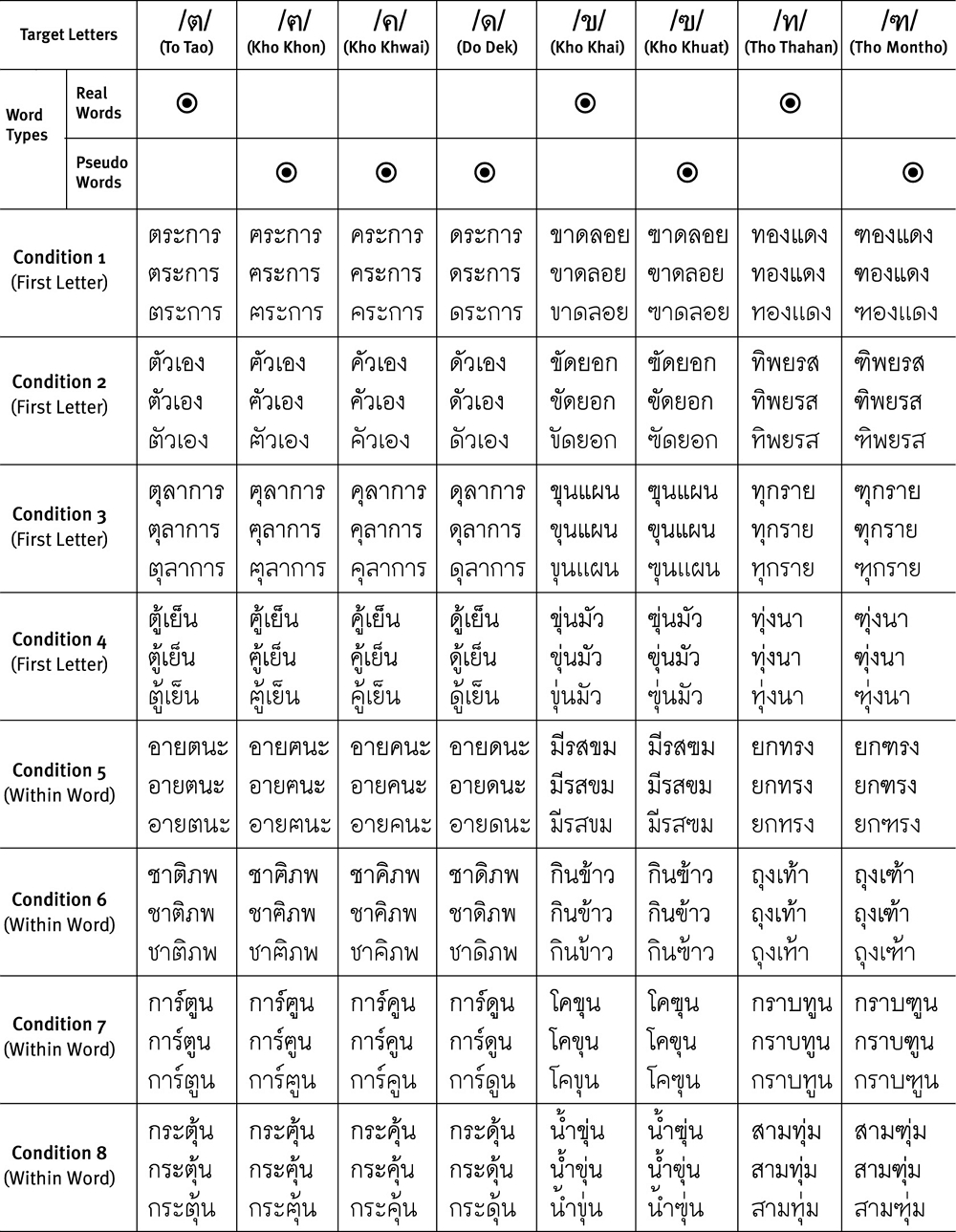
This experimentation examined merely the legibility of the eight homologous Thai types in the context of Thai words, which were presented under the conditions of low visual acuity. The selected characters included the consonant characters /ต/ (To Tao), /ฅ/ (Kho Khon), /ค/ (Kho Khwai), /ด/ (Do Dek), /ข/ (Kho Khai), /ฃ/ (Kho Khuat), /ท/ (Tho Thahan), and /ฑ/ (Tho Nangmontho) (also called ‘Tho Montho’). The characters /ต/ (To Tao), /ข/ (Kho Khai), and /ท/ (Tho Thahan) were tested legibility in real-word conditions. In contrast, the other characters (e.g., /ฅ/ (Kho Khon), /ค/ (Kho Khwai), /ด/ (Do Dek) /ฃ/ (Kho Khuat), and /ฑ/ (Tho Nangmontho) were presented in pseudo-word conditions, as homologous letters.
The characters were designed based on the suggestions in the earlier studies regarding the letter features of the selected characters of Thai UD font (Punsongserm et al. 2017a; 2017b; 2018a, and 2018b). Determining minimal loop in character /ข/ (Kho Khai) and /ท/ (Tho Thahan) prevents misreading to /ฃ/ (Kho Khuat) and /ฑ/ (Tho Nangmontho), respectively. In contrast, the existence of a massive serrated line and jutting out part in the characters /ฃ/ (Kho Khuat) and /ฑ/ (Tho Nangmontho) sustain their legibility. Likewise, giving a massive serrated line in the characters /ต/ (To Tao) and /ฅ/ (Kho Khon) protect confusion for /ค/ (Kho Khwai), /ด/ (Do Dek), respectively. Besides, escalations for more counter space in the characters /ต/ (To Tao), /ฅ/ (Kho Khon), /ค/ (Kho Khwai), and /ด/ (Do Dek) provided better visibility. Also, presence of a curve line that connects with a first loop in the characters /ต/ (To Tao) and /ด/ (Do Dek) differentiate with the characters /ฅ/ (Kho Khon) and /ค/ (Kho Khwai) (see Figure 1).

The selected homologous Thai characters compare in different typefaces; Cordia New, TH Sarabun New, and Thai UD (trial version)
Figure 1 exhibits the selected homologous Thai characters of each font (e.g., Cordia New, TH Sarabun New, and Thai UD font), with and without blur simulation. The figure reveals the capability of the selected characters displays in blurry vision. Also, to highlight the distinct features of the designed Thai letterforms, Figure 2 shows an overlapped image of the designed glyphs of three sets of Thai homologous letterforms varies by the three typefaces. Column one exhibits the overlapped image of homologous characters /ต/ (To Tao), /ฅ/ (Kho Khon), /ค/ (Kho Khwai), /ด/ (Do Dek); column two exhibits the overlapped image of characters /ข/ (Kho Khai), /ฃ/; and column three exhibits the overlapped image of characters /ท/ (Tho Thahan), and /ฑ/ (Tho Nangmontho).

The sets of Thai homologous pairs with overlapping of designed variations in Cordia New, TH Sarabun New, and Thai UD (trial version)
According to Punsongserm (2019) proposed a method of composing the Thai words related to the conditions of encompassing letters. The study determined the eight conditions of aspects to examine the legibility of the target letters on word recognition under low visual acuity (e.g., blur simulation and short-exposure method). The conditions include:
The target letters as the first letters
- • Condition 1. The target letters without upper vowels (or tone marks) and lower vowels
- • Condition 2. The target letters with upper vowels and tone marks
- • Condition 3. The target letters with lower vowels
- • Condition 4. The target letters with upper vowels (or tone marks) and lower vowels
The target letters as the letters inside the words
- • Condition 5. The target letters without upper vowels (or tone marks) and lower vowels
- • Condition 6. The target letters with upper vowels and tone marks
- • Condition 7. The target letters with lower vowels
- • Condition 8. The target letters with upper vowels (or tone marks) and lower vowels
Table 1 shows the real words and pseudo words that were employed in the experiments. The selected characters, as target letters, appear in the words of each condition. Each row of each condition displays the words which were typed by the typeface Cordia New (Row one of each condition), TH Sarabun New (Row two of each condition), and Thai UD (Row three of each condition), respectively.

The Thai real words and pseudo words tested in the experiments, illustrated with the typeface Cordia New, TH Sarabun New, and Thai UD (trial version)
2. 2. Experiments
Punsongserm, Sunaga, & Ihara. (2018a, 2018b) investigated the effectiveness of homologous Thai letterforms under the conditions of low visual acuity. Their first study applied a blur glass filter that simulated the isolated blur characters, like blurry vision (Punsongserm et al. 2018a). The reason for the selection of blur simulation method in the current study included:
- • The method can control and maintain a low visual acuity level with young people who have strong visual acuity; this point is the main benefit that the current study gained.
- • The method avoids an issue concerning fatigue of the elderly due to vision health problems. (The elderly did not participate in the present study.)
- • The blur simulation method supported us to see the same object (blurred words) from a wide field of view to allow discussions.
- • The technique was smooth, and the simulation was conducted at a low-cost.
The second experiment tested the same Thai letterforms used in the first study, measuring in parafoveal vision with a short-exposure method (Punsongserm et al. 2018b). The present study applied both experiment methodologies to examine the legibility of homologous types on visual word recognition.
Regarding maintaining consistency of equivalent character size, the current study derived the method of stipulating character height of Legge and Bigelow (2011) (i.e., x-height). Similarly, the study in Punsongserm (2019), the Bo Baimai height of each font size was set as 4 mm. The conversion to a visual angle from the physical print size was 0.572° of 4 mm, at a viewing distance of 400 mm. The Bo Baimai height of 4 mm, corresponding to each font's point size, was 28.35, 28.9, and 34.1 points (Cordia New, TH Sarabun New, and Thai UD (trial version), respectively). The words as stimulus characters were presented in black on a white background.
Experimenting with the elderly allows us to directly obtain the results from the real poor vision of the elderly. While using people of various ages, provide the findings that cover the ranges of quality of eyesight. However, the elderly have a variation of visual acuity and the difference in eye diseases. Therefore, experimenting with older adults and various ages may need more time, selecting volunteers, and conducting research data collection and financial support, especially in elderly and children. Hence, we employed young people with the two experiments in the present study first.
1) Participants
A sample of 15 native Thai participants with normal or corrected-to-normal visual acuity, including 3 males and 12 females aged between 20 and 29 years old (average: 21.1 years), participated in this experiment.
2) Apparatus
The Thai-words stimuli were presented on an adjusted-to-vertical UHD Monitor (BenQ BL2711U 27 inch) with identical resolution (3840 px × 2160 px) together with a refresh rate of 30 Hz and a luminous intensity of 258 cd/m2. The experimentation was conducted throughout in a dark box with the size W100 × L150 × H200 cm. The monitor and a chinrest were set on a desk with a distance of approximately 400 mm between them. Participants sat on a comfortable chair and used their head maintained against a chin-and-forehead rest. They viewed the displayed Thai-words on the monitor screen with their binocular vision. Participants responded to each perceived Thai word via a Thai keyboard (Marvo KM400) that included backlighted characters.
A blur filter (280 × 356 mm) with the same property which was applied in the studied of Nakano et al. (2006), Inoue et al. (2008), Arai et al. (2010), Nakano et al. (2010), and Punsongserm et al. (2018a) was employed in this experiment. The blur filter with a frame and standing base was placed on a desk from the monitor's front. The distance between the blur filter and the monitor was approximately 50 mm.
3) Procedure
Initially, each participant pressed the Thai keyboard's space key, a stimulus word (Thai-word) with a set of force choices was presented on the monitor screen in a randomized order. After that, the participant perceived and identified the Thai-words one by one. Participants could select a choice (the perceived word) via the arrow keys (left, right, up, down) on the keyboard and then pressed enter key for confirmation (see Figure 3). In this experiment employed the 64 Thai words, including 24 real words and 40 pseudo words. Each word was typed with the three fonts (Cordia New, TH Sarabun New, and Thai UD), generating a total of 192 stimulus words. The Thai words were randomized and presented individually with three repetitions, producing a total of 576 trials.

Sequence of events in the blur simulation experiment (Source: Punsongserm, 2019)
1) Participants
A sample of 15 native Thai participants with normal or corrected-to-normal visual acuity, including 4 males and 11 females aged between 20 and 23 years old (average: 21 years), participated in this experiment.
2) Apparatus and Stimulus
This experiment applied the same apparatus and the identical stimulus Thai words employed in experiment 1 (blur simulation test), except the blur filter. The stimulus words were presented at a distance of 20 mm from the fixation point randomly chosen from 2 directions (top and bottom of the fixation point) (see Figure 4, right). The stimulus presentation's retinal eccentricity was 2.86°, corresponding to the middle parafoveal area (Rayner et al., 2016; Schotter, Angele, & Rayner, 2012; Punsongserm et al., 2018b).

Sequence of events in the short-exposure experiments (Source: Punsongserm, 2019)
3) Procedure
In order to measure the efficacy of the Thai words in parafoveal vision, this experiment applied the short-exposure methodology with two variant durations (200-ms and 300-ms conditions) to investigate the selected Thai words. The method allowed us to achieve parallel data in the series, which could be gainful compared with acquiring only a single data set. This investigation was divided into two tasks, including the short-exposure test with presentations of 200 ms and 300 ms. The 64 Thai words of each font were randomized and presented individually with three repetitions, producing 192 stimulus words, (576 stimulus words with the three fonts). Each Thai word displayed briefly for either 200 ms or 300 ms on the monitor screen. The short-exposure condition with the two different durations included 576 stimulus words, giving 1,152 trials.
Firstly, each participant pressed the space key; a Thai stimulus word was presented randomly for a brief duration (200 ms or 300 ms) at either upper or lower of the fixation point. Second, a mask displayed for 400 ms to eliminate the afterimage. After that, participants could select a choice (the perceived word) via the arrow keys (left, right, up, down) on the keyboard and then pressed enter key for confirmation (see Figure 4).
Figure 4 exhibits the sequence of events in the short-exposure experiments. In detail, on the right of Figure 4 shows character height consorts Bo Baimai height, and distance from fixation (on fovea, plus symbol) to stimulus character (on parafovea).
3. Results and Discussion
3. 1. The Characters /ต / (To Tao) (Role in Real Words)
The Thai UD font words had positive results in the blur simulation test and the short-exposure tests, which were superior to the conventional text fonts (see Figure 5).

The errors in the characters /ต/ (To Tao) (Real words)
The findings reveal that the existence of a massive serrated line and more counter enhances legibility in the character /ต/ (To Tao). These results of the UD font supported and corresponded to the findings Punsongserm et al. (2017a; 2017b; 2018a; 2018b), presence of a broader character width together with massive serrated line (see Figure 6).

The significant letter features in Thai UD font active in low visual acuity, the characters /ต/ (To Tao) and /ฅ/ (Kho Khon) (Source: Punsongserm, Sunaga, & Ihara, 2017b; 2018a; 2018b)
3. 2. The Characters /ฅ/ (Kho Khon) (Role in Pseudo Words)
The results of the Thai UD font worked on the pseudo words (the character Kho Khon /ฅ/ substituted To Tao /ต/) indicated an advantage over the conventional text fonts in every condition. However, most of the Thai UD font's findings had quite high incorrect response rates (see Figure 7). The result s of the UD font supported and corresponded to the findings of Punsongserm et al. (2017a; 2017b; 2018a; 2018b), with a broader character width and massive serrated line (see Figure 6).

The errors in the characters /ฅ/ (Kho Khon) substituted the characters /ต/ (To Tao)
3. 3. The Characters /ค/ (Kho Khwai) (Role in Pseudo Words)
In the blur simulation test with the character Kho Khwai /ค/ substituted To Tao /ต/, the Thai UD font obtained a misreading rate lower than 10% in the conditions 2 – 8, excepted in condition-1 which produced an error rate exceeded 20% rather than the finding in the conventional text fonts. In the 300-ms short-exposure test, the UD font acquired a smaller than 10% misidentification rate, unless in condition 5, which had an error rate exceeding 10%. In contrast, the results in conditions 5 and 6 had a higher significant incorrect response rate in the 200-ms presentation (see Figure 8).

The errors in the characters /ค/ (Kho Khwai) substituted the characters /ต/ (To Tao)
The findings suggest that the character Kho Khwai /ค/ should have more counter space, which includes a broader character width as recommended by Punsongserm et al. (2017a; 2017b; 2018a; 2018b) for improving the character /ฅ/ (Kho Khon) and /ต/ (To Tao). Also, to facilitate better visibility, defining a vertical space between consonants, upper vowels, and lower vowels may be manipulated (see Figure 9).

Suggestion for improving the character width of the characters /ค/ (Kho Khwai) and /ด/ (Do Dek), Thai UD font
3. 4. The Characters /ด/ (Do Dek) (Role in Pseudo Words)
In the blur simulation test, the Thai UD font's findings had an advantage over the conventional text fonts in every condition. However, most error rates had exceeded 30%. In the short-exposure with a 300-ms test, the Thai UD font acquired a misreading rate of less than 10% (except in condition 6). Furthermore, the 200-ms presentation, the Thai UD font, had an advantage in conditions 1, 2, 3, 4, and 8 yet the Thai UD font obtained a quite high misidentification in the condition 5, 6, and 7 (see Figure 10). Resolving the issue may need specifying an adequate character width, as recommended by Punsongserm et al. (2017a; 2017b; 2018a; 2018b) for improving the character /ฅ/ (Kho Khon) and /ต/ (To Tao) (see Figure 9).

The errors in the characters /ด/ (Do Dek) substituted the characters /ต/ (To Tao)
3. 5. The Characters /ข/ (Kho Khai) (Role in Real Words)
Most of the findings of the Thai UD font words had advantages superior to the conventional text fonts in the blur simulation test and 300-ms short-exposure test. The results of the Thai UD font showed that the existence of defining a minimal loop for the character /ข/ (Kho Khai) and /ช/ (Cho Chang) enhanced better legibility according to Punsongserm et al. (2017b; 2018a; 2018b) stated (see Figure 12). The results in 200-ms presentation with condition 5 (a word ‘มีรสขม’), unless in the condition 7 (a word ‘โคขุน’) of the blur test result produced a quite high error rate in each font. The UD font acquired an error rate of more than 50%, but in the 300 ms test, it exhibited a slight misidentification rate (see Figure 11).

The errors in the characters /ข/ (Kho Khai) (Real words)
3. 6. The Characters /ฃ/ (Kho Khuat) (Role in Pseudo Words)
In the blur simulation test with the case of character Kho Khuat /ฃ/ substituted Kho Khai /ข/ (see Figure 13), most words of the UD font had the lowest error rate. However, in condition 6 (a pseudo word ‘ก ินฃ้าว’) and condition 8 (a pseudo word ‘น้ำฃุ่น’) exhibited a considerable misreading rate. Nevertheless, in the same conditions, the UD font acquired a few incorrect response rates in the 300-ms short-exposure test (and in condition two did not incur any error). Even though the UD font's findings in the 200-ms test had a considerable misidentification rate, the findings exhibited a lower error rate than the conventional text fonts. The UD font results confirmed that reducing the significance of the loop and extending the serrated line with jutting out supported legibility and visibility (Punsongserm et al. 2017b; 2018a; 2018b) (see Figure 12).

The significant letter features in Thai UD font active in low visual acuity, the character /ข/ (Kho Khai) /ซ/ (So So), and /ช/ (Cho Chang) (Source: Punsongserm, Sunaga, & Ihara, 2017b; 2018a; 2018b)

The errors in the characters /ฃ/ (Kho Khuat) substituted the characters /ข/ (Kho Khai)
3. 7. The Characters /ท/ (Tho Thahan) (Role in Real Words)
Most of the results in every condition of the Thai UD font had a misreading rate no more than 10% in the blur simulation test and the 300-ms short-exposure test, there was no error in condition 2 for the 300-ms test. In the short-exposure test with 200-ms presentation, the Thai UD font obtained quite high incorrect response rate in the conditions 6 and 7 (the real words ‘ถุงุเท้า’ and ‘กราบทนู ’, respectively) (see Figure 14).

The errors in the characters /ท/ (Tho Thahan) (Real words)
3. 8. The Characters /ฑ/ (Tho Nangmontho) (Role in pseudo words)
The words in the condition 5 (a pseudo word ‘ยกฑรง’) and condition 6 (a pseudo word ‘ถุงเฑ้า’) had a higher misreading rate than the other conditions, particularly the 200-ms presentation (see Figure 15). This finding suggests a jutting out loop-with-serrated-line of the character Tho Nangmontho /ฑ/ requires increasing its front-space.

The errors in the characters /ฑ/ (Tho Nangmontho) substituted the characters /ท/ (Tho Thahan)
4. Conclusion
The present study employed a blur simulation method and a short-exposure method to measure the comparative homologous Thai letterforms' effectiveness on visual word recognition through the real words and pseudo words, Thai Universal Design font versus the Thai conventional text fonts. The results revealed that the overall effectiveness of low visual acuity conditions of the Thai UD font (trial version) has an advantage over the others.
Regarding the special letter features of the selected characters of Thai UD font, the findings suggest that the maintaining distinctive features in the letterforms of Thai UD font, which were tested in the current study with blur simulation and short-exposure methodology, have positive effects. The minimal loop in character /ข/ (Kho Khai) and /ท/ (Tho Thahan) prevents misinterpretation for another letter. While the presence of a massive serrated line along with jutting-out-part in the characters /ฃ/ (Kho Khuat) and /ฑ/ (Tho Nangmontho) sustain their legibility. Besides, determining a sufficient massive serrated line in the characters /ต/ (To Tao) and /ฅ/ (Kho Khon) distinguishes them from the other characters. Moreover, increasing of more counter space in the characters /ต/ (To Tao), /ฅ/ (Kho Khon), /ค/ (Kho Khwai), and /ด/ (Do Dek) supports better visibility. Furthermore, the existence of a curve line that connects with a first loop in the characters /ต/ (To Tao) and /ด/ (Do Dek) differentiate with the other characters.
However, regarding character width, providing more counter space should be manipulated to certain characters, especially the characters Kho Khwai /ค/ and Kho Khon /ฅ/, rather than in their homologous letterforms (e.g., /ด/ (Do Dek) and /ต/ (To Tao). This solution will also influence the expansion of their character width. Besides, the finding suggests that the characters which have a jutting out loop-with-serrated-line, particularly /ฑ/ (Tho Nangmontho) and /ฃ/ (Kho Khuat), should be added further space at the front of the jutting out loop-with-serrated-line (front space of the glyph).
Likewise, the previous study in Punsongserm (2019), defining a more vertical inter-letter space of consonants with upper-vowels and lower vowels may be manipulated in order to facilitate better visibility in conditions of low visual acuity. However, this way may affect the size of Bo Baimai height.
The current study clarifies the role of distinctive letterforms can influence blurred Thai words, visual word recognition. Insufficient legibility and visibility affect both the elderly readers, visually impaired, even those who are learning to read Thai. Accordingly, improving the Thai font's legibility is of the first implication on an excellent quality of life. This awareness will provoke scholars and practitioners' communities, encouraging the cooperation of the cross-disciplinary field of inclusive and user-centered information design that associates communication design and typography with the other fields, including psychology, vision science, social science, health sciences, et cetera.
Acknowledgments
I am grateful to ‘Professor Shoji Sunaga’ (Kyushu University, Japan) for everything that has been sustaining and facilitating me to achieve this study. I would also like to give a special thanks to ‘Professor Hisayasu Ihara’ (Kyushu University, Japan) for the suggestions and contributions which made this study possible. I am also grateful for ‘Professor Yasushi Nakano’ (Keio University, Japan) and his colleague for experimental demonstration and providing knowledge regarding the development of Universal Design font with blur tolerance and supporting some experimental equipment, e.g., blurred glasses and et cetera.
Notes
Copyright : This is an Open Access article distributed under the terms of the Creative Commons Attribution Non-Commercial License (http://creativecommons.org/licenses/by-nc/3.0/), which permits unrestricted educational and non-commercial use, provided the original work is properly cited.
References
- Arai, T., Nakano, Y., Yamamoto, R., Hayashi, K., Takata, Y., Handa, A., & Inoue, S. (2010). Development of a "Universal Design" Font with Blur Tolerance (2): A Comparison of the Readability of Ming, Gothic, and "Universal Design" Typefaces. In Proceedings of the 3rd International Conference for Universal Design. Hamamatsu: International Association for Universal Design (IAUD).
-
Beier, S. (2012). Reading Letters: Designing for Legibility. Amsterdam: BIS Publishers.
[https://doi.org/10.4074/S0336150012014111]

- Dobres, J., Chahine, N., Reimer, B., Mehler, B., & Coughlin, J. (2014). Revealing Differences in Legibility Between Typefaces Using Psychophysical Techniques: Implications for Glance Time and Cognitive Processing. Massachusetts Institute of Technology-MIT AgeLab, (2014-03), 1-28.
- Hakamada, H., Ohya, M., Sakai, A., Sakurada, A., Tomomi, O., & Okajima, K. (2011). Approach to UD Font (Universal Design Font) Development. NEC Technical Journal, 6(2), 51-56.
- Inoue, S., Nakano, Y., Arai, T., Nagai, N., Ooshima. K., Yamamoto. Y., & Schepker. N. (2008). The Effect of Caption Speed on Viewers with Low Vision. In Proceedings of the 9th I3nternational Conference on Low Vision (Vision 2008). Montreal: the University of Montreal (School of Optometry), Institut Nazareth & Louis-Braille and Canadian National Institute for the Blind under the responsibility of the International Society for Low-Vision Research and Rehabilitation (ISLRR).
-
Legge, G. E., & Bigelow, C. A. (2011). Does Print Size Matter for Reading? A Review of Findings from Vision Science and Typography. Journal of Vision, 11(5):8, 1-22, https://jov.arvojournals.org/article.aspx?articleid=2191906.
[https://doi.org/10.1167/11.5.8]
-
Legge, G. E., Pelli, D. G., Rubin, G. S., & Schleske, M. M. (1985). Psychophysics of Reading—I. Normal Vision. Vision Research, 25(2), 239-252.
[https://doi.org/10.1016/0042-6989(85)90117-8]
- Nakano, Y., Arai, T., Nagai, N., Nunokawa, K., Kusano, T., & Maebashi, N. (2006). Developing an Evaluation System for Legibility as a Universal Design Tool: Advantage of a Low vision Simulator Utilizing a Wide View Ground Glass Filter. In Proceedings of the 2nd International Conference for Universal Design. Kyoto: International Association for Universal Design (IAUD).
- Nakano, Y., Yamamoto, R., Arai, T., Inoue, S., Hayashi, K., Takata, Y., & Handa, A. (2010). Development of a "Universal Design" Font with Blur Tolerance (1): A Comparison of the Readability of Ming, Gothic, and "Universal Design" Typefaces. In Proceedings of the 3rd International Conference for Universal Design. Hamamatsu: International Association for Universal Design (IAUD).
- Panasonic Corporation. (2020). Panasonic Universal Design Book. Retrieved August 6, 2020, from https://www.panasonic.com/jp/corporate/technology-design/ud/pdf/udbook_2020.pdf.
- Punsongserm, R. (2010). Glyph Designing Approach for Thai Fonts. (Rep.). Pathum Thani: Faculty of Fine and Applied Arts, Thammasat University. (In Thai).
-
Punsongserm, R., Sunaga, S., & Ihara, H. (2017a). Thai Typefaces (Part 1): Assumption on Visibility and Legibility Problems. Archives of Design Research, 30(1), 5-23.
[https://doi.org/10.15187/adr.2017.02.30.1.5]
-
Punsongserm, R., Sunaga, S., & Ihara, H. (2017b). Thai Typefaces (Part 2): Criticism Based on Legibility Test of Some Isolated Characters. Archives of Design Research, 30(2), 23-45.
[https://doi.org/10.15187/adr.2017.05.30.2.23]
- Punsongserm, R., Sunaga, S., & Ihara, H. (2018a). Effectiveness of the Homologous Thai Letterforms on Visibility under a Simulated Condition of Low Visual Acuity. In Proceeding of the 11th Typography Day. Mumbai: Industrial Design Centre (IDC), Indian Institute of Technology Bombay (IIT Bombay).
-
Punsongserm, R., Sunaga, S., & Ihara, H. (2018b). Effectiveness of Homologous Thai Letterforms Presented in Parafoveal Vision. Information Design Journal, 24(2), 92-115.
[https://doi.org/10.1075/idj.00002.pun]
- Punsongserm, R. (2019). Thai Universal Design Font versus Familiar Thai Text Fonts: The Role of Distinctive Letterforms and Suitable Inter-letter Space Influence in Blurred Words. In Proceedings of the 2019 International Conference on Design for Experience and Wellbeing Xi'an. Industrial Design Department of Northwestern Polytechnical University, Delft Institute of Positive Design in Delft University of Technology.
-
Rayner, K., Schotter, R. E., Masson, E. J. M., Potter, C. M., Treiman, R. (2016). So Much to Read, So Little Time: How Do We Read, and Can Speed Reading Help?. Psychological Science in the Public Interest, 17(1), 4-34.
[https://doi.org/10.1177/1529100615623267]
-
Schotter, R. E., Angele, B., & Rayner, K. (2012). Parafoveal Processing in Reading. Attention, Perception, & Psychophysics, 74, 5-35.
[https://doi.org/10.3758/s13414-011-0219-2]
- Suveeranont, P. (2002). Tracing of Thai font. Bangkok: SC Matchbox. (In Thai).
- Suveeranont, P. (2017, January 6). Sarabun Font. Matichon Weekly. Retrieved August 1, 2020. from https://www.matichonweekly.com/art/article_20392 (In Thai).
- Tinker, M. A. (1963). Legibility of Print. Iowa: Iowa State University Press.