User-Adaptive Data Visualization in Daily Context through Everyday Objects
Background Despite the quantitative growth of data, it is difficult though important to induce users to engage with data fully and effectively in everyday environments. To support users’ spontaneous interaction with data and increase user engagement with data in an everyday context, this study attempts to explore a design approach for a system that adaptively visualizes data in the form of everyday objects.
Methods To understand how people currently utilize data on fine dust concentration and there maining challenges and opportunities to improve users’ data engagement in an everyday context, we interviewed twelve individuals who were frequent users of diverse platforms providing real-time fine dust concentration information.
Results We determined the design requirements necessary to visualize data in a daily environment. First, to attract users’ attention, it was important to afford them immediate access to data. Second, the granularity of information must vary in accordance with the level of user interest. Third, it is necessary to design data visualization in a style consistent with the characteristics and aesthetic styles of users’ interior spaces. Based on the design requirements, we illustrated the concept by designing an interactive clock that adaptively visualizes the fine dust concentration.
Conclusions The possibility of an adaptive method of data visualization through everyday objects was investigated. We expect this research to inspire the design of a system that recognizes usage context and visualizes the data appropriately, which thereby induces more people to engage with data in their everyday environment.
Keywords:
Data Engagement, Data Visualization, Everyday Environment, User-Adaptive Visualization1. Introduction
We are in the midst of a data revolution that involves the collection of large amounts of data. Despite the quantitative growth of data, it is difficult and important to induce users to fully engage with and effectively utilize data (M. H. Lee, 2019).
Categorizing the process of user engagement with data yields three distinct stages of data engagement (Byungkeun & Sungjung, 2008): in the first stage, users who are indifferent to data discover data’s existence and perceive it; in the second stage, users recognize and understand the meaning of a given piece of data; and in the third stage, users remember and utilize the data as they understand it. Considering that users move through these stages of data engagement, is the current approach to data visualization suitable to facilitate user recognition and use of data in everyday environments?
Let us use the visualization of fine dust data as an example. People may encounter the data as expressed in typical graphs, mainly available on websites or mobile applications in the home or office. Although these systems clearly visualize the data itself, the usefulness of the data for users may be limited, because the systems are not designed to fulfill the specific needs of the locations or circumstances in which users may utilize the data. For example, it is difficult to focus on common visualizations of data when users are on the move. In addition, it may be difficult for users to notice changes in data when they are attending to other important tasks.
Likewise, it is reasonable to assume that a large amount of data is naturally neglected in a daily context and does not proceed to the stages of recognition or action. As such, data should be visualized taking the characteristics of each user’s everyday context into account.
User context refers to a number of situations involving data: where and when data is communicated, who encounters data, and how data is encountered.
The context in which the user uses the data is critical, because the data varies, in terms of meaning and value, depending on the subject or context of the use. Careful analysis of the environment, media, etc. where the data is used should, accordingly, precede and be incorporated into the design. In other words, to maximize the value of the data, an appropriate data visualization should be provided for the user and the use situation.
To support the users spontaneous interaction with data and heighten user engagement with data in an everyday context (e.g. home environment), this study attempts to explore a design approach for a system to adaptively visualize data in the form of everyday objects.
In particular, we tried to explore how to visualize fine dust data in user contexts like the home or office, and while doing everyday activities. In conducting this research, we sought to study how to leverage understanding of user context to visualize data effectively.
2. Design Process
We followed a typical iterative user-centered design process (Munzner, 2009), aimed at developing a data visualization system appropriate for users’ everyday environments.
In the first stage, we conducted a formal interview study to understand existing challenges in utilizing fine dust data in users’ daily environments. We were able to derive set of design requirements from the study results that then guided our development of user-adaptive visualization through everyday objects.
For the second stage, we designed and implemented an example of a user-adaptive visualization system in an iterative manner. The iterative development process involved several discussions with our study participants and experts in interaction design. We refined our prototypes on the basis of the feedback obtained from these groups.
2. 1. Interview Study
To understand how people currently utilize data on fine dust concentration and what challenges or opportunities remain to improve users’ data engagement in an everyday context, we interviewed twelve individuals (6 males and 6 females, age = 24.2, SD = 3.8) who frequently used diverse platforms that provide real-time fine dust concentration from various locations.
We recruited participants by reaching out to personal contacts. Given our interest in collecting a set of diverse experiences from people in relation to data visualization, we restricted subjects to individuals who used mobile or Web applications that provide data on fine dust concentration more than five times a week.
Comments from the interviewees reflected some common themes, regarding typical uses of existing applications and needs therein. The interview questions mainly focused on the overall experience of utilizing data on fine dust and the advantages and disadvantages of current systems. We asked the following questions: 1) What everyday circumstances or environment (e.g., home or office) prompted you check for fine dust data?; 2) Which medium did you use to access fine dust data?; 3) Why did you check the data? 4) What problems were associated with using the data in the daily context of your environment? Based on these questions, we sought to explore how data should be visualized in everyday space.
Interviews lasted approximately 30 minutes per person. The data were collected over 6 hours, all interviews were then transcribed, and subsequently analyzed, using the affinity diagramming method and through an iterative process of grouping by our research team.
2. 2. Design Requirements of Data Visualization System in an Everyday Context
Based on the interview sessions, we identified the following design requirements necessary to visualize data in one’s everyday environment.
When we asked participants when and how they check for fine dust data, 10 of the 12 participants indicated that they used mobile applications, while five asserted that they usually checked the fine dust level right before going out by using fine dust notification applications or weather forecasts on portal websites. While most participants became accustomed to using mobile applications, some participants mentioned their personal discomfort with using mobile applications.
P3 indicated the appeal of immediate access to data that thereby facilitated effective use of the data by illustrating the case of emerging from an exit: “I wanted to determine whether a dust mask was needed right in front of the gate of my apartment. But it is annoying to take my phone out of my pocket and run the application”. He noted the potential convenience involved in the existence of an object, other than smartphones and PCs, capable of visualizing key data.
Similarly, P6 said that being at home made it difficult to notice changes in. She claimed to have tried avoiding the use of mobile phones at home to avoid work stress. However, she was inevitably compelled to keep glancing at her smartphone, given her a need to check recent updates in data, from time to time.
Likewise, immediate access to data is important to attract users’ attention to it. In the case of a mobile app or website, a user has to go through several steps to access the data, so the user may be restricted in the perception phase. Therefore, there is a need for a method to provide data naturally in everyday spaces.
Data visualization should be designed with an awareness of the typical behaviors of users in a specific space (Oscar, Mejia, Metoyer, & Hooker, 2017). Consistent with previous research, participants described unnecessary visualization as potentially interfering with activity in their everyday environments.
P6 said it was important for visualization design not to interfere with main activities in the daily space: “I want to concentrate on my work in the office. If there’s anything that shows too much information, it’s likely to distract my attention from time to time, making my work efficiency less efficient”. In the same vein, P10 and P11 mentioned a preference for visualizations with less information, which allows them to rest at home.
Of course, participants also mentioned that, under some circumstances, they wished to see more detailed data. For example, P4 and P5 replied that they would check the current fine dust level, as well as past history and forecast information, to determine whether a walk or other exercise is appropriate: “Sometimes I collect various information and plan which time zone is right for us to take a walk outside with our child” (P4). P5 responded that they searched for ways to deal with fine dust because they were worried about their young children’s health: “I was curious to know why fine dust is dangerous, so I tried to find out detailed guidelines in the application”.
As described above, it is assumed that the participants required different granularity or depth of data, depending on their intentions or situations. As the degree of user interest changes on the basis of user context and user identity, we determined that data should be visualized adaptively to support user engagement with data and prevent users from suffering information overload.
Based on the interviews, we determined that it is necessary to design data visualization in a style consistent with the characteristics and aesthetic style of a user’s interior space.
Some expressed opinions that data visualization that relied on graphs and text seemed be inappropriate to maintain the aesthetic quality of the space: “I am very concerned about the interior of the house. If I had a fine dust graph in my house, I would not like it too much” (P5); “No matter how important it is to visualize fine dust, I hope that the style of visualization matches the interior of our house” (P6).
Specifically, some participants said that typical graphical data visualizations may disturb the mood of the casual space.
For example, P1 mentioned that, as most of the time, he is seeking a break when at home, he may not want a visualization system that is only capable of showing detailed fine dust data: “When I take a break, I do not want to see unnecessary information. It might ruin my mood for rest”.
3. Design Proposal
Conducting interviews enabled us to determine design requirements for visualizing data in an everyday environment. First, immediate access to information was important to attract users’ attention toward the data. Second, the granularity of information must vary in accordance with the level of user interest. Last, we found that it is necessary to design data visualization in a style consistent with the characteristics and aesthetic style of the user’s interior space.
Based on the design requirements, we propose a data visualization system that squares with the user’s everyday environment and context through the use of everyday objects. We generated a detailed illustration of this concept by designing an adaptive data visualization system for fine dust.
3. 1. User-Adaptive Data Visualization Through Everyday Objects
The content of the interviews included people’s comments on the need for a system that afforded easy access to data in their everyday space. To that end, we facilitated their visualization of data by utilizing the forms and affordances of everyday objects (Figure 1).

Clock-shaped System that Visualizes Data
There are several reasons for the selection of everyday objects as the medium for data visualization. First, we thought that the physical presence or proximity of such objects in the space would enable immediate access to data. Second, even when it is not necessary to use data visualization, it is still capable of harmonizing with space as a general object in the casual space. Third, the object can be designed to promote ease of use by aligning the mode of accessing data with the mode of utilizing typical objects.
Based on this concept, we designed a clock-shaped system that visualizes indoor and outdoor fine dust data, allowing users to simultaneously compare the data for a given point in time (Figure 2).

Example of User-Adaptive Data Visualization Through Everyday Objects
Borrowing the shape of a wall clock rendered the system is harmonious with the interior space. Most of the time, the system functions as a typical clock, but, when user context requires it, the system’s changing clock face displays more detailed data.
To elicit and intensify interest in data from the user in an everyday context, it is necessary to base the determination of the appropriate level of data to on each user’s level of interest. Although there are many ways to measure users’ interest, in general, it is possible to increase information granularity as users’ interest increases (Oscar et al., 2017).
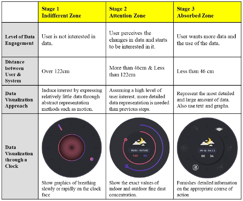
Thus, we propose a data visualization that predicts a user’s level of interest and adaptively presents the appropriate amount of data. In this research, we divided users’ interest levels into three stages, as shown in Table 1 below, to effectively visualize different levels of data.

Example of Visualization According to User Status (*The distance was determined based on the Proxemics theory)
In our system, different visualizations were applied, depending on the distance between the user and the system. For definitions of the distance between users and systems, we referred to the concept of proximity (Lipman & Hall, 1970). Proxemics is a theory about people’s understanding and use of interpersonal distance to mediate their interactions with other people or objects. The authors noticed zones suggesting certain types of interaction, from intimate to private, social, and public. The theory further describes how the spatial layout of rooms and immovable and movable objects influence people’s perception and use of personal space when they interact.
Based on proxemics and the different impacts of interpersonal distances, we designed a system that senses the distance to a user and visualizes data adaptively pursuant to the distance. When a user approaches the product, the system’s ultrasonic sensor measures the distance to the user’s location. Based on the distance detected, users are furnished with access to graphs comparing fine dust indoors and outdoors at the current time, enabling direct data comparisons. In addition, users can inspect detailed fine dust levels and action policies based on fine dust levels. As such, users can narrow their distance gradually, as they need more detailed data within their daily space, and receive further data step-by-step through corresponding actions.
• Stage 1> When the distance between the system and the user exceeds 122cm, we assumed that the users’ main intention is to check the current time. While it does, in fact, function as a time-telling device, the system was designed to stimulate interest in current air conditions through an ambient movement in the display. Depending on the indoor concentration data, the system shows graphics of breathing slowly or rapidly. The wide range in size and slow graphic motion on the clock face can express a calming sensation of breathing, indicating that the fine dust level in the space is good. On the other hand, by expressing a sensation of being short of breath through graphic motion, using fast and narrow and fast movement, the system informs users of the immediate need to ventilate, due to the high concentration of fine dust inside the room.
• Stage 2 > The system provides more data when the system-to-user distance is less than 122cm and greater than 46cm. In this stage, the system shows the exact values of indoor and outdoor fine dust concentration.
• Stage 3 > When the distance between the system and the user falls short of 46cm and users pull down the switch on the clock, the system provides more data, such as the guidelines to protect against fine dust. It furnishes detailed information on the appropriate course of action in the current situation, such as opening a window or wearing a mask.
Accordingly, we expected that users may be able to perceive changes in fine dust data, recognize the desired data as needed, and take appropriate action accordingly.
3. 2. Design Implementation
By connecting Arduino and Processing (https://processing.org/) application, we implemented a system that is capable of adaptively visualizing fine dust levels. A display and various sensors were included in the structure of a clock, thereby rendering a system that appears to be a typical everyday object.
We used a fine dust sensor (PMS7003), connected to an Arduino motherboard, to assemble fine dust levels inside a building, after which the data was sent to the Processing application. Additionally, we used an openAPI, provided by the Korean government, in the application to gather data on fine dust levels outside a building. By using processing, two data output streams were presented through a device with the outward appearance of a clock.
An ultrasonic sensor (RCW-0001), connected to the Arduino board, was used to measure the distance between the user and the system and to display different visualizations, depending on the distance.
Regarding visual style, such as movement and color, the system was designed to retain the shape of a typical wall clock, harmonizing with other everyday objects in each given space.
4. Discussion
We gathered design requirements by conducting interviews and introduced the concept of user-adaptive data visualization through everyday objects in this study. In this section, we compare our design approach with those taken by existing studies and discuss further research issues.
4. 1. How Data Can be Visualized in Everyday Environments
There have been studies on how to empower users by providing them with better ways to interact with data in everyday environments, using physical objects(M.-H. Lee, Cha, & Nam, 2015; M.-H. Lee, Son, & Nam, 2016; Moon-Hwan Lee & Nam, 2016). The motivation of previous studies was the difficulty that most users had in making sense of the data as it was provided through typical websites or mobile applications.
For instance, Physikit provides physical and embedded ambient data visualizations, which visualize one data source through physical dynamic output (Houben et al., 2016). To visualize data abstractly in everyday environments, people can install PhysiCube to enable visualization of the data through light, vibrations, movement, or air flow.
There are also studies of systems that represent data in the form of typical objects. Quietto is an interactive desktop timepiece, made of concrete and wood, that represents users’ daily schedules through the physical movement of a clock hand and light (K.-R. Lee, Goh, & Park, 2017). Through the physical representation of a daily schedule and time the system has been found to help users comprehend and manage their schedules more intuitively. Bookly is designed to function as a lamp that announces the accumulation of a book’s pick-up time for reading through its vertical and horizontal physical movement of the head (Ju, Lee, Kim, & Park, 2019). Bookly aims to encourage the reader to open a book by exposing the current book being read and physically visualizing the duration of reading-related activities.
This data visualization approach has the potential to leverage active perception, become interactive, and evolve into a valuable component of the user’s physical world to make data accessible. However, existing cases tend to focus on abstract representations that are not necessarily connected to the original data. As the information granularity is low (Oscar et al., 2017), the need to obtain detailed data through other media, such as websites or applications, represents a drawback.
Our research and previous studies share the function of utilizing physical objects to visualize data in a day-to-day environment. However, to overcome the characteristic limitations of physical objects, we suggest using not only the physical form of the product, but also digital representations, as needed (Figure 3).

Concept of User-Adaptive Visualization through an Everyday Object
For example, our design prototype uses the general characteristics and affordances of a clock to present data abstractly, while displaying details like a mobile app using the face of a clock. Through the diversification of expression methods, it should be possible to improve users’ accessibility to data and provide proper amounts of data when necessary.
4. 2. How Data Can Be Adaptively Visualized
Although data visualization systems have improved, in terms of general usage and usability, they have traditionally been designed using a one-size-fits-all approach, ignoring individual users’ needs and context (Steichen, Carenini, & Conati, 2013).
To better assist each individual user and enable users to engage with data, recent research has started to investigate adaptive visualization approaches for tailoring visual representations to individual user parameters over the possibly long-term course of interaction, as the user’s interests, desires, motivation, context, and abilities may change.
There have been diverse approaches to adaptive visualization: data-centric adaptive visualization (Robertson, 1991), design time user modeling (Domik & Gutkauf, 1994; Treinish, 1999), and user-adaptive visualization (Steichen et al., 2013; Toker, Conati, Carenini, & Haraty, 2012).
Data-centric adaptive visualization focuses on selecting an appropriate representation, based solely on data attributes and a heuristic model indicating how easily the representation may be interpreted by users.
Task-specific visualization provides specialized interfaces and tools, matched to user goals and underlying visualization tasks, to support them. This approach focuses on creating a framework for visualization and application designers to produce more effective tools for specific domains.
User-adaptive visualization employs user modeling and monitoring to adapt visualizations to user context (Steichen et al., 2013).
Initial research on user-adaptive visualizations has already generated evidence of improved user performance (e.g., time on task and task accuracy), for instance by using click behavior to infer and adapt to suboptimal usage patterns (Gotz & Wen, 2009), or by leveraging a user’s visualization selections to infer and adapt to a user’s visualization expertise and preferences (Grawemeyer, 2006).
In terms of intervention mechanisms, these initial adaptive visualization systems have typically investigated recommending visualizations that are most suitable for the current task and/or appropriate for a particular user’s preferences and expertise.
Our approach of using everyday objects for adaptive visualization is a branch of user-adaptive visualization, in that it considers user context and provides personalized visualizations. However, the method we propose is not suited to situations that would benefit from a method that enhances the efficiency of specific professional tasks. In this study, we explored adaptive visualization as a solution to stimulate users’ interest in data and make data visualization harmonize with an everyday environment and daily user context.
As a further research issue, it is necessary to investigate how a system detects user context and predicts users’ intentions more precisely. In this study, we used distance to predict users’ interest in data. However, as studied in the context of proximity interaction (Marquardt, Diaz-Marino, Boring, & Greenberg, 2011; Zhou, Ferreira, Alves, Hawkey, & Reilly, 2015), it is important to identify an alternative and feasible way to determine the degree of people’s interest and their intentions. In the research on proximity interaction, orientation, location, direction, movement, pointing, and collision are suggested as key factors that decide proxemics. For example, if the system senses the direction of a person’s gaze, the system may be able to predict the user’s level of interest more precisely.
Further, although we have studied systems for individual users at present, we must also study user-adaptive visualization for groups of users. For example, when the current system is installed and used in a home or office, various people may have different intentions when they use it, thereby rendering a study on coping with such conditions necessary.
5. Conclusion
In this paper, we investigated the remaining challenges and opportunities to improve users’ engagement with data in an everyday context. By conducting interviews with frequent users of diverse platforms that provide real-time fine dust concentrations from different locations, we determined design requirements for visualizing data in an everyday environment. First, immediate access to information was important to attract users’ attention to data. Second, there was a need for different levels of information granularity, depending on the level of user interest. Last, we found that it is necessary to design data visualization in a style consistent with the characteristics and aesthetic style of the interior space.
Based on the study results and design requirements, we propose a data visualization system that squares with users’ everyday environments and context through the use of everyday objects. We provided a detailed illustration of the concept by designing an interactive clock that adaptively visualizes the fine dust concentration, according to the distance between the user and the system.
Of course, there are limitations in the research. In terms of the evaluation of the suggested concept, it is important to investigate the effects and sustainability of adaptive visualization systems that use everyday objects. Moreover, in this study we only sought to design a clock that visualizes data on fine dust as an example. As it is expected that people may make use of other datasets in different ways and that other products may result in different interactions with data, it is important to explore diverse types of datasets and everyday objects, as well as people’s experiences with them.
Despite several limitations, we expect this research to inspire designs for a system that recognizes usage context and visualizes the data appropriately, thereby inducing more people to engage with data in their everyday environments.
Acknowledgments
This work was supported by the National Research Foundation of Korea Grant funded by the Korean Government (NRF-2017R1C1B5018268).
Notes
Copyright : This is an Open Access article distributed under the terms of the Creative Commons Attribution Non-Commercial License (http://creativecommons.org/licenses/by-nc/3.0/), which permits unrestricted educational and non-commercial use, provided the original work is properly cited.
References
- Byungkeun, O., & Sungjung, K. (2008). Textbook of information design. Ahn Graphics.
- Domik, G. O., & Gutkauf, B. (1994, October). User modeling for adaptive visualization systems. In Proceedings Visualization' 94 (pp. 217-223). IEEE.
- Gotz, D., & Wen, Z. (2009). Behavior-driven Visualization Recommendation. In Proceedings of the 14th International Conference on Intelligent User Interfaces (pp. 315-324). New York, NY, USA: ACM.
-
Grawemeyer, B. (2006). Evaluation of ERST - An external representation selection tutor. In Lecture Notes in Computer Science (including subseries Lecture Notes in Artificial Intelligence and Lecture Notes in Bioinformatics).
[https://doi.org/10.1007/11783183_21]

-
Houben, S., Golsteijn, C., Gallacher, S., Johnson, R., Bakker, S., Marquardt, N., … Rogers, Y. (2016). Physikit. In Proceedings of the 2016 CHI Conference on Human Factors in Computing Systems - CHI' 16 (pp. 1608-1619). New York, USA: ACM Press.
[https://doi.org/10.1145/2858036.2858059]
-
Ju, S., Lee, K. R., Kim, S., & Park, Y. W. (2019, May). Bookly: An Interactive Everyday Artifact Showing the Time of Physically Accumulated Reading Activity. In Proceedings of the 2019 CHI Conference on Human Factors in Computing Systems (pp. 1-8).
[https://doi.org/10.1145/3290605.3300614]
-
Lee, K. R., Goh, G., & Park, Y. W. (2017, May). Quietto. In Proceedings of the 2017 CHI Conference on Human Factors in Computing Systems (2988-2992). New York, USA: ACM Press.
[https://doi.org/10.1145/3025453.3025670]
-
Lee, M. H., Cha, S., & Nam, T. J. (2015, April). Patina engraver: Visualizing activity logs as patina in fashionable trackers. In Proceedings of the 33rd Annual ACM Conference on Human Factors in Computing Systems (pp. 1173-1182).
[https://doi.org/10.1145/2702123.2702213]
-
Lee, M. H., Son, O., & Nam, T. J. (2016, June). Patina-inspired personalization: personalizing products with traces of daily use. In Proceedings of the 2016 ACM Conference on Designing Interactive Systems (pp. 251-263).
[https://doi.org/10.1145/2901790.2901812]
-
Lee, M. H. (2019). Challenges of designing with open data: The case of cultural data. Archives of Design Research, 32(3), 57-73.
[https://doi.org/10.15187/adr.2019.08.32.3.57]
-
Lee, M. H., & Nam, T. J. (2016). Possibility of Utilizing Digital Traces for Enhancing Emotional Values of Digital Artifacts. Archives of Design Research, 29(2), 65-77.
[https://doi.org/10.15187/adr.2016.05.29.2.65]
-
Lipman, A., & Hall, E. T. (1970). The Hidden Dimension. The British Journal of Sociology.
[https://doi.org/10.2307/589150]
-
Marquardt, N., Diaz-Marino, R., Boring, S., & Greenberg, S. (2011, October). The proximity toolkit: prototyping proxemic interactions in ubiquitous computing ecologies. In Proceedings of the 24th annual ACM symposium on User interface software and technology (pp. 315-326).
[https://doi.org/10.1145/2047196.2047238]
-
Munzner, T. (2009). A nested model for visualization design and validation. IEEE transactions on visualization and computer graphics, 15(6), 921-928.
[https://doi.org/10.1109/TVCG.2009.111]
-
Oscar, N., Mejia, S., Metoyer, R., & Hooker, K. (2017, June). Towards personalized visualization: Information granularity, situation, and personality. In Proceedings of the 2017 Conference on Designing Interactive Systems (pp. 811-819).
[https://doi.org/10.1145/3064663.3064704]
-
Robertson, P. K. (1991). A methodology for choosing data representations. IEEE Computer Graphics and Applications(3), 56-67.
[https://doi.org/10.1109/38.79454]
-
Steichen, B., Carenini, G., & Conati, C. (2013, March). User-adaptive information visualization. In Proceedings of the 2013 international conference on Intelligent user interfaces (pp. 317-328).
[https://doi.org/10.1145/2449396.2449439]
-
Toker, D., Conati, C., Carenini, G., & Haraty, M. (2012). Towards adaptive information visualization: On the influence of user characteristics. In Lecture Notes in Computer Science (including subseries Lecture Notes in Artificial Intelligence and Lecture Notes in Bioinformatics).
[https://doi.org/10.1007/978-3-642-31454-4_23]
-
Treinish, L. A. (1999). Task-specific visualization design. IEEE Computer Graphics and Applications, 19(5),72-77.
[https://doi.org/10.1109/38.788803]
-
Zhou, H., Ferreira, V., Alves, T., Hawkey, K., & Reilly, D. (2015, April). Somebody Is Peeking!: A Proximity and Privacy Aware Tablet Interface. Extended Abstracts of the ACM CHI' 15 Conference on Human Factors in Computing Systems, 2, 1971-1976.
[https://doi.org/10.1145/2702613.2732726]