The Visibility and Legibility of Roman Typefaces: A Review with Blur Simulation
Abstract
Background According to our previous study, Thai Typefaces (Part 1): Assumption on Visibility and Legibility Problems, we examined underlying stages in the visibility and legibility matters of the Thai typefaces where the results have provided the assumption for developing the glyphs of the Thai universal design font (UD font). However, studying the visibility and legibility of Roman letters has still been a necessity, as it represents the international language. Developing high visibility and high legibility of the Roman typeface is requisite for supporting the Thai UD font as well.
Methods The current study qualitatively initial tested the tolerance of Roman characters under blurred conditions. We applied seventy Roman fonts in the form of 'The Internal Relationship of Letters in the Feature Comparison Theory' in the same x-heights as stimuli, which simulated the low visual acuity at different blur levels.
Results The simulated condition suggests significant advantages and disadvantages of each Roman type concerning visibility and legibility. The results improved ideas and possible solutions, which may assist with the approach of designing high-performance Roman letterforms that contribute to the Thai UD font as a Roman character set.
Conclusions In order to improve the visibility and legibility of the Roman letterforms toward a UD font, the current pilot study conducted an investigation via blurred Roman types. The study revealed the advantages and disadvantages of several Roman letterforms, which suggest approaches to developing the Roman characters actively in low visual acuity conditions. The improvement involves manipulating the counter space of the Roman types and considering the letter key features.
Keywords:
Typeface Design, Letter Feature, Blurring Test, Visual Accessibility, Universal Design Font (UD font)1. Introduction
The refractive errors are the original cause of blurred vision (e.g., myopia [nearsightedness], hyperopia [farsightedness], and presbyopia) where eyeglasses can provide the correction. Besides, blurred vision (or blurry vision) can cause symptoms and more significant problems, such as neurological disorders or a potentially sight-threatening eye disease (Rodrigues, 2018). Eye diseases are ordinary among older adults where specific eye conditions cause low vision (e.g., cataracts, macular degeneration, diabetic retinopathy, and glaucoma) (Segre, 2017; Duffy, n.d.). Low vision is the term that refers to significant visual impairment with a visual acuity (VA) of 20/70 or less, and cannot be entirely solved to a reasonable level with eyeglasses, contact lenses, medical treatment, or surgery (Scheiman, Scheiman & Whittaker, 2007; Hellem, 2016; Segre, 2017). However, The U.S. Centers for Disease Control and Prevention (CDC) has defined significant visual impairment as presenting visual acuity of 20/40 or worse (Hellem, 2016).
Movement in typeface design and typography supports those people with impaired vision. Tiresias LPFont was designed based on legibility requirements of visually impaired people at the Scientific Research Unit of Royal National Institute of Blind People (RNIB) in London (MyFonts, 2001). Also, the American Printing House for the Blind developed a specific font family for low vision readers. APHont™ (pronounced ay’-font) helps the readers in terms of reading speed, comprehension, and comfort for large print users (American Printing House for the Blind, n.d.). Besides, an inclusive typography guideline was recommended by the Royal National Institute of Blind People (Wilkinson, 2005). It provides the approaches in typographic design for people with partial sight.
In Japan, awareness of Universal Design is enormous and quite extensive in every field of design. On the discipline of inclusive typeface design, notable examples of the Japanese Universal Design fonts were initiated by Iwata Corporation in association with Panasonic Corporation, which developed a font based on scientific evidence. Iwata' UD font was released in December 2006 as the first UD font for use as a corporate font of Panasonic Corporation (Ryu, 2015; Panasonic, 2017). Besides, Morisawa Inc. (including TypeBank Company) produced a Japanese UD font series, which has been proven through its performance with blur tolerance (Morisawa Inc., n.d.). There is also the FA UD Gothic font by NEC Corporation (NEC Corporation, n.d.), which was designed and tested in matters of readability, visibility, legibility, and display adequacy (Hakamada et al., 2011). These are examples of a new context of typeface legibility investigation in cooperation with academic designers and researchers who have been developing typefaces as test material and conducting experiments that employ evaluation methods by psychophysical scientists.
Several methods are employed in the legibility test. Tinker (1963) has described the methodologies in measuring the legibility of typefaces. Examples include examining the accuracy of letterforms which can be measured with short periods of exposure (short-exposure method), testing legibility of typeface factors concerning distance between the eye and the letterform (distance method), measuring performance of letterforms in various degrees of clearness from blurred to clear (focal variator method), counting the frequency of blinking while a participant is reading text (blinking method), measuring the time it takes an observer to read a set of given text (speed of reading), measuring the movements of the eyes while reading with corneal reflection and electrical signals (measurement of eye movements), and so on.
Traditionally, psychological studies on the legibility and visibility of typefaces have focused on visual letter recognition, and various traditional methodologies have been improved for examining typeface legibility. The short-exposure and distance methods were the most common and standard methods employed for examining letter identification and letter recognition. For instance, Banister (1927), Fisher, Monty, and Glucksberg (1969), Bouma (1971), Townsend (1971), Geyer (1977), and van der Heijden, Malhas, and van den Roovaart (1984) applied the short-exposure method, while Sanford (1888), Bouma (1971), Phillip, Johnson, and Browne (1983) employed the distance method.
Other studies, such as those of Brown (1963), Uttal (1969) and Loomis (1982) proved the legibility of types under low-visibility conditions. Notwithstanding, each of these reports suggested different findings, which may have been caused by using different typefaces. For example, Milloy (1978) reviewed the difference between the typefaces, which Geyer (1977) and Bouma (1971) applied in their studies and their variance in methodology.
In order to examine the legibility of a typeface, most psychological studies have focused on a few typefaces. For instance, some quantitative research (as mentioned above) tested the comparative legibility of a single font, or at least two different typefaces, e.g., the serif and sans serif fonts. However, no study has inclusively investigated the performance of various Roman typeface categories at the same time. According to Punsongserm, Sunaga, and Ihara (2017), the existence of qualitative research as an initial study is an effective way of preliminary verifying and defining certain assumptions, and suggesting avenues for further research. The current study has sustained this opinion.
The present study aimed to qualitatively investigate the visibility and legibility of the different Roman letterforms throughout simulating conditions of low visual acuity. The findings will suggest an understanding of the advantages and disadvantages of Roman letterforms under the blur simulation. It suggests proper introductory approaches to improve the Roman letterforms based on a universal design viewpoint, providing certain assumptions for further study.
To understand the legibility of the Roman letter (also called Latin letter), realizing the importance of the terminology of Roman type anatomy involves various aspects of letters. Figure 1 exhibits some parts of a letter and terms that are referred to in this study.

Roman typeface terminology
2. Method
To simulate the conditions of low visual acuity, Arai et al. (2010), Legge, Pelli, Rubin, and Schleske (1985), and Nakano et al. (2010) employed a wide view ground glass filter. Also, Hakamada, Ohya, Sakai, Sakurada, and Tomomi (2011), Panasonic Corporation (2019), and Waleetorncheepsawat, Pungrassamee, Ikeda, and Obama (2013) applied pseudo-cataract experience goggles. Besides, Yamamoto & Yamamoto (2000) applied the blur simulation by computer software for testing the performance of Japanese fonts, while Punsongserm et al. (2017) used this method for examining the underlying stages in the legibility and visibility of various Thai typefaces.
According to the previous study of Punsongserm et al. (2017), the current study adopted their method for investigating the visibility and legibility of various Roman letterforms throughout the computer software, which simulated blurred vision. This method allowed the most effortless process of predicting legibility in the condition of low visual acuity.
2. 1. Materials
From 1954, Vox’s classification system, proposed by French Maximilien Vox, has been widely adopted for clarifying and expanding the typeface classification in the present day. Vox’s classification is comprised six categories, including Humanist (Venetian), Graralde (Old face), Transitional, Didone (Modern), Slab-serif (Egyptian), and Sans-serif (Lineale) (Poheln, 2015). The first four categories (i.e., Humanist, Graralde, Transitional, and Didone) are based on a historical letter classification, while the others (i.e., Slab-serif and Sans-serif) have focused on the characteristics of appearance (Hill, 2005). Thereafter, in 1962, the Vox System was recognized as a formula by the Association Typographique Internationale (ATypl), and it was extended into ten categories, by appending the Glyphic, Script, Graphic, and Gothic categories (Poheln, 2015).
Although it may be a better approach to classify numerous typefaces in a chronological way, in order to avoid the problem of typeface classification, this method may be unfeasible when it reaches the contemporary design period (Coles, 2012).
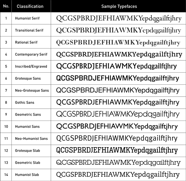
Coles (2012) has suggested a model of type classification that approaches the visual appearance of typefaces. The current study adopted fourteen categories based on the Coles’ classification (i.e., Humanist Serif, Transitional Serif, Rational Serif, Contemporary Serif, Inscribed/Engraved, Grotesque Sans, Neo- Grotesque Sans, Gothic Sans, Geometric Sans, Humanist Sans, Neo-Humanist Sans, Grotesque Slab, Geometric Slab, and Humanist Slab), and it excluded the Script category. Moreover, this study also employed other Roman fonts that are not in the abovementioned categories, as well as the Japanese universal design fonts, which included Roman characters. A total of seventy fonts were tested. Table 1 shows a sample of the Roman typefaces for blurring tests.

Fourteen sample Roman typefaces selected for testing
The seventy Roman fonts were tested in the form of 'The Internal Relationship of Letters in the Feature Comparison Theory.’ This table was proposed by Sofie Beier (Beier, 2009; Beier, 2012) to assist in a comparison of the legibility of letters. In this study, the images of the table were reproduced with different levels of blurring applied. Figure 2 illustrates an example of the Roman characters in ‘The internal relationship of letters in the feature comparison theory’ that exhibit a comparison of being similar to or the same as the characters’ group.

Upper: The pattern of the internal relationship of letters in the feature comparison theory illustrated in FF DIN (adapted from Beier, 2009; Beier, 2012). Lower: An example of the types set in the blur simulation. 2.
Legge and Bigelow (2011) state that “The common typographic measure is the ‘point’, which has had different definitions over the centuries in different countries.” They suggest that “Measures of x-height provide a convenient metric, being familiar to typographers and vision researchers. Easy transformations exist for conversion of x-height between physical size and visual angle”. Likewise, despite being set at the same point size, the heights of conventional Thai fonts vary. Accordingly, we selected two levels for the height of lowercase /x/ in order to equalize the heights of all other characters within a given font. The x-heights selected are 2.5 mm (7.087 pixels) and 5 mm (14.173 pixels), which represent an average small font size and large font size. The conversion to visual angle (VA) in degrees from physical print size, VA = 0.3575 of 2.5 mm, VA = 0.715 of 5 mm, for a viewing distance of 400 mm. The x-height of 2.5 mm was correlated as a representative of a manifest point size for Roman fonts, which range between 11.1 to 21.3 points when set at the same font size. The x-height of 5 mm was correlated as representative of a quite large point size for Roman fonts, with heights ranging from 22.2 to 42.6 points, when set at the same font size. (See also Appendix 1: A comparison of point sizes in the Roman fonts using the same x-height).
According to Fisher, Dawson-Howe, Fitzgibbon, Robertson, and Trucco (2005), “a 'Gaussian blur' or ‘Gaussian smoothing’ is an image processing operation aimed to attenuate image noise, computed by convolution with a mask sampling a Gaussian distribution,” and “low pass filters are a kind of smoothing or noise reduction filter.” Similarly, a ‘Gaussian blur’ in image processing is a low pass filter that is applied to decrease the image noise and to reduce the detail by various graphics software. This blurring technique allows the visual effect of a smooth blur resembling that of viewing the image through a translucent screen. Applying a Gaussian blur has the effect of reducing the image’s high-frequency components, and it is distinctly different from the ‘bokeh effect’ produced by an out-of-focus lens (Shanthini & Mahalakshmi, 2016; CodePlex Archive, n.d.). Accordingly, it seems likely that the Gaussian blur may be explained as a low-pass spatial frequency filter similar to the ground-glass diffusers employed in the studies of Legge, Pelli, Rubin, and Schleske (1985) and Nakano et al. (2010).
Likewise, the study of Punsongserm et al. (2017) simulated the low visual acuity conditions of the Gaussian blur filter by blurring the selected Roman fonts using the Gaussian blur effect on Adobe Illustrator CC, Windows 7. In current study, the levels of blur were defined to 6, 8, and 10 pixels (i.e., the standard deviation of Gaussian function: 2.08, 2.78, and 3.47 mm, respectively) for the x-height of 2.5 mm (7.087 pixels), and 12, 15, and 18 pixels (i.e., standard deviation of Gaussian function: 4.17, 5.21, and 6.25 mm, respectively) for the x-height of 5 mm (14.173 pixels). The blur levels were approximately proportional to the x-heights.
In terms of visual acuity levels: For x-heights of 2.5 mm, we assumed the blur level of 6 pixels as parafoveal vision (moderate blur) and another as peripheral vision (very blur); for x-heights of 5 mm, the blur level of 12 pixels as parafoveal vision and another as peripheral vision were assumed. Under the simulated visual acuity conditions, when the standard deviation of the Gaussian Blur Filter is 6 pixels, and the viewing distance is assumed to be 400 mm, this blur corresponds to the visual acuity of 0.03.
2. 2. Procedure
The blurred the-internal-relationship-of-letters tables were printed via a laser printer onto uncoated paper, using a grayscale resolution of 300 dpi. The blurred types were observed by ourselves, focusing on visibility and legibility.
3. Results and Discussion
Overall results suggest that most of the Roman typefaces at 2.5 mm of x-height could endure blurring at the level 6 pixels but started to have clarity issues at level 8 pixels. In the blur of 10 pixels, most characters could not be identified; only those with a simple form (e.g., /O/, /V/, /A/) could be identified.
While most of the Roman typefaces at 5 mm of x-height could endure blurring at level 12 pixels, clarity is compromised at levels 15 and 18 pixels. However, the test on the x-height 5 mm of all typefaces has discovered a problem somewhat fewer than the test on the x-height 2.5 mm. It is possible that the size of the characters at the x-height 5 mm was more likely than the characters at the x-height 2.5 mm. Hence, the results and discussion will focus mainly on the examples provided, and they will be based on the findings from the study of an x-height of 2.5.
3. 1. The Visibility of Roman Typefaces
Visibility depended not only on the aspect of key features character, i.e., the positive space, but also on both the closed and opened counters, i.e., the negative space. Importantly, these findings will provide a review that focuses on the counters.
Character /Q/
As shown in Figure 3, the capitals /Q/ of Arnhem-LF-Blond (Q1), Bodoni MT (Q2), Modern No. 20 (Q3), and Verdana (Q4) provided both clarity and stylishness, while TheSans Plain (Q5) and Fedra Sans Std (Q6) exhibited acceptable visibility. The quite heavy tail terminal of Optima LT Std (Q7) might protect the shrinking of the tail in the blurred view. The capitals /Q/, which is remarkable, may be PT Sans (Q8) because it has a tail that is not connected with the main structure (i.e., O form) and that enhances clarity, both in terms of visibility and legibility.

The visibility of the blurred characters /Q/, /P/, /p/, /b/, and /B/
In contrast, it seems that the capitals /Q/ in the group of Gothic Sans, such as New Gothic (Q10) and Whitney (Q11), as well as A-OTF UD Shin Go Pro (Q9), had a lower visibility, but with inferior capitals /Q/ among the group of the serif font. In other words, /Q/, of New Gothic, a tail that was drawn from its inner-counter, did not contribute for better visibility. /Q/ of Whitney and Gill Sans MT (Q14) exhibited a black spot at the connected corner because they were excessively short for their diagonal right tails. Besides, /Q/ of the ITC Lubalin Graph (Q13) was obscured within its counter.
Character /P/
The aspect of the counter of /P, p/ (Including b, d, and q) in Verdigris MVB TF (Pp1) may improve visibility, similar to /P/ in Cronos Pro (Pp2), which had an open-counter for capital /P/ (see Figure 3), This feature could be adopted for character /R/ as well. The open counter of /b/ (at the top link) may increase differentiation between the letter /h/. A quite narrow form of /P/ in Albertus Medium (Pp3) had lower visibility, contrary to the form of /P, p/ in I-OTF-UD Minchō Pro (Pp4), which had a sufficient counter; thus, improving internal visibility with its counter (see Figure 3).
Character /B/
As shown in Figure 3, the characters /B/ in Baskerville Old Face (B1) and Mrs. Eaves (B2) have advantages in their sizes of the lower lobes, which are larger than their upper lobes, and over the size that corrected the illusion effect. The character /B/ in Albertus (B3) can have degraded visibility caused by the narrow width of its bowls. The character /B/ in I-OTF-UD Minchō Pro (B4) exhibited superior visibility within its counter. A letterform that has a waist and a broader character width than the numeral /8/ may aid in desirable visibility.
Character /C, c/
The visibility problems of characters /C, c/ are also involved in the issue of legibility intimately. A negative space (counter) is significant for the character /C, c/; therefore, defining the aperture magnitude as much as possible would improve the character /C, c/ in accordance with the appearance of characters /C, c/ Albertus (Cc3) and UD fonts (e.g., Cc4, Cc5, and Cc6), as shown in Figure 4.

The visibility of the blurred characters /C/, /c/, /E/, /F/, /m/, /M/, /W/, /w/, /K/, /k/, /s/, /f/, /t/, and /r/
Characters /E/ and /F/
A broader character width, a long central arm, and an identical arm length (upper arm and central arm) for the characters /E/ and /F/ can contribute to visibility. An excellent representative feature is shown in Figure 4: e.g., Neue Helvetica (EF1); Microsoft Sans Serif (EF2); and TBUD Goshikku Std (EF3).
In contrast, the unacceptable visibility characters were evident in Franklin Gothic Book (EF8) and New Gothic (EF7), particularly Interstate (EF6), which had a shorter central-arm than other characters (e.g., EF1, EF2, and EF3) (see Figure 4). Although the existence of equal arm length in the characters /E/ and /F/ could retain clarity while they were blurred at 6 pixels of blurring, they revealed a confusion at 8 pixels of degree, e.g., TBUD Goshikku Std (EF9) (see Figure 4).
Characters /m/ and /M/
As shown in Figure 4, character /m/ requires more negative space (wider character width). Moreover, character /m/, which has somewhat fewer counters, may cause a problem concerning visibility such as the character /m/ of PT mono (m1), when compared with /m/ of Verdana (m2), which exhibited better visibility.
Both /M/ of Whitney (M6) and Myriad Pro (M7) demonstrated as a concrete form with a diagonal front stem and diagonal back stem. This feature may provide higher visibility than character /M/ with vertical front stem and vertical back stem. Besides, it seems likely that /M/ of Heron Serif (M1), Grotesque slab, indicated poor visibility as having a base serif affected its aperture.
According to the letterforms /M/ of A-OTF UD Shin Go Pro (M8), and ITC Kabel LT Book (M9), they included a diagonal front-back stem, while the glyphs /M/ of DFUD Goshikkukarada W4 (M3) and TBUD Goshikku Std (M4) consisted of a vertical front-back stem together with having a higher position of the vertex. Both features can provide superior visibility. Therefore, it should be noted that the use of diagonal front-back stems with high vertex position improves visibility in the character /M/. See also Myriad Pro (M7) versus Verdana (M5).
Character /W, w/
A character with sophisticated strokes such as /W/ of Garamond Premier Pro (Ww1) and ITC Kabel LT Book (Ww2) may be the cause of inefficient visibility, unlike /W/ of Fedra San (Ww3), which may enhance excellent visibility better than the other /W/; see Figure 4.
However, a lowercase /w/ of ITC Kabel LT Book (Ww2) provided acceptable visibility because it had a broader degree of angle, which can apply this feature to a capital /W/. Furthermore, a lower apex position should be provided to have superior visibility.
Character /K, k/
As shown in Figure 4, the characters /K,k/ of Microsoft Sans Serif (Kk1) and FF DIN (Kk2) had an arm that connected to the lower stem, defining the connection of a leg to the arm directly, without connecting to the stem. This aspect is different from other typefaces that are connected with the center of the stem, e.g., /K,k/ of Syntax LT Std (Kk3). Although the prior feature may enhance more visibility, the latter feature may prevent confusion for the letter /h/.
Additionally, the features of /K, k/ in Roboto (Kk4) and PT Mono (Kk5) may have satisfactory visibility because there is a horizontal crossbar connecting the stem at the angle of the diagonal converged strokes, as shown in Figure 4.
Character /S, s/
The character /S, s/ of I-OTF-UD Go Hyōji Pro (s1), TBUD Goshikku Std (s2), and Hiragino UD Kakugo Std (s3) provide acceptable visibility with their terminals, which include a slightly horizontal line.
Even though the importance of character width in character /S, s/ may not have more effect in terms of legibility, in terms of visibility, the width should perhaps be considered. In other words, character /S, s/ with its narrow character width may have lower visibility, particularly in low visual acuity conditions, similar to Trajan Pro (s4) in Figure 4. Thus, it should be noted that a broader character width is a key feature that supports visibility in character /S, s/.
Besides, the character /S, s/ in serif style exhibits poor visibility. That is, when these characters are blurred, the negative space also decreases. Therefore, the absence of serifs and curve terminals is the optimal letterform for low visual acuity conditions.
Characters /f/ and /t/
As shown in Figure 4, a higher crossbar of characters /f/ and /t/ in Franklin Gothic Book (f1, t1) and Neue Helvetica (f2, t2) may be a cause for lower visibility. Therefore, the use of a low crossbar may be a more appropriate approach, as well as utilization of the length of a hook (f) and a tail (t), which could provide acceptable visibility. The length of the right-crossbar for the character /t/ should be shorter than the length of the left-crossbar.
Character /r/
A notch and branch of the character /r/ are more significant for visibility. The finding suggests that having the lower connection for the branch and stem may provide desirable visibility, while the presence of a proper length of the branch may encourage to identify the character /r/.
Character /a/
The two-storey /a/ of humanist sans typefaces which had insufficient space of a closed counter revealed a solid space inside the counter, e.g., Gill Sans MT (a1), Syntax LT Std (a2), and Cronos Pro (a3), as shown in Figure 5. Resolving this issue may require specifying an adequate character width together with having more apertures opened.

The visibility of the blurred characters /a/, /A/, /e/, /R/, and /g/
Character /a/ of Albertus (a4), Figure 5, as well as Franklin Gothic Book (a5) and Neue Helvetica (a6), had excessive narrow character width and displayed a solid space inside its closed counter while it was blurred.
The one-storey /a/ of Geometric Sans was either blurred or showed in a diminutive size. It may be confused with the lowercase /o/ easily, see ITC Lubalin Graph (a7), Figure 5.
Character /A/
In the case of the sans serif typeface, using a higher bar position–see Neue Helvetica (A1), FF Meta (A2), and Optima LT Std (A3)–may cause partly insufficient visibility within the closed counter. However, defining the feature of a lower bar position may produce superior visibility, as shown in Figure 5; FF DIN (A4), Amplitude (A5), and TheSans Plain (A6).
Character /e/
As shown in Figure 5, the character /e/ has a small eye, that is, /e/ of Interstate (e1) and Lexicon No.1 (e2) both showed a black spot while they were blurred. It is highly possible that this causes confusion with the letter /c/. In the same way, the existence of a diagonal bar may assist in creating a sufficient opened counter; nevertheless, this feature may not be as advantageous for acceptable visibility as ITC Kabel LT Book (e3).
Furthermore, in Figure 5, the finding suggests that some characters such as /e/ of Neue Helvetica (e4) and Myriad Pro (e5) may encounter visibility problems due to having a small aperture, as well as Albertus Medium (e6) and Knockout-HTF31 (e7), which have a rather narrow character width.
Besides, as shown in Figure 5, the character /e/ of Fedra Serif A Pro (e8) had a characteristic of a bigger aperture, which contributes to superior visibility, like /e/ of Hiragino UD Minchō Std (e9). However, /e/ of NUD Motoyashīda Std (e10), which had a narrower character width than others, displayed poor visibility.
To improve the character /e/, it should provide a considerable eye size (i.e., closed counter) and manipulate to an outstretched terminal for an advantage of the aperture.
Character /R/
As shown in Figure 5, character /R/ of Albertus Medium (R1) exhibited somewhat low visibility caused by having a narrow character width and a bold stroke weight. Character/R/ of I-OTF-UD Go Hyōji Pro (R2) with a small closed counter made confusion with the letter /A/, in comparison to /R/ of I-OTF-UD Minchō Pro (R3) which had a broader closed counter, see Figure 5.
For distinctiveness of the glyph, which may enhance being of /R/ and provide preferable visibility is the presence of a straight diagonal leg and a considerable counter such as the leg of Mrs Eaves (R4), including character /R/, which had the whole opened-counter as ITC Lubalin Graph (R5) did, see Figure 5.
Character /g/
A character /g/ in the humanist serif style, which had double-closed loop (an upper and lower of the closed-loop) may be a determinant for unacceptable visibility, Figure 5, see Adobe Jenson Pro (g1), Lexicon No.1 (g2), and Garamond Premier Pro (g3); nevertheless, the presence of an apparent ear can encourage an ability for identifying letters of readers, see Filosofia OT (g4). Also, an open loop of /g/ in FF Meta (g11) might enhance for positive visibility.
A character /g/ in the sans serif style, Figure 5, such as Knockout-HTF31 (g5) and Franklin Gothic Book (g6) somewhat demonstrated poor visibility within both counters, particularly the lower closed loop.
Although a character /g/ in the geometric sans style had a minimal letterform, e.g., ITC Kabel LT Book (g7) and FF DIN (g8), Figure 5, it could be confused with the numeral /9/ easily.
As shown in Figure 5, in the case of negative space (opened counter), /g/ of TBUD Goshikku, Std (g9) demonstrated somewhat unacceptable visibility. In contrast, /g/ of UD Taiposu 510 Std R (g10) provided an acceptable visibility.
3. 2. The Legibility of Roman Typefaces
In the results, we categorized the letterforms concerning the relative legibility into groups of similar form focused on confusing pair letters, including round form, round-square form, square form, vertical form, hook-vertical form, diagonal-square form, diagonal form, and branched form (Cheng, 2005).
/G/→ /C/
In some serif typefaces, if the character /G/ has too short of a throat, it may cause confusion with the capital /C/, see Figure 6, e.g., Baskerville Old Face (G1) and Garamond Premier Pro (G2). On the other hand, if the character /G/ has excessive throat length, it will be close to the upper terminal. It can be perceived aFs a capital /O/ in Times New Roman (G3), in accordance with the finding of Tinker (1928), which examined a low contrast Didone typeface with the short-exposure test.

The legibility of the blurred characters /G/, /C/, /c/, /e/, /S/ /R/, /D/, and /g/
Also, in accordance with the results of Banister (1927) and Townsend (1971) concerning the short-exposure test, there is a high possibility that having a short line or a lower chin in the character /G/ causes confusion with the letter /C/. This presumption is represented in Interstate (G4), as well as in the character /G/, which has an unconnected serif (without a chin) such as in Fedra Serif A Pro (G5) and Fedra Sans Std (G6), see Figure 6. Besides, it also found that Neue Helvetica (G7) had a tendency similar to capital /Q/, Figure 6, evident at 8 pixels of blurring. This trouble may be affected by its spur, which displayed a black spot, this corresponding to the findings in the distance test of Phillip et al. (1983), and the blurring-by-diffusion test of Loomis (1982).
The results suggested that the presence of serif at the upper terminal of /G/ and /C/ might assist in preventing a connection between upper and lower terminals.
Capital /C/
As shown in Figure 6, a thick-and-thin-stroke of /C/ in Garamond Premier Pro (C1) might assist in stabilizing for letter /C/, even though both terminals have the serif. The slenderized stroke at the terminals of Bodoni MT (C2) might decrease connecting of the terminals; besides, designing for the terminals that are entirely diverged, may decrease the connection, and cause it to have more aperture, such as Albertus Medium (C3), I-OTF-UD Go Hyōji Pro (C4), NUD Motoyashīda Std (C5), and TBUD Goshikku Std (C6).
/c/ → /e/
The result of the current study is similar to the findings of the prior distance studies such as the works of Sanford (1888) and Bouma (1971), as well as the study among the short-exposure test such as Tinker (1928), Geyer (1977), Bouma (1971), Dockeray and Pillsbury (1910). A lowercase /c/ with a ball terminal or a teardrop terminal may tend to be similar to /e/, which has a small eye such as Baskerville Old Face (ce1), Adobe Caslon Pro (ce2), Filosofia OT (ce3), Century Schoolbook (ce4), and ArnhemLF-Blond (ce5), as shown in Figure 6. This case is also related to visibility.
On the other hand, the appropriate approach may coincide with the designing letterforms /c/ and /e/ of I-OTF-UD Go Hyōji Pro (ce6), as a sans serif style.
/S/ → /8/
A beak of character /S/ in serif style may cause similarity with a numeral /8/, for example, Modern NO. 20 (S1) at the 8 pixels of blurring displayed as the numeral /8/, Figure 6. In contrast, the characters /S/ of Albertus Medium (S2), Whitney (S3), and TheSans Plain (S4) can provide acceptable legibility due to avoidance of the curved terminals. Likewise, a character width may not affect legibility, as when the narrow character width of /S/ in Gill Sans MT (S5) is compared with the broader character width of /S/ in Verdana (S6), see Figure 6.
/R/ → /A/
It seems likely that defining a feature of the leg in the character /R/ is more significant for identification. As shown in Figure 6, a vertical leg of Knockout-HTF31 (R1) tended to be confused with /A/ (diagonal form), which differs from the diagonal leg of Mrs Eaves (R2). This finding corresponds to the study of Phillip et al. (1983), which employed a distance method to test the Helvetica typeface. In other words, using a diagonal leg may be an optimal approach for enhancing legibility in the character /R/, together with the presence of the large counters (upper part of /R/, bowl).
/D/ → /O/
The roundish character /D/ tends to become the letter /O/, see Figure 6, and is compared between Knockout-HTF31 (D1) and Albertus Medium (D2). Thus, an optimal approach for designing /D/ should determine a somewhat narrow character width, along with adding a bracketed serif on the top and bottom of the stem of the character /D/. The confusion with letter /O/ in the present study corresponds to the studies of Townsend (1971), Banister (1927), Loomis (1982), and Fisher et al. (1969).
/g/ → /8/, /9/
The serif /g/ is often confused with the numeral /8/ while the sans /g/ is often confused with the numeral /9/. A feature that contributes to identifying character /g/ is its ear, which requires distinctiveness for designing.
/E/ → /B/
A serif of /E/ could produce a connecting line while they were blurred. In contrast, a sans serif character /E/ can provide both better legibility and visibility. For instance, Figure 7, Adobe Jenson Pro (E1), Georgia (E2), and Times New Roman (E3) are compared with Microsoft Sans Serif (E4) and FF DIN (E5).

The legibility of the blurred characters /E/, /F/, and /H/
/F/ → /P/
In accordance with the results of Tinker (1928), which tested a low contrast Didone type, a serif character /F/ may cause confusion with the letter /P/ (round-square form), see Figure 7, Georgia (F1), as well as /F/ in geometric slab style as Rockwell (F2). Therefore, a sans serif /F/ may be more suitable than a serif /F/ such as FF DIN (F3) and Roboto (F4), Figure 7. However, the prior short-exposure tests showed that the confusion occurred in the sans serif types, e.g., Banister (1927), Van der Heijden et al. (1984), and Fisher et al. (1969), along with the study of blurring by diffusion of Loomis (1982), which examined Helvetica Extra Light.
/H/ → /M/
As shown in Figure 7, a character /H/ with a narrow character width, which has a shorter bar, might be mistaken for the letter /M/, in accordance with the finding of Phillip et al. (1983); see FF DIN (H1). Consequently, a character /H/ with a more extended bar may have enhanced legibility and visibility; see Gill Sans MT (H2). For the character /M/, a front stem and a back stem (which is defined as a diagonal stem) should be an optimal approach to distinguish it from the character /H/ entirely and obtain acceptable visibility.
Lowercase /l/ → Capital /I/
For most serif typefaces, this occurs despite the difference in detail between a lowercase /l/ and an uppercase /I/. However, as seen in Figure 8, the pair is likely to become confused due to their similar characteristics, such as in Verdigris MVB TF (lI1). Likewise, in some paired letters with different features, they still cannot be distinguished easily, as seen in Figure 8, with Albertus Medium (lI2), Heron Serif (lI3), and Gill Sans MT (lI4).

The legibility of the blurred characters /l/, /I/, /j/, /i/, /J/, /t/, and /f/
Confusion between a lowercase /l/ and an uppercase /I/ is a common problem in the design glyphs of the sans serif category. Both characters are very similar and have only a slight distinction in character height, such as in I-OTF-UD Go Hyōji Pro (lI5), NUD Motoyashīda Std (lI6), Myriad Pro (lI7), and Cronos Pro (lI8), shown in Figure 8. However, designing uniqueness for a sans serif of uppercase /I/, the slab serif is usually enhanced for assisting in distinguishing it from a lowercase /l/ such as Verdana (lI9) and Heron serif (lI3), Figure 8.
Also, in order to enhance a distinctiveness for a lowercase /l/, some typefaces have designed a curved line as the base of a stem such as FF Meta (lI10), FF DIN (lI11), and A-OTF UD Shin Go Pro (lI12), see Figure 8. However, an acceptable efficacy has not been found in the blurring view, like the glyphs of ITC Officina Serif (lI13) and PT Mono (lI14) exhibited the distinctiveness of the lowercase /l/.
To improve a lowercase /l/, we should manipulate its tail for a more massive tail, some tail features of any uppercase /J/ may be adapted and then inverted to a lowercase /l/ such as shown in Figure 8, Whitney (J→l1), FF DIN (J→l2), Myriad Pro (J→l3).
In the case of a dot of /j/ and /i/, and a tail of capital /J/
For the dots of a lowercase /j/ (hook-vertical form) and a lowercase /i/ (vertical form), arranging a dot too close to a stem may cause recognition error. In other words, a lowercase /i/ may appear either a lowercase /l/ (vertical form) or an uppercase /I/ (square form), in accordance with the results of Sanford (1888), Bouma (1971), Tinker (1928), and Geyer (1977). Similarly, this problem may occur with a lowercase /j/, which has a shorter tail.
Furthermore, for example, an unsatisfactory tail of the Minion (J1) may be confused with an uppercase /I/ while a satisfactory tail of Adobe Jenson Pro (J2) demonstrated excellent legibility as shown in Figure 8. Moreover, in Figure 8, an uppercase /J/, which has a ball terminal such as Filosofia OT (J3), as well as a larger hook of the uppercase /J/ such as Knockout-HTF31 (J4), Interstate (J5), PMN Caecilia (J6), PT Mono (J7), TBUD Goshikku Std (J8), and NUD Motoyashīda Std (J9), may have better legibility.
/t/ → /c/
If a right-crossbar of character /t/ (hook-vertical form) has excessive long may be caused for confusion as letter /c/ (round form), see the characters /t/ of Adobe Jenson Pro (t1) and Gill Sans MT (t2) Figure 8. To solve this problem, providing a right-crossbar for a slight length and arranging a position of a crossbar for a lower position which will enhance a more length of an ascender. This approach may be the proper way to improve the legibility for the character /t/, see Figure 8, the designs of Syntax LT Std (t3) and ITC Lubalin Graph (t4).
/f/ → /t/
It should be noted that the hook of the character /f/ (hook-vertical form) is a significant feature and contributes to indicating the letter /f/. If any type of character /f/ has an excessive short hook, it tends to be similar to the character /t/, corresponding to the findings of Bouma (1971) and Tinker (1928). The example of Adobe Caslon Pro (f1) and FF DIN (f2) compared the differences between the two hook aspects, Figure 8.
/Y/ → /V/
A significant cause of recognition error is that the character /Y/ is similar to the character /V/ (diagonal form) due to the stems being too short (i.e., less than a half of a capital height) in accordance with the study of Loomis (1982), Tinker (1928), Banister (1927), and Phillip et al. (1983). An example of Gill Sans MT (Y1) and NUD Motoyashīda Std (Y2), see Figure 9, exhibited a comparison between an acceptable stem and an unacceptable stem, respectively. Besides, increasing the degree of angle of the diagonals (i.e., widened angle) could retain clarity of letterform /Y/ in low visual acuity conditions.

The legibility of the blurred characters /Y/, /K/, /k/, and /h/
/K, k/ → /h/
As shown in Figure 9, the tapered arms of an uppercase /K/ and a lowercase /k/ in Bodoni MT (k1) might be confused with a character /h/ (branched form) in accordance with the finding of Tinker (1928). Likewise, an arm that is not apparent, e.g., Baskerville Old Face (k2), can diminish legibility under low visual acuity conditions. However, the design of Grotesque Sans might provide better legibility, see Franklin Gothic Book (k3) and Neue Helvetica (k4), Figure 9.
/y/ → /v/
The current results correspond to the findings of Tinker (1928), Sanford (1888), Geyer (1977), Dockeray and Pillsbury (1910). A length of the insufficient tail and having a lower vertex in character /y/, such as Amplitude (y1) and NUD Motoyashīda Std (y2), see Figure 9, might cause confusion with letter /v/. To improve legibility, adding a considerable tail length or giving some features of a terminal (e.g., a slight horizontal line or a ball terminal) may encourage an acceptable tail.
/h/→ /b/
In accordance with the findings of Sanford (1888), Dockeray and Pillsbury (1910), and Tinker (1928), the foot-serif has an influence on the stability of a character /h/. In other words, as shown in Figure 9, they can create a connected line, causing confusion with the letter /b/, e.g., Adobe Jenson Pro (hb1). As shown in Figure 9, Bodoni MT (hb2) displayed ambiguity at the 6 pixels of blurring level and then became the same at 8 pixels of blur level.
For improving a character /h/, an outer half-serif in slab may be added to the base of a back stem, as well as manipulating a dropped junction between a front stem and a shoulder line (i.e., depth notch). Additionally, improving a character /b/, should design a bowl for a more diagonal-obtuse angle or use a curved baseline of a bowl without a spur, see Figure 9, PMN Caecilia (hb3) and ITC Kabel LT Book (hb4) respectively.
4. Conclusion
The present study investigated the capability of 70 different typefaces throughout the blur simulation by a computer as a qualitative study, in order to understand the advantages and disadvantages of several Roman typefaces, under low visual acuity conditions, concerning visibility and legibility. The study provides an idea and suggests further research.
The findings suggest that each of the different letterforms revealed shortcomings and potentiality of type characteristics for improving visibility and legibility of the Roman letterforms as a universal design font (UD font).
Regarding the visibility of Roman typefaces under the low visual acuity condition, defining a sufficient size for the closed-counter in some characters is essential to factor what affects the visibility of letterforms, providing more counter space in the characters /P/, /B/, / two-storey /a/, /A/, /e/ and so on. Also, avoidance of the existence of a tail line inside the closed-counter of character /Q/ caused a visibility problem.
For the open-counter letterforms, it is a basic approach for providing sufficient aperture magnitude in the characters /C, c/ and /S, s/ for superior visibility and legibility. Defining an identical arm's length in characters /E/ and /F/ to enhance a better character width can contribute to visibility. Besides, designing the diagonal front-back stem together with having a higher position of the vertex in character /M/ can provide superior visibility, as these approaches extend more counter space. In the same way, the approaches for improving character /M/ can apply to design the characters /W, w/. Moreover, for the characters /K, k/, adding a horizontal crossbar that connects the main stem and the angle of the diagonal converged strokes can enhance visibility due to its extension and provide more counter.
When it comes to the legibility of Roman typefaces, considering certain key features is very crucial. For instance, having a prominent chin in character /G/ can prevent confusion with letter /C/. Also, defining the distinctive feature of the leg in character /R/ may assist in identifying it, while giving importance to the ears of the character /g/ is significant in contributing to its legibility.
Furthermore, the existence of the upper-bar and lower-bar (as slab serif) in capital /I/ is vital as well as adding the left-hook for the lowercase /l/ in order to differentiate it correctly when dealing with the confusing letter pair.
Providing a more massive crossbar in the characters /E/, /F/ and /H/, influences character width, which can enhance both legibility and visibility. However, when it comes to the character /t/, having a smaller character width can contribute more to legibility.
Although the current pilot study applied a computer blur simulation and reviewed the blurred typefaces by the researcher, the findings suggest certain assumptions to improve the Roman characters actively in low visual acuity conditions. In order to develop into Roman universal design letterforms, the assumptions need to be proved in a further study. The investigation may employ specific blur simulation equipment (e.g., blur glass filter and cataract simulation goggles) and collaborate with those participants who have normal visual acuity, as well as those visually impaired and elderly.
Acknowledgments
A special thanks goes to ‘Associate Professor Shoji Sunaga and Professor Hisayasu Ihara' (Faculty of Design, Kyushu University, Japan) for lending the Japanese Universal Design Fonts.
Notes
Copyright : This is an Open Access article distributed under the terms of the Creative Commons Attribution Non-Commercial License (http://creativecommons.org/licenses/by-nc/3.0/), which permits unrestricted educational and non-commercial use, provided the original work is properly cited.
References
- American Printing House for the Blind. (n.d). APHont™: A Font for Low Vision. Retrieved July 9, 2019. From https://www.aph.org/products/aphont/..
- Arai, T., Nakano, Y., Yamamoto, R., Hayashi, K., Takata,Y., Handa, A., & Inoue, S. (2010). Development of a "Universal Design" Font with Blur Tolerance (2): A Comparison of the Readability of Ming, Gothic, and "Universal Design" Typefaces. In Proceedings of the 3rd International Conference for Universal Design. Hamamatsu: International Association for Universal Design (IAUD)..
-
Banister, H. (1927). Block Capital Letters As Tests Of Visual Acuity. British Journal of Ophthalmology, 11(2), 49-62..
[https://doi.org/10.1136/bjo.11.2.49]

- Beier, S. (2009). Typeface Legibility: towards defining familiarity (Doctoral dissertation). Royal Collage of Art, London, UK..
-
Beier, S. (2012). Reading Letters: Designing for Legibility. Amsterdam: BIS Publishers..
[https://doi.org/10.4074/S0336150012014111]
-
Bouma, H. (1971). Visual recognition of isolated lower-case letters. Vision Research, 11(5), 459474..
[https://doi.org/10.1016/0042-6989(71)90087-3]
-
Brown, D. W. (1963). Recognition of typed letters in noise. Information and Control, 6(3), 301-305..
[https://doi.org/10.1016/S0019-9958(63)90370-X]
- Cheng, K. (2005). Designing Type. New Haven: Yale University Press..
- CodePlex Archive (n.d.). Gaussian blur. Retrieved July 1, 2019. From https://archive.codeplex.com/?p=gaussianblur.
- Coles, S. (2012). The Anatomy of Type: A Graphic Guide to 100 Typefaces. Hove: Quid Publishing..
-
Dockeray, F. C., & Pillsbury, W. B. (1910). The span of vision in reading and the legibility of letters. Journal of Educational Psychology, 1(3), 123-131. doi: 10.1037/h0073545.
[https://doi.org/10.1037/h0073545]
- Duffy, A., M. (n.d.). What Is Low Vision?. Retrieved July 9, 2019. from http://www.visionaware.org/info/your-eye-condition/eye-health/low-vision/123..
-
Fisher, D. F., Monty, R. A., & Glucksberg, S. (1969). Visual Confusion Matrices: Fact or Artifact?. The Journal of Psychology, 71(1), 111-125..
[https://doi.org/10.1080/00223980.1969.10543077]
-
Fisher, R. B., Dawson-Howe, K., Fitzgibbon, A., Robertson, C., & Trucco, E. (2005). Dictionary of computer vision and image processing. Chichester: Wiley..
[https://doi.org/10.1002/0470016302]
-
Geyer, L. H. (1977). Recognition and confusion of the lowercase alphabet. Perception & Psychophysics, 22(5), 487-490..
[https://doi.org/10.3758/BF03199515]
- Hakamada, H., Ohya, M., Sakai, A., Sakurada, A., Tomomi, O., & Okajima, K. (2011). Approach to UD Font (Universal Design Font) Development. NEC Technical Journal, 6(2), 51-56..
- Hellem, A. (2016). Resources for the visually impaired. Retrieved July 9, 2019. from https://www.allaboutvision.com/lowvision/resources.htm..
- Hill, W. (2005). The complete typographer: A manual for designing with type. Kaki Bukit: Page One..
-
Legge, G. E., & Bigelow, C. A. (2011). Does print size matter for reading? A review of findings from vision science and typography. Journal of Vision, 11(5):8, 1-22, https://jov.arvojournals.org/article.aspx?articleid=2191906, doi:10.1167/11.5.8..
[https://doi.org/10.1167/11.5.8]
-
Legge, G. E., Pelli, D. G., Rubin, G. S., & Schleske, M. M. (1985). Psychophysics of reading—I. Normal vision. Vision Research, 25(2), 239-252..
[https://doi.org/10.1016/0042-6989(85)90117-8]
-
Loomis, J. M. (1982). Analysis of tactile and visual confusion matrices. Perception & Psychophysics, 31(1), 41-52..
[https://doi.org/10.3758/BF03206199]
-
Milloy, D. G. (1978). Comment on recognition and confusion of the lowercase alphabet. Perception & Psychophysics, 24(2), 190-191..
[https://doi.org/10.3758/BF03199550]
- Morisawa Inc. (n.d.). UD Font. Retrieved July 9, 2019. From https://www.morisawa.co.jp/files/catalog/fonts/UDfont_web_201609.pdf. (In Japanese).
- Morisawa Inc. (n.d.). TypeBank Universal Design Font. Retrieved July 9, 2019. From https://resources.morisawa.co.jp/uploads/tmg_block_page_image/file/3189/TypebankUD_1709.pdf. (In Japanese).
- Morisawa Inc. (n.d.). TBUD. Retrieved July 9, 2019. from https://resources.morisawa.co.jp/uploads/tmg_block_page_image/file/3187/TBUDgakusan_1709.pdf. (In Japanese).
- MyFonts. (2001). Tiresias. Retrieved July 9, 2019. From https://www.myfonts.com/fonts/bitstream/tiresias/..
- Nakano, Y., Yamamoto, R., Arai, T., Inoue, S., Hayashi, K., Takata,Y., & Handa, A. (2010). Development of a "Universal Design" Font with Blur Tolerance (1): A Comparison of the Readability of Ming, Gothic, and "Universal Design" Typefaces. In Proceedings of the 3rd International Conference for Universal Design. Hamamatsu: International Association for Universal Design (IAUD)..
- NEC Corporation. (n.d.). Universal Design Font. Retrieved July 9, 2019. from https://jpn.nec.com/font/ud/index.html. (In Japanese).
- Panasonic Corporation. (2019). Panasonic Universal Design Book. Retrieved July 1, 2019, from https://www.panasonic.com/jp/corporate/technology-design/ud/pdf/udbook_2019.pdf..
-
Phillips, J. R., Johnson, K. O., & Browne, H. M. (1983). A comparison of visual and two modes of tactual letter resolution. Perception & Psychophysics, 34(3), 243-249..
[https://doi.org/10.3758/BF03202952]
- Poheln, J. (2015). Letter Fountain: The Ultimate Type Reference Guide. Cologne: TASCHEN GmbH..
-
Punsongserm, R., Sunaga, S., & Ihara, H. (2017). Thai Typefaces (Part 1): Assumption on Visibility and Legibility Problems. Archives of Design Research, 30(1), 5-23. doi: 10.15187/adr.2017.02.30.1.5.
[https://doi.org/10.15187/adr.2017.02.30.1.5]
- Rodrigues, A. (2018). Blurry Vision In One Eye Or Both Eyes. Retrieved July 9, 2019. From https://www.allaboutvision.com/conditions/blurry-vision.htm..
-
Ryu, H. (2015). Design and Development Trends for Universal Design Fonts in Japan-with a focus on the font manufacturer, Iwata Corporation. Archives of Design Research, 28(1), 53-69. doi: 10.15187/adr.2015.20.113.1.53.
[https://doi.org/10.15187/adr.2015.02.113.1.53]
-
Sanford, E. C. (1888). The Relative Legibility of the Small Letters. The American Journal of Psychology, 1(3), 402-435..
[https://doi.org/10.2307/1411012]
- Segre, L. (2017). What Is Low Vision?. Retrieved July 9, 2019. from https://www.allaboutvision.com/lowvision/overview.htm..
- Scheiman, M., Scheiman, M., & Whittaker, S. (2007). Low Vision Rehabilitation: A Practical Guide for Occupational Therapists. Thorofare: SLACK Incorporated..
- Shanthini, B., & Mahalakshmi, A. (2016). A Statistical Model for Image Deblurring Using Monte Carlo. International Journal of Engineering Science and Computing, 6(5) 5865-5868. doi: 10.4010/2016.1423.
-
Tinker, M. A. (1928) The Relative Legibility of the Letters, the Digits, and of Certain Mathematical Signs, The Journal of General Psychology, 1(3-4), 472-496. doi: 10.1080/00221309.1928.9918022.
[https://doi.org/10.1080/00221309.1928.9918022]
- Tinker, M. A. (1963). Legibility of Print. Iowa: Iowa State University Press..
-
Townsend, J. T. (1971). Theoretical analysis of an alphabetic confusion matrix. Perception & Psychophysics, 9(1), 40-50..
[https://doi.org/10.3758/BF03213026]
-
Uttal, W. R. (1969). Masking of alphabetic character recognition by dynamic visual noise (DVN). Perception & Psychophysics, 6(2), 121-128..
[https://doi.org/10.3758/BF03210695]
-
Van der Heijden, A. H., Malhas, M. S., & Van den Roovaart, B. P. (1984). An empirical interletter confusion matrix for continuous-line capitals. Perception & Psychophysics, 35 (1), 85-88. doi.org/10.3758/BF03205927.
[https://doi.org/10.3758/BF03205927]
- Waleetorncheepsawat, B., Pungrassamee, P., Ikeda, M., & Obama, T. (2013). Proper-sized Thai Letters on Different Background Contrasts and Illumination Environment Suitable for Elderlies. In Proceedings of ACA2013 Thanyaburi: Blooming Color for Life (74-77). Thanyaburi: Asia Color Association and Rajamangala University of Technology Thanyaburi..
- Wilkinson, I. (2005). Inclusive Design: Clear and Large Print Best Practice Guide for Designers. Taunton: International Society of Typographic Designers..
- Yamamoto, A., & Yamamoto, Y. (n.d.). Development of Barrier-Free: More Accessible Font for Normal and Low Vision People. Retrieved July 1, 2019, from http://home.catv.ne.jp/hh/akihikoy/NewFiles/jate01.html.